


What Does Custom Yard Sign Design Mean for You
Custom yard sign design is far more than placing text on a board and staking it in the ground. Understanding what does custom yard sign design mean gives you a real advantage whether you are promoting a business, running a political campaign, or announcing an event. At its core, it is a strategic process that combines message clarity, visual hierarchy, material selection, and placement planning to produce a sign that communicates instantly and holds up outdoors. This article breaks down every component so you can make smarter decisions before you ever place an order.
Table of Contents
- Key takeaways
- What custom yard sign design actually means
- Materials and sizes: how they shape your design
- Design by use case: promotions, politics, and events
- Practical steps for designing and ordering your sign
- My take on what most people get wrong
- Design your custom yard sign with Yardsigns
- FAQ
Key takeaways
| Point | Details |
|---|---|
| Design is strategic, not decorative | Custom yard sign design combines message, layout, color, and materials to achieve a specific communication goal. |
| Readability rules everything | Your sign must deliver its full message in 3 to 5 seconds to a person passing at speed. |
| Material matches purpose | Corrugated plastic suits short-term use; aluminum is the right choice for long-term or permanent placement. |
| Context shapes design choices | Promotional, political, and event signs each follow different design priorities and layout conventions. |
| Simplicity outperforms complexity | One dominant message with minimal secondary detail consistently performs better than a sign packed with information. |
What custom yard sign design actually means
The custom yard sign definition goes beyond picking a template. It refers to the full process of creating the artwork and layout for a physical outdoor sign, including the message, branding, color palette, typography, graphics, and any call to action. Every element is tailored to the sign’s specific purpose and the material it will be printed on.
Think of it like designing a miniature billboard. You have a fraction of a second to register in someone’s mind. That constraint shapes every decision you make.
The 3-second rule you cannot ignore
Yard signs must deliver their entire message in 3 to 5 seconds to be effective. That is roughly the time a driver has to read your sign from a moving vehicle. This single fact should guide every design choice you make, from font size to how many words you include.
The meaning of custom yard signs is tied directly to this constraint. A sign that requires ten seconds to read is not a custom yard sign. It is a missed opportunity.
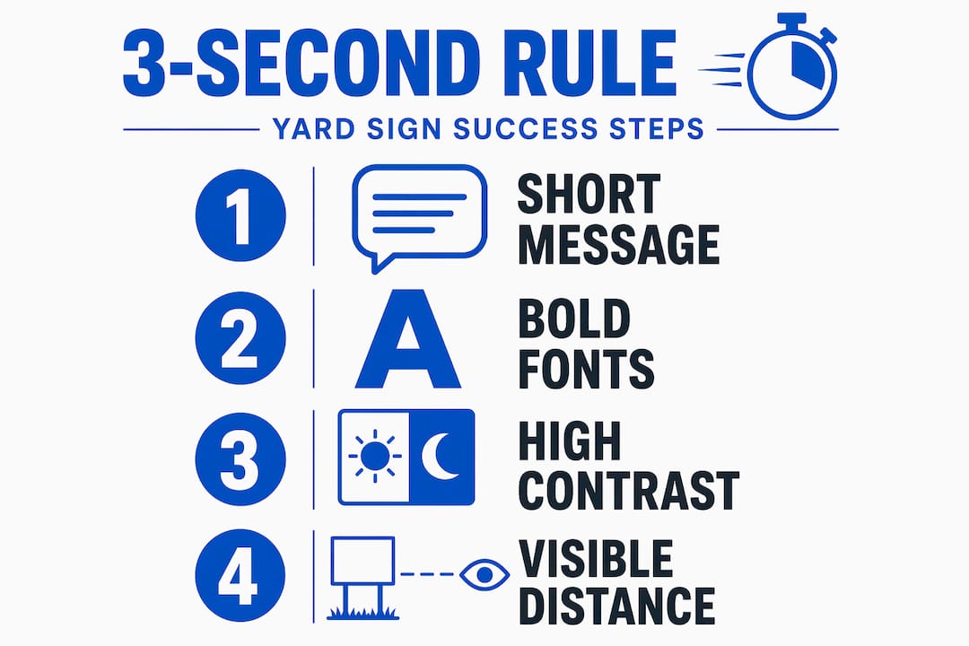
Core components of effective design
Here is what goes into a well-executed custom signage design:
- Message clarity. Define one primary action or idea. “Open House Saturday” beats “Come visit our open house this Saturday from 10am to 4pm, refreshments provided.”
- Visual hierarchy. The most important information gets the largest text. Secondary details, like a phone number or website, sit below in smaller type.
- Typography. Bold, sans-serif fonts are the standard for legibility at distance. Decorative or script fonts may look attractive on screen but fail outdoors.
- Color contrast. High contrast between text and background matters more than matching your brand palette. Black on yellow and white on dark blue are proven combinations.
- Negative space. Empty space is not wasted space. It gives the eye a place to rest and makes your primary message pop.
- Avoiding clutter. Every additional element you add competes with your main message. If it is not critical, leave it off.
Pro Tip: Test your design by stepping back 20 to 30 feet and squinting at it. If you cannot read the main message immediately, simplify.
A common mistake is treating a yard sign like a flyer. Flyers reward close reading. Yard signs punish it.
Materials and sizes: how they shape your design
Choosing the right material is not a separate decision from design. It directly affects how your sign looks, how long it lasts, and how well the colors print.
Comparing the two most common materials
| Feature | Corrugated plastic | Aluminum |
|---|---|---|
| Best use | Short-term events, campaigns | Long-term business, permanent display |
| Durability | Weeks to months | Years |
| Print quality | Vibrant, full color | Sharp, professional finish |
| Weight | Lightweight, easy to stake | Heavier, more rigid |
| Cost | Lower | Higher |
Material and size decisions affect both durability and legibility. Corrugated plastic is the go-to for political campaigns and real estate signs because it is affordable and easy to deploy in volume. Aluminum suits contractor branding or a contractor agency sign that needs to stay sharp through multiple seasons.
Standard sizes and viewing distances
Size is a design variable, not just a logistical one. The rule of thumb is 1 inch of text height per 10 feet of viewing distance. On a standard 18x24 inch sign with 3-inch text, your message is legible at roughly 30 feet. A 24x36 inch sign gives you more room to work with without crowding the layout.
Common sizes and their typical applications:
- 12x18 inches. Residential use, close-proximity placement, real estate riders.
- 18x24 inches. The most popular all-purpose size for campaigns, events, and promotions.
- 24x36 inches. High-traffic areas, roadside placement, maximum visibility.
Pro Tip: When ordering in volume, bulk sign orders reduce per-unit cost significantly. Plan your size and quantity together to get the best value.
Stakes and mounting options also factor into your design. H-wire stakes work for most lawn placements. Larger signs in high-wind areas may need a frame or wall-mount hardware.
Design by use case: promotions, politics, and events
What makes a yard sign custom is not just the artwork. It is how the design choices align with the specific goal. A political sign and a grand opening sign share the same format but follow very different rules.
Promotional signs for businesses
Businesses use custom yard signs as localized advertising that works around the clock. Unlike digital ads, a physical sign builds familiarity through repeated daily exposure. The design priorities for a promotional sign are:
- Lead with the brand name or offer, not a tagline.
- Include one clear call to action: a phone number, website, or address.
- Use brand colors, but verify they provide enough contrast outdoors.
- A home cleaning sign placed near a job site, for example, builds neighborhood awareness with zero ongoing cost.
Avoid the temptation to list every service. Pick the one that drives the most calls and lead with that.
Political campaign signs
Political signs prioritize name recognition above everything else. The candidate’s name should be the dominant element, sized to fill the sign. A short slogan, party affiliation, or office sought can appear below in noticeably smaller text.
Research on campaign sign design confirms that treating the candidate’s name as the single dominant element improves voter recall. Adding a website or social media handle is optional. Adding a photo, a list of endorsements, and a slogan all at once is a design failure.
Event signs
Event signs have three non-negotiable elements: what, when, and where. Everything else is secondary. A wedding yard sign, for example, succeeds when guests can read the couple’s names and date at a glance without hunting for the information.
Common pitfalls in event sign design include using decorative fonts that sacrifice readability, choosing colors that blend into the surroundings, and including so much detail that the sign reads like a program rather than a directional marker.
Practical steps for designing and ordering your sign
Knowing the principles is one thing. Applying them when you sit down to create your sign is another. Here is a step-by-step approach that works regardless of your design experience.
- Define your single goal. What is the one thing you want someone to do or know after seeing your sign? Write that down before you open any design tool.
- Write your message first, then design around it. Most people do it backwards. The message dictates the layout, not the other way around.
- Use templates when available. Templates for standard sizes specify dimensions, bleed areas, and safe zones. They prevent costly errors like text getting cut off at the edges.
- Test contrast against real outdoor backgrounds. Print a draft or hold your screen up near grass, concrete, or a fence. What looks great on a monitor can disappear against a green lawn.
- Limit yourself to two fonts maximum. One for the headline, one for supporting text. More than two creates visual noise.
- Plan your placement before you finalize the size. A sign near a 35 mph road needs different sizing than one at a pedestrian entrance.
- Order a proof if available. Seeing a physical sample before a full run saves money and frustration, especially for larger orders.
Replacing worn or faded signs promptly matters too. A damaged sign reflects poorly on the business or campaign it represents.
My take on what most people get wrong
I have reviewed hundreds of yard sign designs over the years, and the same mistakes show up constantly. The biggest one is not choosing the wrong font or the wrong color. It is misunderstanding what the sign is actually supposed to do.
People treat yard signs like they have the reader’s full attention. They do not. You are competing with traffic, noise, and a dozen other visual inputs. The moment you accept that your sign gets one glance and nothing more, your design instincts change completely.
I have seen beautifully branded signs that nobody could read from a car. I have also seen plain black-on-white signs that generated more calls than a full digital campaign because the message was clear and the placement was smart. Creativity matters, but clarity wins every time.
The other thing I would push back on is the idea that yard signs are a low-effort medium. The constraint of a small space with a short viewing window actually demands more design discipline than a full-page ad. Getting it right takes thought. The good news is that once you understand the rules, applying them becomes second nature.
— YardSignGuy
Design your custom yard sign with Yardsigns
Yardsigns makes the design and ordering process straightforward whether you are starting from scratch or working from a concept. You can choose from ready-made templates across categories including political, event, business, and even funny yard signs for personal use. If design is not your strength, the “Design It for Me” service puts a professional on your project.
Orders under 50 pieces ship within 24 hours, so you are never waiting when timing matters. Need to stock up? Blank signs in bulk give you flexibility for campaigns or events where you want to customize on your own schedule. Explore the full range at Yardsigns and find the right sign for your next project.
FAQ
What does custom yard sign design mean?
Custom yard sign design is the process of creating a tailored layout and artwork for an outdoor sign, covering message, colors, fonts, graphics, and materials to serve a specific purpose like a promotion, campaign, or event.
What makes a yard sign custom vs. a standard sign?
A custom yard sign is designed specifically for your message, branding, and use case rather than using a generic pre-printed layout. Every element, from text to color to size, is chosen to fit your goal.
How do you design yard signs for maximum readability?
Use bold sans-serif fonts, high-contrast color combinations, and limit your message to one primary idea. Text should be sized at roughly 1 inch of height per 10 feet of intended viewing distance.
What are the benefits of custom yard signs over digital advertising?
Custom yard signs work 24 hours a day with no recurring cost, build local brand recognition through repeated physical exposure, and cannot be scrolled past or blocked by an ad filter.
What size yard sign should I order?
The 18x24 inch size works for most applications. Use 12x18 for close-range residential placement and 24x36 for high-traffic roadside visibility where you need maximum impact from a distance.
