


Best Yard Sign Fonts: Readable Picks and Sizing Rules
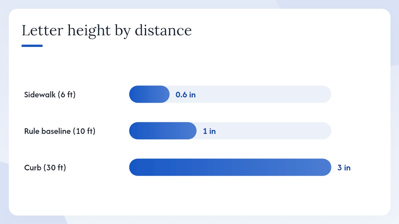
Bold, extended sans-serif typefaces are the most reliable choice for yard sign fonts. Three rules determine whether your sign gets read or ignored: size (use at least 1 inch of letter height for every 10 feet of viewing distance), contrast (dark text on a light background or vice versa), and spacing (open tracking, no tight kerning). For a typical drive-by sign seen from 30 feet, your headline letters need to be at least 3 inches tall. That single measurement, drawn from industry sizing guidance, eliminates more design mistakes than any font choice alone.
Sizing rule: 1 inch of letter height = 10 feet of comfortable reading distance. A 3-inch minimum headline covers most roadside and drive-by scenarios.
If you can’t read the headline in under two seconds, increase the size or switch fonts.*
Key Takeaways
The most reliable yard sign fonts are bold sans-serifs sized at 1 inch of letter height per 10 feet of viewing distance, set in high contrast against a solid background.
| Point | Details |
|---|---|
| Size before font | Apply the 1-inch-per-10-feet rule; use a 3-inch minimum headline for drive-by signs. |
| Top font picks | Arial, Helvetica, Gotham, Franklin Gothic, and Open Sans cover most use cases reliably. |
| Contrast is non-negotiable | Dark on light or light on dark; target well above the WCAG 3:1 minimum for outdoor use. |
| Print-test before ordering | Print at full scale and step back the real viewing distance to confirm readability. |
| Yardsigns for fast production | Yardsigns ships orders under 50 pieces within 24 hours with free proofs and weatherproof materials. |
Table of Contents
- Which yard sign fonts should you use?
- Why do some fonts work better at a distance?
- How do you pick the right font for your specific sign?
- Which fonts work best for each type of yard sign?
- Sizing and layout: a quick reference chart
- Fast design rules that make signs readable in seconds
- Where do you find these fonts and what do licensing mean?
- A sign maker’s perspective on what actually works in production
- Ready to print your yard sign with the right fonts?
- Sources
Which yard sign fonts should you use?
Eight typefaces consistently perform well across real-world sign applications. Each one earns its place through legibility at distance, broad availability, and a style that fits at least one common use case.
- Arial — A ubiquitous Windows system font with open counters and uniform stroke width. Free, widely available, and prints cleanly on corrugated plastic.
- Helvetica — The gold standard for neutral, professional signage. Slightly tighter spacing than Arial, but its clean geometry reads well from a moving car. Bundled with macOS; licensed separately on Windows.
- Gotham — Geometric, confident, and built for large display sizes. A commercial typeface (Hoefler&Co.) that became the go-to for political campaigns and corporate outdoor signage because its circular letterforms stay distinct at distance.
- Proxima Nova — A hybrid between geometric and humanist sans-serif. Paid (Adobe Fonts subscription or direct license), but its slightly wider proportions and generous x-height make it one of the best fonts for yard signs when you want a modern, approachable feel.
- Open Sans — Free via Google Fonts. Designed with upright stress and open apertures specifically for screen and print legibility. A reliable fallback when budget or licensing is a constraint.
- Times New Roman — The most recognizable serif. Works for real estate and formal announcements where tradition signals credibility. Its thin serifs can close up at small sizes, so keep headlines at 3 inches or larger.
- Garamond — A classic old-style serif with elegant proportions. Better suited to formal event or directional signs than fast-moving traffic scenarios; thin strokes demand high print quality and strong contrast.
- Franklin Gothic — A condensed American sans-serif with heavy weight options. Its narrow proportions let you fit more words without sacrificing size, making it a practical choice for political signs with longer candidate names.
Pro Tip: When you specify a font for printing, ask for the exact typeface name AND the weight (e.g., “Franklin Gothic Heavy” not just “Franklin Gothic”). Printers work from specific font files, and the wrong weight can arrive looking thin and unreadable.
| Font | Style | Licensing | Best for |
|---|---|---|---|
| Arial | Neutral sans-serif | Free (Windows bundled) | General use, real estate |
| Helvetica | Clean sans-serif | Free (macOS); paid on Windows | Corporate, retail |
| Gotham | Geometric sans-serif | Commercial (Hoefler&Co.) | Political, campaign |
| Proxima Nova | Humanist sans-serif | Commercial (Adobe Fonts) | Modern business, events |
| Open Sans | Humanist sans-serif | Free (Google Fonts) | Budget-friendly, all uses |
| Times New Roman | Traditional serif | Free (bundled) | Real estate, formal |
| Garamond | Old-style serif | Free variants available | Formal events, directional |
| Franklin Gothic | Condensed sans-serif | Bundled or commercial | Political, long names |
Why do some fonts work better at a distance?
Legibility at speed comes down to measurable type anatomy, not personal preference. Four factors matter most.
X-height is the height of lowercase letters relative to capitals. Fonts with a tall x-height (Open Sans, Proxima Nova) pack more visual mass into each character, making them easier to read at distance than fonts with short x-heights (some versions of Garamond).
Stroke contrast describes the difference between thick and thin strokes within a single letterform. High-contrast faces like Garamond have delicate thin strokes that can disappear at small sizes or on textured corrugated plastic. Low-contrast faces like Arial and Franklin Gothic maintain consistent stroke width, so every part of the letter stays visible.
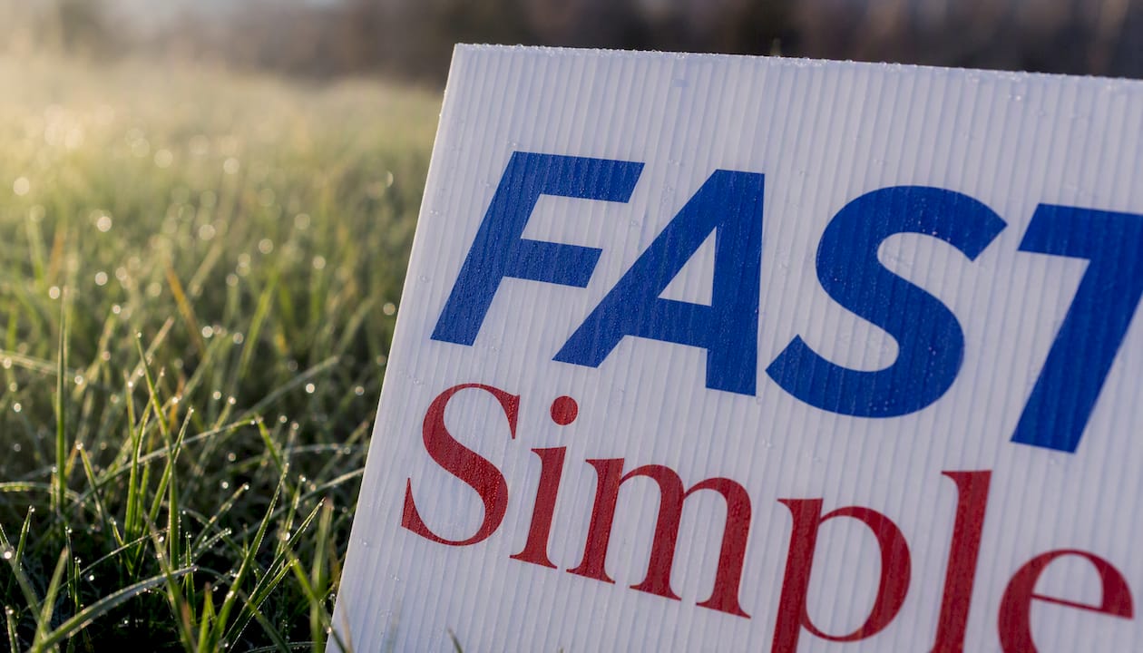
Open counters are the enclosed or partially enclosed spaces inside letters like “e,” “a,” and “c.” When counters close up due to ink spread (common on corrugated plastic), an “e” can read as a “c” and an “a” as an “o.” Fonts with wide-open counters resist this problem.
Letter differentiation covers how distinctly a font draws similar pairs: b/d, p/q, 1/l/I. Humanist sans-serifs like Open Sans handle these better than purely geometric faces, where a lowercase “l” and capital “I” can be identical.
Wayfinding Sans Pro was developed specifically around these principles. An independent empirical study cited by the FDI Type Foundry found it outperformed several common signage faces on legibility metrics, reinforcing why purpose-built signage typefaces sometimes outperform general-purpose options when maximum reading distance is the priority.
For contrast, WCAG 2.1 contrast guidance defines a minimum contrast ratio of 4.5:1 for normal text and 3:1 for large text. Outdoor signs should aim well above those minimums given variable lighting, glare, and viewing angles.
| Letter height | Comfortable reading distance |
|---|---|
| 1 inch | 10 feet |
| 2 inches | 20 feet |
| 3 inches | 30 feet |
| 4 inches | 30 feet |
| 6 inches | 60 feet |
Distance rule: The 1-inch-per-10-feet standard is the baseline. Add 20–30% to that figure for signs placed near fast-moving traffic (35+ mph roads).
Step back the actual viewing distance. If a letter looks ambiguous, it will look worse on a sign in direct sunlight.*
How do you pick the right font for your specific sign?
A short checklist cuts the decision time significantly.
- Define your primary message. One headline, one call to action. If you have more than seven words in your headline, shorten it before choosing a font.
- Measure the typical viewing distance. Curb sign seen from a car at 30 feet? Sidewalk sign read by pedestrians at 6 feet? The distance sets your minimum letter height.
- Calculate headline size. Apply the 1-inch-per-10-feet rule. A 30-foot viewing distance requires 3-inch letters at minimum.
- Choose the font family. Sans-serif for speed and clarity; serif only when tradition or formality is part of the message.
- Select the weight. Bold or heavy for headlines. Regular or medium only for secondary text that supports the headline.
- Test at scale. Print and step back. This step is not optional.
- Finalize contrast. Dark text on a white or yellow background, or white text on a dark background. Avoid mid-tone combinations.
Before sending files to a printer, ask two questions: What is the minimum stroke width your process can reproduce cleanly? Do you output from vector files or rasterize at a fixed DPI? Thin hairlines below 1 point often fill in or disappear on corrugated plastic. Vector output preserves letterform edges; raster output at low resolution softens them.
Pro Tip: Avoid italic type for main headlines on yard signs. Italics reduce the effective stroke width and tilt the letterforms, both of which hurt fast recognition at distance. Reserve italics for secondary lines only.
Which fonts work best for each type of yard sign?
Font choice carries meaning beyond legibility. Research from Northeastern University shows that typeface selection functions as a deliberate branding signal in campaign signage, with serif choices implying stability and tradition while sans-serifs project modernity and approachability. That logic applies equally to real estate, retail, and event signs.
| Use case | Recommended fonts | Why it fits | Weight guidance |
|---|---|---|---|
| Real estate | Times New Roman, Garamond | Serif conveys trust and tradition | Bold headline, regular secondary |
| Political / campaign | Gotham, Franklin Gothic | Strong geometry, high impact at distance | Heavy or Black weight |
| Retail / business promo | Helvetica, Proxima Nova | Neutral, professional, brand-flexible | Bold headline |
| Events / directional | Open Sans, Arial | Clear, fast to read, works at any size | Bold for arrows/key info |
| Community / school | Open Sans, Proxima Nova | Friendly, approachable, legible | Bold headline, medium body |
For font pairings, two rules cover most situations. First, limit yourself to two typefaces per sign: one for the headline, one for supporting text. Second, ensure the headline font is more legible than the supporting text. A common pairing that works well in practice: Franklin Gothic Heavy for the headline, Open Sans Regular for the address or phone number below it. The contrast in weight and style creates visual hierarchy without competing for attention.
- Pair a geometric sans-serif headline (Gotham, Futura) with a humanist sans-serif secondary (Open Sans, Proxima Nova).
- Pair a serif headline (Times New Roman) with a clean sans-serif secondary (Arial, Helvetica) for real estate signs.
- Never pair two serif fonts or two script fonts on the same sign.
Sizing and layout: a quick reference chart
The 1-inch-per-10-feet rule gives you the headline size. Layout decisions determine whether that headline has room to breathe.
Worked example 1: An 18" x 24" sign placed at a sidewalk, read by pedestrians at roughly 15–20 feet. A 2-inch headline fits comfortably and leaves room for a secondary line at 1 inch. Keep left and right margins at least 1 inch from the edge to prevent text from appearing cut off.
Worked example 2: A 24" x 36" sign staked at a driveway entrance, seen by drivers at 50–60 feet. Your headline needs 5–6 inch letters. At that size, a condensed face like Franklin Gothic lets you fit a full name without wrapping to a second line.
On a 24-inch-wide sign, that means 2.4 inches of clear space on the left and right. Text that runs edge-to-edge looks crowded and loses legibility when the sign is staked at an angle.
Layout rule: No more than three lines of text on a standard yard sign. Headline, subhead, and contact. Every additional line reduces the size of every other line.
Pro Tip: For graphic design layouts on yard signs, treat white space as a design element. A sign with generous margins and large type outperforms a sign packed with small text every time.
Fast design rules that make signs readable in seconds
Contrast, case, and spacing each affect how quickly a driver or pedestrian processes your sign. Get all three right and the font choice becomes almost secondary.
Contrast: Dark text on a white or yellow background is the most legible combination for daytime outdoor use. White text on a dark blue or red background works well but requires slightly larger type to compensate for the halation effect (light letters on dark backgrounds appear slightly smaller). Avoid placing text on a gradient or a photographic background. Both reduce effective contrast unpredictably across the sign’s surface.
Capitalization: All-caps works for short headlines of three words or fewer. The uniform cap height creates a clean, rectangular text block that reads fast at distance. For names, addresses, or multi-word phrases, headline case (capitalize each major word) is easier to read because the varied ascenders and descenders give the eye more shape cues. Avoid all-lowercase for headlines; it reduces the visual weight of the text block.
Capital letters set at default tracking tend to feel compressed. For condensed faces like Franklin Gothic, slightly wider tracking prevents letters from merging at distance. Never tighten kerning on a sign headline; the optical illusion of merged letters is worse on a physical sign than on a screen.
- Use solid, single-color backgrounds whenever possible.
- Limit your sign to two colors plus white; three colors maximum.
- Drop shadows and outlines add visual noise. Use them only when the background color is too close to the text color and you cannot change either.
- Script and decorative fonts fail at distance. Industry sign guidance consistently lists scripts, thin display faces, and novelty fonts among the worst choices for outdoor signs.
Contrast note: WCAG defines a 3:1 minimum contrast ratio for large text. Outdoor signs in variable light should target 7:1 or higher wherever possible.
Where do you find these fonts and what do licensing mean?
Understanding the difference between a typeface and a font saves confusion when ordering. A typeface is the design family (Helvetica); a font is the specific file for a weight and style (Helvetica Bold Italic). When you send files to a printer, you are sending fonts. When you describe what you want, you are naming a typeface.
Free options:
- Arial and Times New Roman come bundled with Windows and Microsoft Office.
- Open Sans and National Park are available free via Google Fonts, with open licenses that cover commercial print use. National Park was designed with letterforms inspired by carved park signage, making it a useful reference for how signage-focused typefaces handle legibility across sizes.
- Garamond has several free variants (EB Garamond on Google Fonts).
Commercial options:
- Gotham requires a license from Hoefler&Co. Adobe Fonts subscribers can access it through that platform.
- Proxima Nova is available through Adobe Fonts or direct from Mark Simonson Studio.
- Helvetica is bundled with macOS; Windows users need a license from Monotype.
Pro Tip: When you upload a design file to a printer, embed or outline your fonts. Outlined text converts letterforms to vector shapes, so the printer never needs the font file and you avoid substitution errors that can change your layout entirely.
For design tools, Canva includes Proxima Nova and Open Sans in its free tier. Adobe Illustrator and InDesign support all commercial fonts with proper licensing. Google Docs and Slides support Google Fonts natively, though neither is ideal for print-ready sign files.
A sign maker’s perspective on what actually works in production
The font conversation in design circles often focuses on aesthetics. In production, the constraints are physical.
Corrugated plastic (the standard material for yard signs) has a slightly textured surface. Ink sits on top of the flutes rather than soaking in, which means thin strokes and tight spacing can fill in or feather at the edges. A font that looks crisp on screen at 12 points can look muddy on a 24" x 36" corrugated sign if the stroke width is too narrow for the printing process. The practical floor is roughly 2–3 points of stroke width at the final print size. Bold weights of Arial, Franklin Gothic, and Gotham all clear that threshold comfortably.
Aluminum signs handle finer detail better than corrugated plastic, which is why Garamond and Times New Roman are more viable on aluminum real estate signs than on corrugated political signs. The material choice and the font choice are connected decisions, not separate ones.
Sign shops that handle high volumes of political and campaign work often print a candidate’s name in six to eight typefaces at full scale before committing to one. That elimination process, described in research on political campaign typography, is the same physical print-test recommended throughout this article. It is not a design-school exercise; it is a production reality check.
Ready to print your yard sign with the right fonts?
Yardsigns prints custom weatherproof signs on corrugated plastic and aluminum, with UV-resistant inks that keep bold sans-serifs sharp through rain, sun, and wind. Orders under 50 pieces ship within 24 hours, so you can move from font decision to staked sign in a single business day.
Every order includes free design proofs with unlimited revisions, double-sided printing options, and included metal H-stakes. If you have already chosen your font and layout, upload your file and get a proof back fast. If you are still working through the design, Yardsigns’s templates cover real estate, political, retail, and event formats with pre-set typography that follows the sizing and contrast rules in this article.
Order custom yard signs and get a free proof with your first submission.
Sources
The recommendations in this article draw on the following sources.
- 4 quick tips for designing yard signs - Campaigns & Elections
- What fonts are used in political campaigns?
- Wayfinding Sans Pro - FDI Fonts & Downloads - FDI Type Foundry Skip to content
- National Park - Google Fonts
