


Listing Sign Design Best Practices for Real Estate Agents
The most effective listing yard signs follow five non-negotiable rules: a bold, single-line headline; a cap height sized to the viewing distance to ensure readability; high-contrast color pairing; a durable substrate matched to the listing’s timeline (Coroplast for short campaigns, aluminum for longer-term listings); and one trackable CTA such as a QR code or short URL. Get those five right and your sign does its job before a driver reaches the intersection.
Before you send anything to print, run through this checklist:
- Headline: “For Sale,” “Open House,” or “Just Sold” in the largest type on the sign
- Primary CTA: QR code or short URL linking to a dedicated property page
- Contact line: Agent name and phone number, readable from the sidewalk
- Double-sided print: Required for any sign visible from two directions
- Local compliance: Municipal ordinance, HOA rules, and brokerage policy confirmed
The sections below explain how to apply each rule, with sizing tables, color guidance, material comparisons, production specs, and a pre-print checklist you can hand directly to your designer.
Table of Contents
- What are the design fundamentals for a listing yard sign?
- How do you make sign text readable at street speeds?
- Which color combinations make listing signs visible in any light?
- How should you lay out the elements on a listing sign?
- What materials and hardware should you choose for listing signs?
- Where should you place listing signs for maximum visibility?
- What legal and compliance rules apply to listing signs in the U.S.?
- What are the most common listing sign mistakes, and how do you fix them?
- What file specs does your printer need to avoid reprints?
- How do you track leads from a listing yard sign?
- Key Takeaways
- The sign mistakes that cost agents real listings
- Yardsigns makes it easy to order signs that match these specs
- Useful sources and further reading
What are the design fundamentals for a listing yard sign?
Your headline is the sign’s only job. “For Sale,” “Open House,” or “Just Sold” must be the largest element on the face, set in a weight heavy enough to read at 30 mph. Everything else is secondary.

Keep the core message concise to a few words. Drivers have roughly 3 seconds to register what they see. A sign that tries to say six things says nothing. The hierarchy should flow: headline → status or price (optional) → agent name and phone → website or QR → brokerage logo. The Equal Housing Opportunity logo belongs in a lower corner when required by your broker or MLS.

Resist the urge to add a tagline. Every extra line of text shrinks the headline or forces you to reduce type size across the board, which defeats the purpose.
Pro Tip: Before ordering a full run, photograph a printed mockup at the actual viewing distance. A phone photo from 30 feet reveals legibility problems a proof on a monitor never will. This is the single step most agents skip.
How do you make sign text readable at street speeds?
The 1-inch-per-10-feet rule is the practical standard for real estate signage: a sign read from 50 feet needs at least 5-inch capital letters. Some industry guides cite a looser maximum of 1 inch per 25–50 feet, but that range is for ideal conditions. Use the 1-in-per-10-ft benchmark as your floor, not your ceiling.
Font choice matters as much as size. Bold, humanist or grotesque sans-serif faces, such as Frutiger, DIN, or similar clear grotesques, outperform decorative or serif fonts at distance. Thin weights disappear against a light background. Increase letter spacing slightly (5–10% above default tracking) so characters don’t blur together on corrugated plastic surfaces. For yard sign design that holds up at speed, weight and spacing do more work than font personality.
| Sign size | Viewing distance | Min. cap height | Approx. point size |
|---|---|---|---|
| 18×24 in | 20 ft | 2 in | — |
| 18×24 in | 30 ft | 3 in | — |
| 24×36 in | 50 ft | 5 in | — |
Test your mockup in the actual environment. Print at full scale, stake it at the property, and walk or drive past. Adjust before you order 25 copies.
Pro Tip: Always check professional yard sign sizes against the specific street speed and setback at your listing. A 24×36 sign on a 35-mph road needs bigger type than the same sign on a quiet cul-de-sac.
Which color combinations make listing signs visible in any light?
High contrast is the single biggest legibility lever you control. Black on yellow, white on navy, and black on white are the most reliable outdoor pairings because they hold contrast in both direct sunlight and low-light conditions. Avoid saturated-on-saturated combinations — red text on a blue background, for example — because they vibrate visually and reduce reading speed.
Your brand colors may not translate directly to signage. A mid-tone brand blue paired with white text works well on a website but can wash out on a glossy Coroplast panel in afternoon sun. Test a printed sample outdoors before committing. If your brand palette is low-contrast, create a signage variant with a higher-luminance background or a darker text color.
- Use: Dark text on light ground, or light text on dark ground
- Avoid: Similar luminance values (gray on white, navy on dark green)
- Night visibility: Reflective vinyl or reflective laminate adds visibility after dark without changing daytime appearance
- Finish: Matte or satin finishes reduce glare on aluminum panels; gloss works well on Coroplast in shaded locations
Pro Tip: Convert your proof file to grayscale before printing. If the text and background look similar in grayscale, the contrast is insufficient for outdoor use.
How should you lay out the elements on a listing sign?
Negative space is not wasted space. A sign with tight margins and no breathing room reads as cluttered from the street, even if each individual element is legible. Keep a minimum 0.5-inch margin on all sides for an 18×24 sign; scale up proportionally for larger formats.
The logo should occupy no more than 15–20% of the sign face. Agent name and phone can share a line in a smaller weight below the headline. Photos of the property or the agent are only appropriate on signs placed near foot traffic (open house A-frames, for example) — from the street, a photo reduces the type size available for the headline and CTA, which costs you legibility.
Before sending art to print, confirm: headline is largest element, cap height meets the viewing-distance rule, phone number is at least 1.5 inches tall, double-sided art is mirrored correctly, and all text clears the safe margin.
What materials and hardware should you choose for listing signs?
Substrate choice should match how long the sign will be in the ground. Corrugated plastic (Coroplast) is the right call for short-term use: directional open-house signs, weekend campaigns, and listings expected to close in under 60 days. It’s lightweight, easy to stake, and cost-effective in bulk. Aluminum or aluminum composite panels (such as Dibond) are the better choice for premium listings, longer market times, or coastal and high-UV climates where Coroplast degrades faster.
- Coroplast: Economical, lightweight, easy to stake with H-stakes; best for campaigns under 60 days
- Aluminum: Rigid, weather-resistant, premium appearance; recommended for listings over 60 days or high-end properties
- UV-resistant inks: Standard for outdoor printing; extend color life significantly in sun-heavy markets
- Lamination: Adds scratch and UV protection; matte laminate reduces glare on aluminum
- H-stakes: Included with most Yardsigns orders; quick to install and remove without tools
- Angle-iron frames: More permanent; better for high-wind areas
- Colonial post systems: Premium presentation for luxury listings; requires more installation time
| Substrate | Best for | Lifespan (outdoor) | Weight |
|---|---|---|---|
| Coroplast: suitable for short-term and directional signs, lightweight | |||
| Aluminum: suitable for long-term and premium signs, medium weight | |||
| Aluminum composite (Dibond): suitable for high-end and coastal use, medium-heavy weight |
Pro Tip: Order signs flat-packed and store them horizontally. Vertical storage warps Coroplast panels, which makes them harder to stake cleanly and looks unprofessional at the curb.
Where should you place listing signs for maximum visibility?
Orient signs toward the main approach lane, not the property itself. A driver coming from the north needs to read the sign as they approach, which means the sign face should be perpendicular to the road, not angled toward the house. Double-sided printing handles bidirectional streets without any extra hardware.
- Place the sign at eye level from a car: the top of the sign should sit roughly 3–4 feet above grade.
- Clear obstructions: check for parked cars, utility boxes, and low-hanging branches that block sightlines seasonally.
- For open houses, place directional signs at every major intersection leading to the property, using consistent arrow graphics and the same color scheme as the primary sign.
- Before staking, call 811 (the national Dig Safe line) to locate underground utilities.
- Keep signs off public sidewalks and out of intersection sight triangles — both are common code violations.
Physical signs reach a neighborhood audience that digital ads cannot: casual nearby buyers and sellers who are present but not actively searching online, a fact that highlights why event marketing increases foot traffic. That local reach is why placement precision matters.
Pro Tip: For open houses, remove directional signs within two hours of the event ending. Signs left overnight are the fastest way to trigger a code complaint and a fine.
What legal and compliance rules apply to listing signs in the U.S.?
Local municipal codes and HOA CC&Rs commonly restrict sign placement, duration, and design. Run through this checklist before posting any sign:
- Municipal ordinance: Confirm temporary sign permits, size limits, and duration rules for your jurisdiction
- Right-of-way: Never place signs on public right-of-way without written permission; this is the most common violation
- HOA/condo rules: Review CC&Rs for sign size, placement, and removal timelines
- Brokerage/MLS policy: Confirm required logo placement, font minimums, and any co-branding rules
- Fair Housing Act: Avoid language or imagery that could be interpreted as discriminatory; place the Equal Housing Opportunity logo where your broker requires it
- Duration limits: Note the expiration date on any permit and set a calendar reminder to remove or renew
- Removal documentation: Photograph signs in place and after removal; keep records in the transaction file
Enforcement typically comes from city code officers or HOA management. Fines vary by jurisdiction but can accumulate quickly on a per-day basis. When in doubt, confirm with your broker’s compliance team before posting.
Pro Tip: Keep a simple spreadsheet per listing: sign placement date, permit number (if required), HOA approval, and planned removal date. It takes two minutes to set up and protects you from disputes.
This article provides general information, not legal advice. Confirm current sign ordinances and Fair Housing requirements with your broker, local municipality, or a qualified real estate attorney for your specific situation.
What are the most common listing sign mistakes, and how do you fix them?
Most sign failures come down to three problems: too much text, wrong font weight, and weak contrast. Here’s what to watch for and how to correct each one before you order.
Common mistakes and fixes:
- Crowded layout: Remove any element that isn’t headline, CTA, or contact. If it doesn’t help a buyer take action, cut it.
- Decorative or script fonts: Replace with a bold grotesque sans-serif. Decorative fonts lose legibility at 20+ feet.
- Low-contrast brand colors: Create a signage-specific color variant with higher luminance contrast.
- Undersized phone number: Set it at a minimum 1.5 inches cap height on an 18×24 sign.
- Missing double-sided art: Always submit two-sided files; single-sided signs on bidirectional streets waste half their impressions.
- No bleed on file: Submit with 0.125–0.25 inches of bleed to prevent white edges after trimming.
Pre-print checklist:
- [ ] Headline is the largest element
- [ ] Cap height meets the 1-in-per-10-ft rule for the viewing distance
- [ ] Color contrast passes a grayscale check
- [ ] Phone number is at least 1.5 in tall
- [ ] Double-sided art submitted and mirrored correctly
- [ ] File is vector PDF with outlined fonts
- [ ] Bleed set to 0.125–0.25 in
- [ ] Material and substrate confirmed
- [ ] Local compliance and HOA approval confirmed
- [ ] Mockup photographed at actual viewing distance
Pro Tip: Send the pre-print checklist to your designer as a brief. It cuts revision rounds in half and prevents the most expensive mistake: reprinting a full run.
What file specs does your printer need to avoid reprints?
Vector artwork is the standard for sign production. Submit PDF, AI, or EPS files with all fonts outlined and layers organized. Raster elements (photos, textures) should be embedded at 300 DPI at final print size. Set bleed to 0.125–0.25 inches and keep all live text and critical elements at least 0.25 inches inside the trim line.
| Spec | 18×24 in sign | 24×36 in sign |
|---|---|---|
| File format | Vector PDF/AI/EPS | Vector PDF/AI/EPS |
| Resolution (raster) | 300 DPI at final size | 300 DPI at final size |
| Bleed | 0.125–0.25 in | 0.125–0.25 in |
| Safe margin (text) | 0.25 in inside trim | 0.125–0.25 in bleed |
| Color mode | CMYK | CMYK |
| Double-sided | Separate files, mirrored | Separate files, mirrored |
For double-sided signs, submit each side as a separate file. The back side should be a mirror image of the front so the stake holes align correctly after printing. If color matching is critical for brand compliance, include Pantone spot color callouts in your file notes.
Turnaround at Yardsigns is rapid for small orders, with larger orders taking slightly longer. Rush production is available, but submitting clean files the first time is faster than any rush option.
Pro Tip: Always request a scaled digital proof before approving a full run. A proof reviewed on a 27-inch monitor at 100% zoom shows you exactly what the sign will look like at print size.
How do you track leads from a listing yard sign?
A yard sign without a trackable CTA is an impression you can’t measure. QR codes sized at 2–3 inches square reliably link passersby to property landing pages and capture leads that would otherwise go to aggregators. Place the QR code in the lower third of the sign, large enough to scan from a standing position at arm’s length.
Pair every QR code with a short URL for non-smartphone users. Use UTM parameters on the destination link so your analytics platform separates sign traffic from other sources. A minimal tracking workflow looks like this:
| Step | Action | Tool |
|---|---|---|
| 1 | Create a short URL with UTM parameters | Bitly, Pretty Links, or similar |
| 2 | Build a dedicated property landing page | Your website or CRM |
| 3 | Generate QR code linking to the short URL | QR code generator |
| 4 | Add QR and short URL to sign art | Design file |
| 5 | Monitor source traffic in analytics | Google Analytics or CRM |
SMS shortcodes are a strong alternative for markets where QR scanning is less common. A simple “Text HOME to 55555” line captures mobile leads without requiring a smartphone camera. Whichever method you use, keep the CTA exclusive to that listing so attribution stays clean. Shared aggregator links make it impossible to know which sign drove the lead.
Pro Tip: Create a new short URL for each listing, not each sign type. That way, if you run both a primary yard sign and directional signs, you can add a UTM source tag to distinguish them.
Key Takeaways
Effective listing sign design combines legibility, durable materials, legal compliance, and a measurable CTA — all five elements must work together for a sign to generate leads rather than just impressions.
| Point | Details |
|---|---|
| Cap height rule | Use at least 1 inch of capital-letter height for every 10 feet of viewing distance for comfortable readability on real-estate signs, as your minimum floor. |
| Substrate selection | Choose Coroplast for campaigns under 60 days; aluminum or aluminum composite for longer listings or premium curb appeal. |
| High-contrast color | Black on white, white on navy, or black on yellow are the most reliable outdoor pairings in varied light. |
| Trackable CTA | Add a 2–3 inch QR code and a short URL with UTM parameters to every sign to capture and attribute leads. |
| Yardsigns for production | Yardsigns offers Coroplast and aluminum options, double-sided UV printing, included H-stakes, free proofs, and ships most orders within 24 hours. |
The sign mistakes that cost agents real listings
Most agents treat the yard sign as an afterthought — something to order the day before the listing goes live. That’s the wrong frame. A sign is the first physical impression a potential buyer gets of how you operate. A cramped layout with a decorative font and a phone number no one can read from the street signals the same thing as a sloppy listing description: this agent didn’t sweat the details.
The agents who get this right treat the sign as a micro-billboard with one job: stop someone, give them one piece of information, and tell them exactly what to do next. That’s it. The headline, the phone number, and the QR code. Everything else is noise.
What I see most often in proofs is agents trying to include their headshot, a tagline, the brokerage logo at full size, a social media handle, and the property address — all on an 18×24 sign. Strip it back. The address is on the house. The headshot belongs on your business card. The sign’s only job is to make someone pick up the phone or scan the code.
The other underrated move: ordering double-sided signs on every listing, not just corner lots. A single-sided sign on a two-way street is throwing away half your impressions. The cost difference is minimal. The visibility difference is not.
Yardsigns makes it easy to order signs that match these specs
Every recommendation in this guide maps directly to what Yardsigns produces: Coroplast and aluminum substrates, double-sided UV-resistant printing, included metal H-stakes, free design proofs with unlimited revisions, and turnaround times that keep pace with fast-moving markets. Most orders under 50 pieces ship within 24 hours.
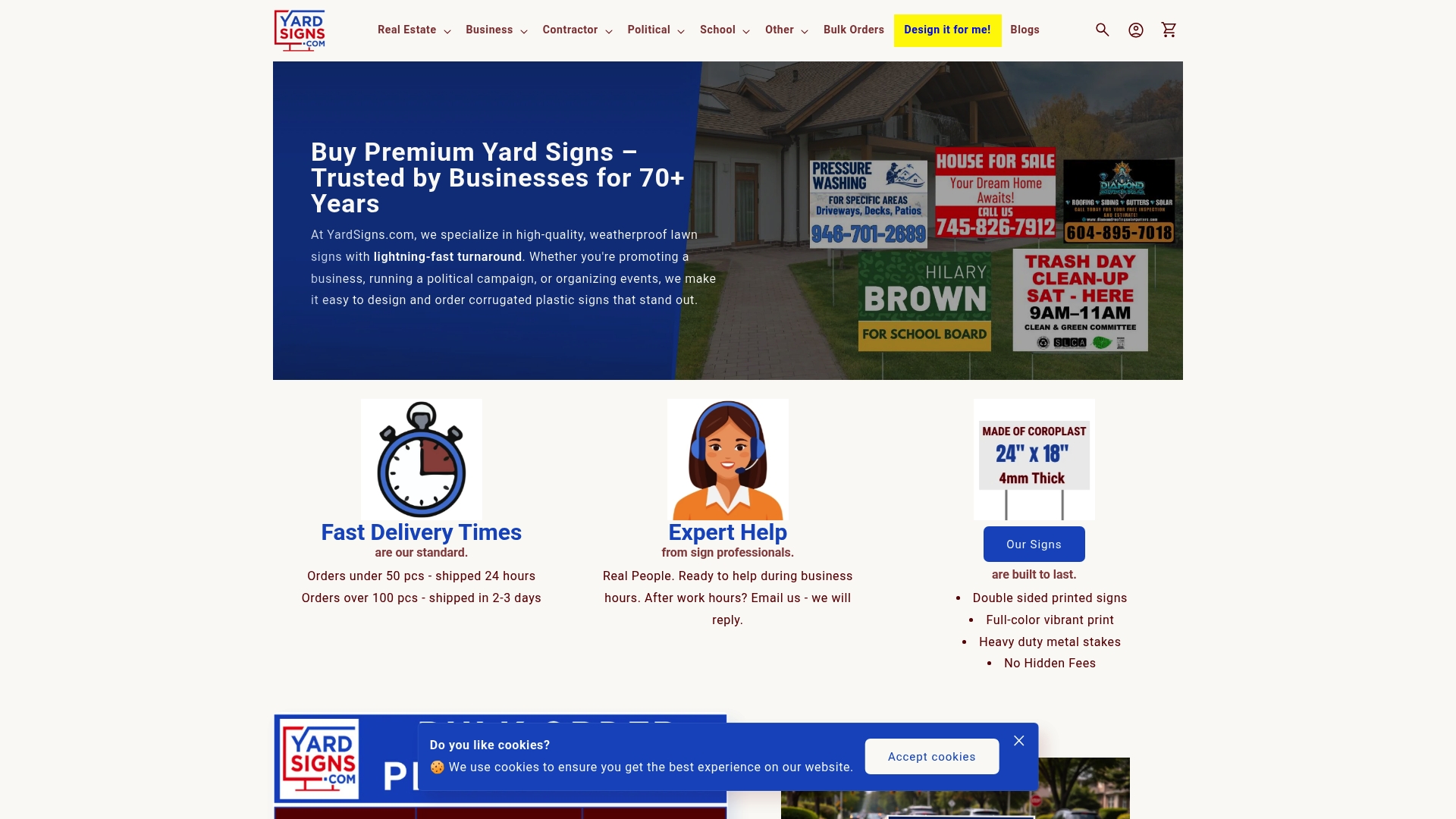
You don’t need to chase a local print shop or wait a week for proofs. Upload your art, select your substrate and size, request a free proof, and approve it the same day. Bulk discounts apply automatically as your order quantity increases, which makes it practical to order primary signs, directional signs, and open-house riders in a single transaction and keep your branding consistent across every touchpoint. Browse real estate sign options at Yardsigns and place your order today.
Useful sources and further reading
The resources below support the guidance in this article and are worth bookmarking for ongoing compliance checks and design reference.
- Real Estate Signs Custom: 2026 Guide to Design & Materials — substrate selection, legibility rules, and legal compliance overview
- 9 Real Estate Sign Ideas That Generate Leads — QR code sizing, trackable CTAs, and lead-capture strategies
- Sign Design That Sells: Practical Guide to Getting Noticed — color contrast, message length, and hierarchy principles
- Signage Design: A Complete Guide — production workflow, file specs, and environmental audit steps
- Yard Sign Design: 12 Tips to Maximize Visibility — on-site testing, cap height, and proof workflow from Yardsigns
- Professional Yard Sign Sizes: What Works Best and Why — size-to-distance reference charts
- How to Design Eye-Catching Yard Signs — step-by-step design workflow for in-house art
- Arkansas Real Estate Commission — Agent Best Practices Guide — state-level signage and advertising compliance reference
- California Department of Real Estate — Advertising Guidelines — brokerage and agent sign rules for California licensees
- North Carolina Real Estate Commission — Broker-in-Charge Guide — sign and advertising compliance for NC brokers
For local ordinance details, start with your city or county planning department’s temporary sign permit page, then cross-reference your brokerage’s advertising policy. When those two sources conflict, the more restrictive rule applies.
