


Print Proof Approval: What Reviewers Must Check
Print proof approval is your final sign-off that a job is ready for full production — and once you give it, the printer is authorized to run every copy. A printer’s proof is a sample print used to check color, layout, text, and overall quality before the full production run, and approving it without a thorough review is one of the most expensive mistakes you can make. Before you click “approve,” run these three checks immediately:
- Confirm critical text. Read every name, date, price, phone number, and address character by character, not word by word.
- Verify the version. Confirm the file version matches your latest revision, not a draft from two rounds ago.
- Check contact and call-to-action details. A wrong URL or phone number on a printed piece cannot be fixed after the run.
Approving a proof as shown is a production gate. Most printers treat your approval as legal authorization to proceed, and corrections requested after that point may be chargeable, refused, or simply too late to act on before the press run begins.
When color accuracy or a specialty finish is part of the job, a soft PDF proof alone is not enough. Request a hard or contract proof before signing off.
Key Takeaways
Disciplined print proof approval prevents reprints: check text, version, bleed, resolution, and color specs before issuing written sign-off, and request a hard proof whenever color or substrate accuracy is mission-critical.
| Point | Details |
|---|---|
| Approve in writing | Use a clear phrase with the file name, version, and date to create an unambiguous production record. |
| Soft proofs have limits | PDF proofs are reliable for copy and layout checks but cannot confirm final press color — request a contract proof for brand-critical color. |
| Checklist order matters | Review version, text, layout, bleed, and resolution in sequence to avoid missing high-risk items under time pressure. |
| Hard proofs for outdoor signs | For corrugated plastic and aluminum, request a substrate-specific proof when color accuracy or fine-text legibility is critical. |
| Yardsigns proof-first workflow | Yardsigns provides free design proofs with unlimited revisions, UV-resistant inks, and retained order records for every custom yard sign order. |
Table of Contents
- What are the main proof types and when should you request each?
- Your complete print proof review checklist
- How to evaluate color on a proof — and when a soft proof is not enough
- How to view proofs properly and what file checks to run
- What happens after you approve — the point of no return
- Common errors that cause reprints and how to prevent them
- Proofing yard signs: what to check for outdoor durability
- Yardsigns makes proof-first ordering fast and accountable
- Sources
What are the main proof types and when should you request each?
Understanding which proof type fits your job keeps you from over-approving a soft proof when the stakes are higher than layout and copy.
- Soft proof (digital/PDF): A screen-viewable file, usually a PDF, that shows layout, copy, and basic positioning. Soft proofs speed approvals and reduce cost but cannot reliably predict final press color, so use them for content and layout checks, not color-critical decisions.
- Hard proof (physical sample): A printed physical output on or close to the intended stock. Request one when substrate texture, ink opacity, or color matching matters to the final result.
- Contract proof: A color-accurate physical proof produced to a defined standard. A contract proof serves as both the customer’s sign-off and a color reference the press operator uses to match ink on press, and it can carry legal significance. Use it for brand-critical color, packaging, and high-volume runs.
- Press proof: An actual short run on the production press using the production inks and stock. The most accurate and most expensive option, reserved for jobs where color consistency across a large run is non-negotiable.
- Substrate or packaging mock-up: A physical sample on the exact material, including laminate, corrugated plastic, or aluminum. Request one whenever the substrate itself affects how color and finish read.
| Proof type | Best for | Color accuracy |
|---|---|---|
| Soft proof (PDF) | Copy, layout, version checks | Low (screen only) |
| Hard proof | Stock feel, general color review | Medium |
| Contract proof | Brand color sign-off, legal agreement | High |
| Press proof | Production-critical color, large runs | Highest |
| Substrate mock-up | Material-specific finish, outdoor signs | Material-accurate |
Your complete print proof review checklist
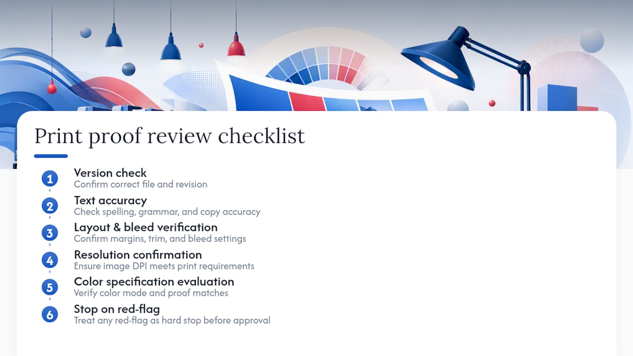
A structured review order reduces the chance of missing something. Work through these categories in sequence rather than scanning randomly, and treat each red-flag item as a hard stop before approval.
Suggested review sequence
- Confirm the version. Check the file name, revision number, or timestamp against your records before reviewing anything else.
- Read all text aloud. Names, dates, prices, phone numbers, URLs, legal disclaimers, and taglines. Read slowly, character by character for numbers.
- Check layout and alignment. Verify that text blocks, images, and logos sit where they should and that nothing is cropped, shifted, or overlapping.
- Inspect bleed, trim, and safe zones. Confirm that background elements extend to the bleed edge, that no critical content sits inside the trim zone, and that text and logos clear the safe zone margin.
- Evaluate images and resolution. Zoom to 100% and check that images are sharp at print size. Blurry or pixelated images at screen size will print worse.
- Verify fonts. Confirm that all fonts are embedded or outlined and that no font substitution has occurred. Substituted fonts change spacing and can break layouts.
- Check barcodes and QR codes. Print a test scan or use a barcode verification app. A QR code that scans correctly on screen may still fail at reduced print size.
- Review color callouts and spot colors. Confirm Pantone or spot-color numbers match the spec sheet. A wrong Pantone number can produce a noticeably different color on press.
- Verify personalization or variable data. For variable-data jobs, check at least the first record, a middle record, and the last record for correct merge fields.
- Review prepress comments. Read every preflight note the printer flagged. Decide whether each item needs a designer fix or a prepress adjustment, and respond in writing.
Red-flag items that must block approval
- A phone number or URL that does not match your current records
- Any image flagged as below 300 DPI at print size
- Missing bleed on a full-bleed design
- A font listed as “missing” or “substituted” in the preflight report
- A QR code that fails to scan
Pro Tip: Never approve a proof under time pressure without at least completing steps 1 through 4. Those four checks catch the majority of reprints. If you are short on time, do those first and schedule a full review before the deadline.
Printable mini-checklist
Copy and print this for your desk:
- [ ] Version confirmed
- [ ] All text read aloud, character by character
- [ ] Layout and alignment verified
- [ ] Bleed, trim, and safe zones checked
- [ ] Images sharp at 100% zoom
- [ ] Fonts embedded or outlined
- [ ] Barcodes and QR codes tested
- [ ] Spot colors and Pantone numbers verified
- [ ] Variable data spot-checked
- [ ] Prepress comments reviewed and responded to
How to evaluate color on a proof — and when a soft proof is not enough
Screen color and press color are not the same thing, and understanding why helps you decide when to push for a physical proof.
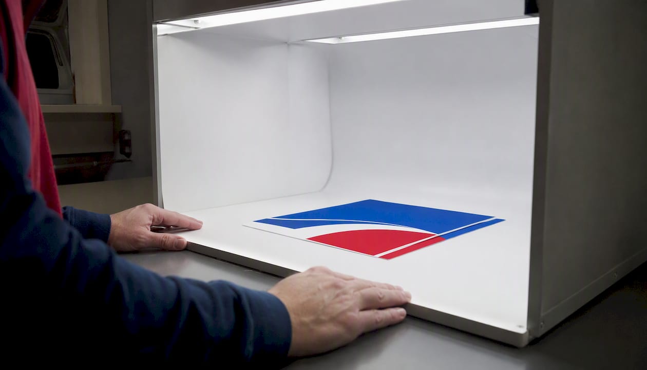
Your monitor displays color in RGB (red, green, blue), while commercial printing uses CMYK (cyan, magenta, yellow, black). The RGB color space is wider than CMYK, which means some colors you see on screen simply cannot be reproduced on press. Neon greens, vivid purples, and certain bright reds are common casualties of this conversion. Monitor calibration adds another variable: an uncalibrated screen can shift perceived color by a visible margin even before the press enters the picture.
Ambient lighting compounds the problem. Reviewing a proof under warm incandescent light makes colors read warmer than they are. Prepress professionals use D50 or D65 standardized viewing booths for exactly this reason.
When to accept a soft proof for color: routine jobs where color is not brand-critical, internal documents, and jobs where you have approved the same color scheme on press before.
When to demand a contract or press proof:
- Brand colors, especially reds, blues, and corporate Pantones
- Neon, metallic, or fluorescent inks
- Varnish, spot UV, or foil finishes
- Any job where color consistency across multiple print runs matters
Proof validation gives you measurable assurance. Embedding color bars or charts into the artwork lets the press operator verify that the proof emulates the desired press result, and it creates a documented reference point if a color dispute arises later.
Pro Tip: Ask your printer to provide the proof on the intended stock, not a generic proofing paper. Ink absorbs differently on coated, uncoated, and corrugated substrates, and a proof on the wrong stock can mislead your color judgment.
For yard signs specifically, UV-resistant inks on corrugated plastic behave differently than inks on coated paper stock. If you are ordering outdoor signs with brand colors, a substrate-specific proof is worth the extra step. You can read more about how offset and digital printing affect color output for yard sign applications.
How to view proofs properly and what file checks to run
How you open and view a proof affects what you catch. A quick glance on a phone screen is not a review.
Step-by-step viewing checklist
- Open the proof on a desktop or laptop, not a phone. Mobile screens compress and rescale content in ways that hide alignment and bleed issues.
- Use a PDF viewer that preserves crop marks and bleed. Adobe Acrobat Reader shows trim marks and bleed indicators; browser-based PDF viewers often strip them.
- Set the view to 100% (actual size). This is the only zoom level where image sharpness and font rendering reflect what will print.
- Check the full spread, then zoom in. Review the overall layout first, then zoom to 200–400% for fine text, small print, and image edges.
- View on a calibrated monitor. If your monitor has not been calibrated recently, treat any color judgment as approximate.
- Use neutral ambient lighting. Avoid reviewing proofs under strong warm or colored light sources.
File checks before approving
- Color space: Confirm the file is CMYK, not RGB, unless your printer handles the conversion. An RGB file submitted to a CMYK press will shift colors unpredictably.
- Resolution: Images should be at least 300 DPI at the final print size. Check the image properties in Acrobat or ask your prepress contact.
- Embedded fonts: Open the Document Properties panel in Acrobat and confirm all fonts are listed as “embedded” or “embedded subset.”
- Bleed and trim marks: Crop marks and bleed guides should be visible in the proof. If they are missing, ask prepress to resend with marks included.
- ICC profile: Confirm the correct ICC profile is embedded. For commercial print, this is typically SWOP or GRACoL for US offset printing.
Printers commonly flag resolution, bleed, and font issues in preflight; responding with an annotated PDF or line-by-line correction list is the fastest way to get revisions and preserve the proof history.
What happens after you approve — the point of no return
Approval is not a formality. It is the moment a job moves from review to production, and what follows is largely outside your control.
Typical approval workflow
- Proof delivery: Printer sends a soft proof (PDF) or ships a hard proof sample.
- Reviewer inspection: You or your team review against the checklist above.
- Revision request or approval: You either send annotated corrections or issue written approval.
- Prepress sign-off: Printer’s prepress team confirms the file is production-ready.
- Production scheduling: Job enters the press queue. Plates are made or digital files are queued.
- Press run: Printing begins. At this stage, changes are not possible without stopping the run.
- Finishing and shipping: Cutting, laminating, and fulfillment follow the press run.
Many printers treat proof approval as the gate to production and may refuse corrections made after approval without extra cost. Some will accommodate minor text corrections before plates are made, but once the press is running, the job is committed.
“Approved as shown — please proceed to production.” Use this exact phrase in your written approval, along with the file name, version number, and date. This creates an unambiguous record that you reviewed the correct version.
Record your approval in writing. An email thread with the approval phrase, file name, and timestamp is the minimum. For high-value jobs, a digital sign-off workflow with a timestamped audit trail gives both parties a clear record if a dispute arises.
Timeline note: Approval speed directly affects your delivery date. Most printers schedule production in daily batches. An approval that arrives after the cutoff time moves the job to the next production window, which can add one to two business days to your turnaround. For fast-turn orders, approval timing is one of the biggest controllable factors in your delivery date.
Common errors that cause reprints and how to prevent them
Most reprints trace back to a small set of recurring mistakes. Knowing them in advance lets you build targeted checks into your review.
- Typos in critical copy. Names, phone numbers, and URLs are the highest-risk fields. Prevention: read them aloud and have a second person verify independently.
- Low-resolution images. Images sourced from websites are typically 72 DPI, which prints blurry at any size above a thumbnail. Prevention: request original high-resolution files from your designer or photographer before submitting.
- Missing or insufficient bleed. A design with no bleed that gets trimmed will show a white edge. Prevention: confirm bleed extends at least 0.125 inches beyond the trim line on all sides.
- Wrong orientation. A landscape file submitted as portrait, or vice versa, prints sideways. Prevention: check orientation in the Document Properties panel before approving.
- Incorrect page order. Multi-page documents with pages out of sequence are a common and embarrassing reprint cause. Prevention: page through every spread in order during review.
- Ignored preflight warnings. Printers flag issues for a reason. Dismissing a “low resolution” or “missing font” warning without investigating it is a direct path to a reprint. Prevention: treat every preflight flag as a required response, not an optional note.
- Version confusion. Approving an outdated file version after revisions have been made. Prevention: confirm the file name and modification date match your latest revision before starting the review.
Workflow changes that reduce human error: assign one named proof owner per project, set a review deadline at least 24 hours before the printer’s cutoff, and use version-controlled file naming (v1, v2, v3 — never “final” or “final-final”).
Proofing yard signs: what to check for outdoor durability
Yard signs introduce substrate-specific variables that standard print proofing guidance does not always address. Corrugated plastic and aluminum behave differently from paper, and outdoor conditions stress the print in ways an indoor proof cannot simulate.
Material and finish checks
- Corrugated plastic (Coroplast): Confirm ink coverage accounts for the fluted texture. Thin lines and small text can lose definition at the flute ridges. Check that fine text is at least 10–12 points.
- Aluminum signs: Verify that the design accounts for the substrate’s reflectivity. Metallic finishes can affect how colors read in direct sunlight.
- UV-resistant inks: Confirm with your printer that UV-resistant inks are specified, especially for signs intended for extended outdoor use. Yardsigns uses UV-resistant inks as standard, which protects color vibrancy through weather exposure.
- Double-sided printing: If the sign is double-sided, verify that both sides are included in the proof and that the orientation is correct for each face. A flipped back panel is a common and costly error.
Yard-sign-specific checklist
- [ ] Text legible at a distance of 10–15 feet (check at reduced zoom to simulate viewing distance)
- [ ] Stake placement zone is clear of critical text and logos
- [ ] Bleed extends to all four edges
- [ ] Both sides confirmed for double-sided orders
- [ ] UV-resistant ink specified in the order
- [ ] Fine text is at least 10 points on corrugated plastic
Turnaround and proof timing
For orders under 50 pieces, Yardsigns ships most jobs within 24 hours of approval. That speed means the proof review window is short and the stakes of a missed error are immediate. For larger runs or color-critical jobs, request a hard sample before approving. Same-day printing constraints make hard proofs impractical for rush orders, so a thorough soft-proof review using the checklist above is your primary safeguard.
If the headline is not readable at that zoom level, it will not be readable at 15 feet.*
For a broader look at what to verify before placing a custom sign order, the custom sign order checklist covers design, material, and quantity decisions that feed directly into the proof review.
The discipline that separates a smooth run from a reprint
Proof review is one of those tasks that feels optional until it is not. The checklist above is not bureaucracy — it is the difference between a sign that goes up correctly and one that comes back for a reprint at your cost and your timeline.
Color-critical jobs deserve a hard proof, full stop. Approving a brand-red political sign or a real estate sign with a specific corporate color from a PDF on an uncalibrated laptop is a gamble. The cost of a contract proof is almost always less than the cost of reprinting 500 signs. Document every approval in writing, keep the email thread, and note the file version. If a dispute arises, that thread is your evidence.
For readers who want a proof-first workflow, the process is straightforward: request the proof before payment clears, review it against the checklist, and approve in writing only when every item passes.
Yardsigns makes proof-first ordering fast and accountable
Every Yardsigns order includes a free design proof before production begins, with unlimited revisions until the design is exactly right. For orders under 50 pieces, most jobs ship within 24 hours of approval, so the proof review window is tight but the turnaround is real. All order threads and proof records are retained, giving you a documented approval history for accountability.
Yardsigns prints on corrugated plastic and aluminum with UV-resistant inks, so the sign you approve is the sign that holds up through weather, sun, and the full length of your campaign. If you need a hard sample for a color-critical or high-volume run, contact the team before placing your order to discuss proof options. When you are ready to order, start your custom yard sign with a free proof and see the design before a single sign prints.
Sources
- What is a Printer’s Proof? The Complete Definition.
- Digital proof - GlobalVision
- Prepress proof - Wikipedia
- Digital Proofs Explained: What a PDF Proof Can and Cannot Tell You - The Print Reviewer
- The Ultimate Guide to Print Proof Review: What to Check Before Final Approval
