


10 Common Real Estate Sign Design Errors (and Fast Fixes)
Most yard signs fail for one of two reasons: nobody can read them fast enough, or they’re planted somewhere a driver never sees them. Between those two failure modes sits a long list of smaller mistakes, from clashing colors to skipped permit checks, that quietly cut into your leads. Fix legibility and placement first, and everything else on this list becomes easier to catch.
Run this before anything goes to print:
- Bump letter height until it passes the squint test from six feet away.
- Cut your headline to one property fact and one call to action.
- Swap low-contrast color pairs for a dark-on-light or light-on-dark combo.
- Confirm setbacks and HOA sign rules before you order, not after.
- Choose UV-resistant ink on coroplast or aluminum, not standard poster stock.
- Dial the phone number on the proof and click the URL before approving it.
Key Takeaways
Real estate signs convert best when large, high-contrast text and unobstructed placement take priority over decorative branding.
| Point | Details |
|---|---|
| Size letters to distance | Use roughly 1 inch of letter height per 10 feet of intended reading distance. |
| Simplify the message | One property fact and one call to action outperform a paragraph of features. |
| Check rules before ordering | Confirm HOA CC&Rs and municipal sign codes before printing, not after. |
| Prioritize placement over polish | Clear sightlines and two-sided visibility matter as much as the design itself. |
| Order from Yardsigns | Yardsigns ships UV-inked, double-sided signs with H-stakes within 24 hours for small runs. |
Table of Contents
- The Top Common Real Estate Sign Design Errors to Fix Before You Print
- Where Should You Place a Yard Sign for Maximum Visibility?
- How Do You Check HOA and Local Sign Rules Before Printing?
- Which Materials Hold Up Best for Outdoor Real Estate Signs?
- How Do You Test a Sign for Readability Before It Ships?
- What Vendors Wish Agents Knew Before Ordering
- Order Signs Built Around the Same Checklist
- Frequently Asked Questions
- Sources
The Top Common Real Estate Sign Design Errors to Fix Before You Print
Every one of these mistakes shows up on repeat across listings, and every one has a quick fix you can apply to the next proof you review.
Text too small or too decorative. A script font might match your brand, but drivers going 25 mph can’t parse it. A practical rule of thumb is about 1 inch of letter height for every 10 feet of reading distance, so a sign meant to be read from 50 feet needs letters roughly 5 inches tall. Fix: pick a bold sans-serif and size the main line using that ratio before you touch the layout.
Too many words, no hierarchy. Signs crammed with “Charming 3BR/2BA, updated kitchen, new roof, call today” lose the reader before they finish the sentence. One property fact plus one action item is the whole job. Fix: cut every line except the address or feature, the phone number, and a single verb like “Call” or “Tour.”
Poor color contrast. Gray text on beige, or navy on dark green, disappears from a moving car. Contrast standards built for screens, like WCAG’s minimum contrast guidance, translate directly to outdoor signage: the bigger the gap between text and background brightness, the faster the eye locks on. Fix: test your color pair against a white or navy background, the two combinations that consistently read best on coroplast.
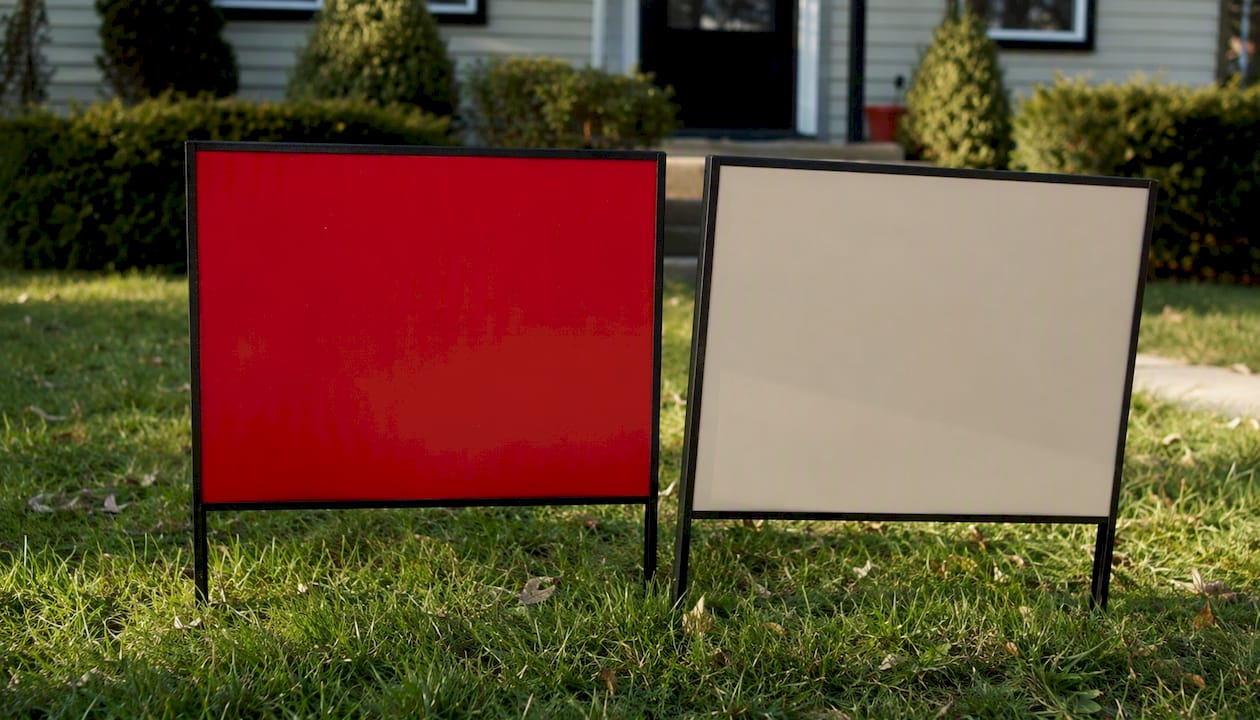
Cluttered layout with no breathing room. Packing every inch with text, logos, and borders forces the eye to hunt for the message. Design guidance on white space suggests keeping roughly 30 to 40 percent of the sign area clear of text or graphics. Fix: shrink your logo to a corner accent and let the headline breathe.
Over-branding. Broker logo, agent headshot, team badge, and a QR code all fighting for the same six square feet buries the one thing that matters: how to reach you. Fix: one logo, sized smaller than your phone number, always.
Proofing errors. A transposed digit in the phone number or a dead URL turns a $30 sign into a wasted print run. Fix: before approving any proof, dial the number from your own phone, tap the URL, and have a second person reread every word out loud.
Production shortcuts. Ordering before confirming an HOA allows the placement, or choosing non-UV ink to save a few dollars, both lead to signs that get pulled or fade within weeks. Fix: confirm permission and material specs on the same call you place the order.
Pro Tip: Keep a template checklist on your phone: font size, contrast, word count, phone test, URL test. Run it every time before you hit “approve,” even on a design you’ve used ten times before.
Where Should You Place a Yard Sign for Maximum Visibility?
A well-designed sign in the wrong spot still fails. Sign-industry guidance treats placement and design as equally weighted factors in whether a sign actually converts. Clear the line of sight from both directions of approach, not just the direction you drove in from. Parked trucks, hedges, and mailboxes block more signs than bad design ever does.
Use a double-sided print so drivers coming from either direction get the message, and angle the sign slightly toward oncoming traffic rather than flat to the curb. Stake it at a height where the headline sits near eye level for a seated driver, not buried in tall grass.
- Walk both approaches to the property and check sightlines at eye level.
- Drive past at normal speed and count how many seconds the sign stays readable.
- Note any visual noise nearby (other signs, banners, bright storefronts) competing for attention.
Pro Tip: If a listing sits on a curve or near an intersection, place the sign slightly before the turn, not at it. Drivers need a beat to register the message before they’re already past it.
How Do You Check HOA and Local Sign Rules Before Printing?
Skipping this step is how signs end up in a dumpster the week after installation. HOA covenants and municipal codes routinely restrict sign size, color, and placement, and ignorance of the rule doesn’t stop enforcement.
- Pull the property’s CC&Rs or HOA sign policy first; most management companies post them online or will email a copy on request.
- Search the city or county planning code for temporary sign regulations, including size caps, setback distances from the curb, and duration limits.
- Call code enforcement or the planning desk if the written rule is ambiguous. A two-minute call beats a $150 fine.
- Document the answer, screenshot the policy page or save the confirmation email, before you place your print order.
A common and costly sequence is ordering signs first and checking rules second. That timing mistake leaves agents holding paid-for inventory they can’t legally display, which is why the CC&R check belongs at the top of your workflow, not the bottom.
Which Materials Hold Up Best for Outdoor Real Estate Signs?
Coroplast, the corrugated plastic most yard signs use, is lightweight, cheap, and fine for a listing that turns over in a few weeks. Aluminum costs more but survives storms, direct sun, and repeated reuse across multiple listings, which makes it the better call for open house signs you’ll deploy every weekend.
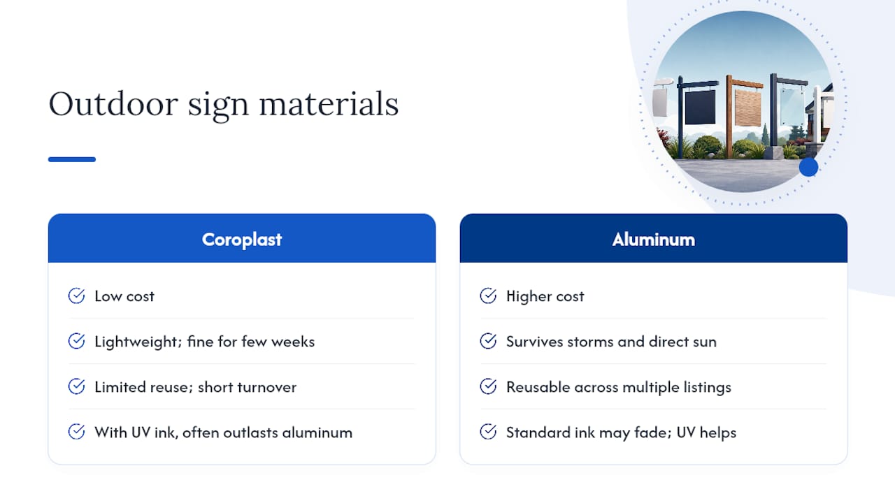
UV-resistant inks matter more than the substrate in most fading complaints; a coroplast sign with UV ink often outlasts an aluminum sign printed with standard ink. Double-sided printing is worth the small upcharge on any corner lot or two-way street. Before you approve a production run, request a proof, confirm double-sided alignment, and ask whether the sign printing run includes metal H-stakes rather than plastic ones that bend in wind.
Pro Tip: Ask your printer directly whether the inks are rated for outdoor UV exposure. “Full color” and “UV-resistant” are not the same claim, and only one of them survives August in direct sun.
How Do You Test a Sign for Readability Before It Ships?
Run these checks in order, and you’ll catch most legibility problems in under ten minutes:
- Squint test. Blur your eyes looking at the proof on screen. If the headline disappears, so will it from a moving car.
- Distance simulation. Print at actual size or tape a mockup at scale, then walk back using the 1 inch per 10 feet rule and see what still reads.
- Mobile drive test. Prop a printed mockup at the install site and drive past at the posted speed limit from both directions.
- Contrast and glare check. View the proof in direct sunlight and under shade; glossy laminates can wash out under midday glare.
- Dial the phone number listed on the sign.
- Copy and paste the URL to confirm it resolves.
- Get a second set of eyes on spelling before final approval.
What Vendors Wish Agents Knew Before Ordering
The fastest fix I’ve seen agents make isn’t a font change, it’s swapping a cluttered four-logo layout for one clean headline and a bigger phone number. One agent who simplified a sign this way reported a noticeable jump in call-ins the same weekend. Ask any vendor for fast proofs, UV-resistant inks, and double-sided printing as standard, not upsells.
Order Signs Built Around the Same Checklist
Everything in this checklist, big letters, high contrast, one clean message, durable materials, is exactly what Yardsigns builds into every order. Orders under 50 pieces ship within 24 hours, so when you catch a proofing error the night before an open house, you’re not stuck waiting a week for a corrected print.
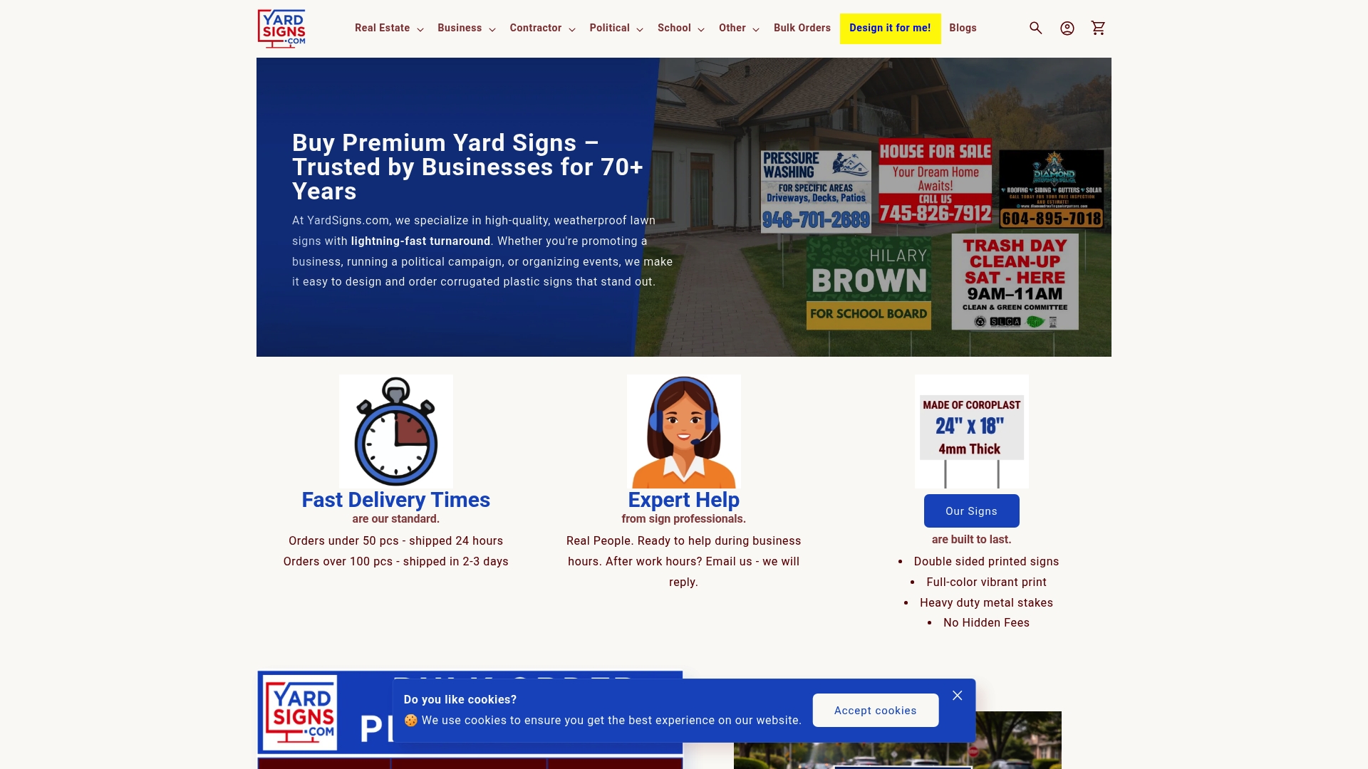
- Double-sided printing on every template, so both directions of traffic get the message.
- UV-resistant inks on corrugated plastic or aluminum, whichever fits your budget and reuse plans.
- Metal H-stakes included, not sold separately.
- Free proofs with unlimited revisions before anything goes to press.
Before you upload artwork, run through a short ordering checklist: upload your proof, note any permit or HOA confirmation you’ve already secured, pick your substrate, and request double-sided printing if the lot has two-way visibility. Browse realtor yard sign templates built with the contrast and hierarchy rules above already baked in, or start a fresh design if your branding needs a custom layout.
Frequently Asked Questions
What is the single biggest cause of ineffective real estate signs? Illegible text at driving speed. Even a well-branded sign fails if the headline can’t be read within the two or three seconds a passing driver has to notice it.
How big should the letters be on a yard sign? A practical starting point is 1 inch of height per 10 feet of expected reading distance, then adjust up if the sign sits on a faster road.
Do I need to check HOA rules even for a temporary open house sign? Yes. Many HOAs restrict temporary signage the same way they restrict permanent signs, and enforcement is common enough to be a leading cause of sign removal.
Is aluminum always better than coroplast for real estate signs? Not always. Coroplast works fine for short-term listings, while aluminum earns its higher cost on signs you reuse weekend after weekend, like open house directionals.
What’s the fastest way to catch design errors before printing? Run the squint test on the digital proof, dial the listed phone number, click the URL, and have a second person read every line aloud before you approve the order.
Sources
- What to know about HOA restrictions on signage
- Design and placement of signs — Signs101 / International Sign Association
