


3 Steps to Pantone Matched Yard Signs: Factory Workflow for Businesses
Yes, you can get an exact Pantone match on a yard sign, but a monitor preview will never prove it. Reliable matches come from spot inks or custom-mixed formulas checked against a physical proof on the actual substrate, not a screen. Before you order anything, do three things: supply your exact PMS code or a physical swatch, request a hard proof on the real material, and choose a printer that explicitly offers spot-ink or custom-mixed color matching.
TL;DR:
- Spot ink and custom-mixed Pantone colors provide the most precise match, but require physical proofs on the actual material, not digital previews.
- CMYK process colors are less accurate for brand-critical hues, making Pantone essential for logos and signature colors on yard signs.
- Accurate color matching starts with supplying a PMS code or a physical swatch and requesting a hard proof on the actual substrate before full order approval.
- UV-resistant inks and substrate type significantly influence how a Pantone color appears outdoors, affecting vibrancy and consistency over time.
- Proper file setup with vector artwork, outlined fonts, and clear notes on tints ensures color accuracy and prevents surprises during printing.
Table of Contents
- How Does Pantone Color Matching Actually Work?
- Do You Need Pantone or Will CMYK Work Fine?
- What Files and Specs Do You Need to Submit?
- Which Printing Method Gives the Closest Match?
- Does the Sign Material Change How Color Looks?
- What Does Real-World Testing Show About Color and Visibility?
- Is Perfect Pantone Matching Overrated for Yard Signs?
- How to Order Pantone Matched Yard Signs From Yardsigns
- Where to Verify the Technical Details
- Sources
- FAQ
How Does Pantone Color Matching Actually Work?
PANTONE, often shortened to PMS for Pantone Matching System, is a standardized library of colors identified by number rather than by how they look on any given screen. Standard printing uses CMYK process color, which builds hues from four overlapping ink dots. Pantone spot color skips that approximation and uses a single pre-mixed ink formulated to match one specific swatch. That difference matters enormously for brand colors like a real estate logo’s exact blue or a campaign’s signature red.
Printers reproduce spot colors through screen printing with individually mixed inks, or through custom-mixed formulas run on digital and UV presses. Either method gets closer to the target than four-color process printing because there’s no dot pattern trying to fool the eye into seeing a blended shade.
Here’s the part most people miss:
- Your monitor displays color in RGB light, an entirely different system from printed ink, so what you see on screen is a guess at best.
- Vendors that do this professionally require Pantone colors sourced from the PANTONE+ Solid Coated library rather than a color you eyeballed on a laptop.
- A physical Pantone guide is the only dependable reference for approving brand-critical colors, not a PDF proof viewed on a phone.
Do You Need Pantone or Will CMYK Work Fine?
Not every element on a sign needs a spot color, and paying for one you don’t need wastes money and time. The decision comes down to what’s actually riding on the color.
- Reach for Pantone when brand consistency is non-negotiable: a corporate logo, a political campaign’s signature color, or a real estate brokerage’s house palette.
- Stick with CMYK/digital printing for photos, gradients, and background elements where a slight shift in hue won’t hurt recognition.
- Expect Pantone matching to come with longer lead times and, for screen printing, higher minimum quantities than straight digital runs.
- Budget accordingly: custom-mixed inks and screen setups cost more upfront but often pay off across a large run where consistency matters at scale.
A single yard sign for a garage sale doesn’t need a PMS code. A hundred signs for a statewide campaign absolutely does.
What Files and Specs Do You Need to Submit?
Sloppy files are the number one cause of color surprises, and they’re almost entirely avoidable. Follow this checklist before you upload anything to a vendor.
- Build your artwork in a vector program and export as PDF or EPS. Vector files preserve sharp edges and type at full print size, while raster images can go soft or pixelated when blown up to sign dimensions.
- Select your spot colors directly from the PANTONE+ Solid Coated library inside your design software. Don’t convert them to RGB or apply an ICC profile unless your printer specifically asks for it.
- Note the exact PMS number in your order comments, and mail a physical swatch if the color is truly critical. A written number in an email thread is easy to misread; a swatch is not.
- Convert all text to outlines so fonts don’t shift or substitute during file processing.
- Flag any tints or overprints clearly in your notes so the printer knows which areas are meant to be lighter or layered.
- Set bleed and resolution to your vendor’s specifications, and always request a hard proof on the actual Coroplast before committing to a full production run.
Pro Tip: Ask your printer to run a small physical sample of your PMS color surrounded by a neutral border before final approval. It shows you how the color reads against light, not just how it looks on a clean white swatch.
Which Printing Method Gives the Closest Match?
Not all production methods hit a Pantone target with the same precision, and picking the wrong one is how businesses end up reordering signs.
- Screen printing with spot inks delivers the strongest fidelity to a PMS code, though it usually carries higher setup costs and larger minimum quantities.
- Custom-mixed UV inks on digital presses get you close with far more flexibility on small runs, making them a solid middle ground for most business orders.
- Standard digital UV printing is fast and convenient but may land near, not exactly on, your target PMS, which matters more for a logo than a background graphic.
Run your proof in stages rather than approving on faith. Start with a digital soft proof to catch layout errors, confirm the intended color against a physical Pantone swatch, request a printed sample on the real substrate, and only then approve a small test run before the full order ships. Before you commit to a vendor, ask directly: do they mix from the PANTONE+ Solid Coated library, can they produce a hard proof on Coroplast, and what’s their policy if the delivered color drifts from the approved swatch?
Does the Sign Material Change How Color Looks?
Corrugated plastic, commonly called Coroplast, doesn’t behave like coated paper. Its fluted surface and matte finish scatter light differently, which means a color that looks rich on a glossy proof card can read flatter once it’s printed at the standard 4mm thickness used for most yard signs.
A few practical points worth knowing before you finalize artwork:
- UV-resistant inks slow fading from sun exposure, an important factor since most yard signs live outdoors for weeks or months at a stretch.
- Gloss finishes make colors pop with more saturation; matte finishes mute them slightly but cut glare, which can actually help legibility in bright sun.
- Double-sided printing and lamination add durability, and it’s normal to see minor color shifts between the two faces or after extended weather exposure.
None of this means Pantone matching is unreliable outdoors. It means the substrate is part of the equation, not an afterthought.
What Does Real-World Testing Show About Color and Visibility?
Yard signs live or die on whether someone driving 35 miles per hour can read them, and color choice is a bigger factor in that than most people assume.
High-contrast pairings consistently outperform low-contrast ones for roadside readability, and that pattern held up across field-tested comparisons of yard sign color combinations.
That finding has a direct implication for Pantone matching: prioritizing contrast between your background and text color matters more for visibility than achieving a pixel-perfect hue. A few things worth doing during proofing:
- Check your approved color against grass, asphalt, and typical roadside backgrounds, not just a white studio backdrop.
- If a minor shift shows up between the digital proof and the printed sample, ask your vendor whether it’s an ink batch issue or a substrate effect before rejecting the run.
- Always sign off on a hard proof before authorizing full production, even when the timeline feels tight.
Is Perfect Pantone Matching Overrated for Yard Signs?
The technical workflow for Pantone matching is well established: supply a PMS code, verify with a physical proof, choose a production method suited to your run size. Where a lot of advice on this topic goes wrong is treating exact hue matching as the whole game.
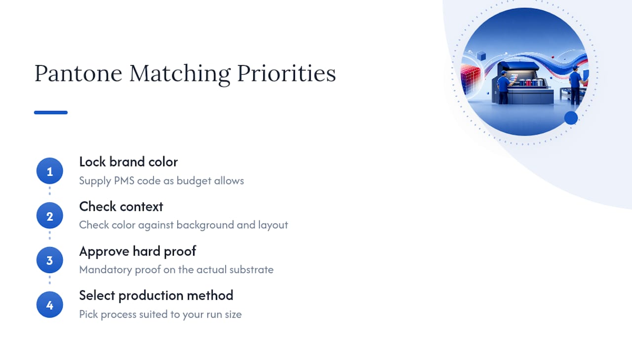
It isn’t. That’s not an argument against Pantone matching, it’s an argument for sequencing your priorities correctly. Lock in your brand color as precisely as your budget and timeline allow, then spend just as much attention on how that color sits against its background and the sign’s overall layout.
The other thing conventional advice underplays: outdoor substrates are not neutral surfaces. A color that got approved under studio lighting on coated paper can shift once it’s printed on textured Coroplast and sitting in direct sun. Treat the hard proof on the actual material as a mandatory step, not a courtesy upgrade a vendor offers if you ask nicely. Skipping it is the single most common reason businesses reorder signs.
— YardSignGuy
How to Order Pantone Matched Yard Signs From Yardsigns
Some yard sign vendors ship small orders quickly and larger runs within a few days, so getting your color right the first time actually matters. When you place an order for Custom Yard Signs, note your PMS number directly in the order comments or upload notes, and mention if you’re requesting a color-match proof before full production.
Many yard sign vendors include design proofs and revisions, allowing color adjustments before printing begins. For real estate brokerages needing consistent brand colors across every listing, the Real Estate Yard Signs collection is built for exactly that. Running a larger campaign or event? Bulk Yard Signs covers higher quantities where getting the color locked in once pays off across every sign in the run. Business owners can browse Business Signs for templates suited to storefronts and services.
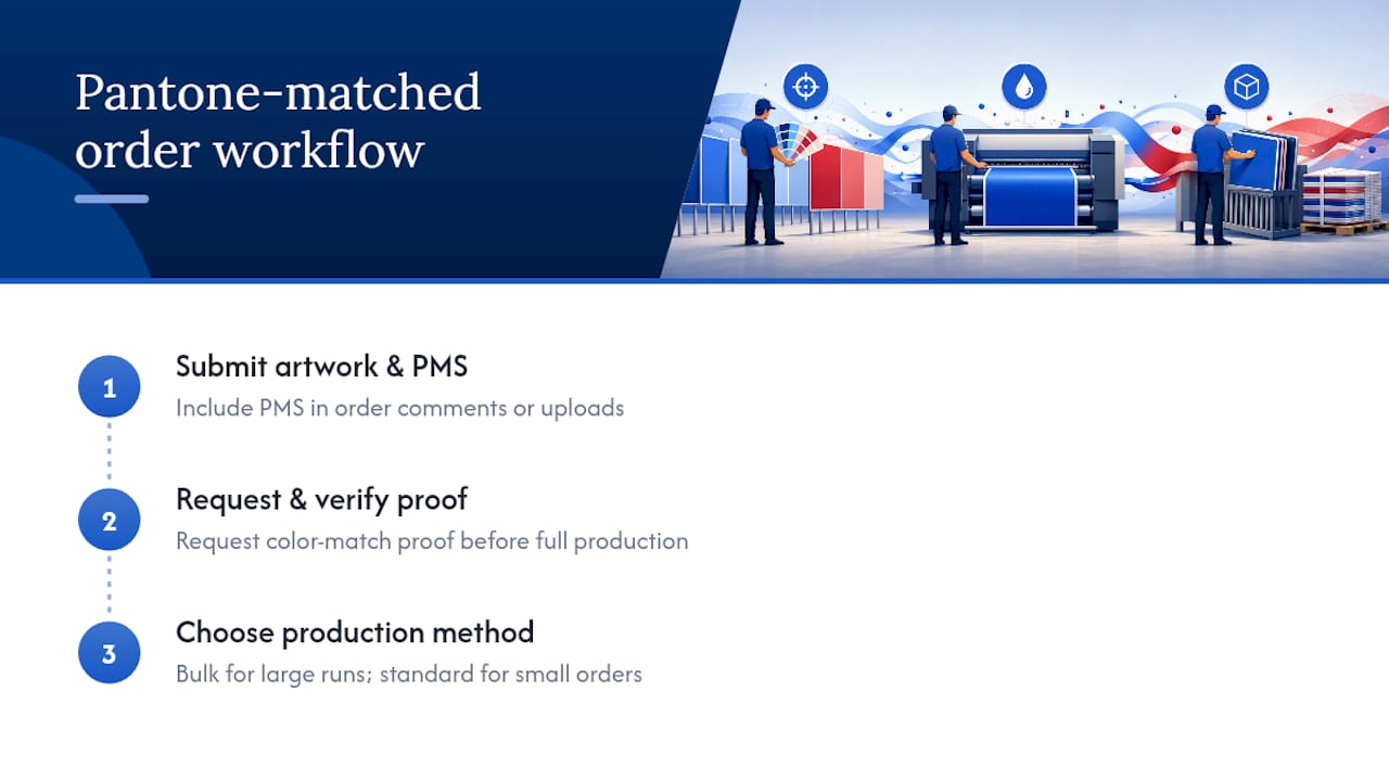
When deadlines are tight or confirmation of a Pantone match is desired before a full run, contact the vendor directly, submit artwork and PMS codes, and request proofs as needed.
Where to Verify the Technical Details
For the full artwork specifications printers expect, including bleed, resolution, and vector file requirements, review the yard sign artwork specifications referenced throughout this guide. For file setup basics like trim marks and bleed margins, this print-ready file guide covers the fundamentals designers need before submitting artwork.
Sources
- Easy Signs - Yard Signs - Artwork Specifications
- CMYK vs RGB vs Pantone (explanation for designers/printers)
- Pantone Color Matching Service | Lollipop Signs
FAQ
How Do You Find a Pantone Color Match?
Compare your target color against a physical PANTONE+ Solid Coated fan deck rather than a screen, then confirm the closest PMS number with your printer. For brand-critical colors, mail a physical swatch along with your PMS number so there’s no ambiguity in the order notes.
Can Home Depot Match a Pantone Color?
Home Depot’s in-store paint matching is designed for wall paint, not commercial sign printing, and it doesn’t use the ink systems or substrates that outdoor signage requires. For yard signs, work with a sign printer that explicitly offers spot-ink or custom-mixed Pantone matching on Coroplast.
Is There a Pantone App for Color Matching?
Pantone offers digital tools and color libraries for reference, but screen-based color previews remain unreliable for final approval because RGB light and printed ink behave differently. Always confirm any app-based color choice against a physical proof before production.
Can Sherwin Williams Match a Pantone Color?
Sherwin Williams can approximate many Pantone colors in wall paint formulations, but that’s a different ink system and substrate than yard sign printing uses. For signage, a dedicated Pantone color-match service from a sign vendor is the more reliable route.
Does Yardsigns Offer Pantone Color Matching?
Some yard sign vendors support color-match requests when customers supply a PMS code or physical swatch, often providing design proofs for review. Current pricing and product options are available directly on the Yardsigns site.
