


Readable in Two Seconds: Field Tested Yard Sign Color Contrast
Use high luminance contrast, dark text on a light background or the reverse, and skip pairs that just swap hues at the same brightness. Black on yellow is the top performer for pure visibility, while white on navy or black on white deliver a more professional look without losing an inch of readability. At normal driving speeds, a passing car has roughly two seconds to catch your message, so the color pairing has to do the work instantly.
TL;DR:
- Using black on yellow provides the highest visibility and recognition from long distances, making it ideal for attention-grabbing messages like sales or voting signs.
- Limit your sign’s color palette to two main colors plus one accent to prevent visual noise and ensure clear, instant readability.
- Avoid color combinations with similar brightness levels, such as red on blue or green on green, to prevent chromatic vibration and background blending issues.
- Conduct a field test by printing a mockup, photographing it in direct sun and shade, and asking others to read the sign from necessary distances before finalizing your design.
- Prioritize contrast over hue matching; evaluate luminance differences to guarantee your sign remains legible under various outdoor lighting and environmental conditions.
Table of Contents
- Simple Rules for Yard Sign Color Contrast
- Which Color Combinations Give You the Most Contrast?
- What Color Mistakes Hurt Yard Sign Readability?
- How Does the Yard Change Your Color Choices?
- How Do Fonts and Layout Support Strong Contrast?
- How Do You Test a Yard Sign Design Before Printing?
- Why Trust YardSigns.com’s Yard Sign Guidance?
- An Editorial Take on Getting Yard Sign Colors Right
- Get Your High-Contrast Yard Sign Printed Fast
- Sources
Simple Rules for Yard Sign Color Contrast
The rule sounds almost too basic to matter, but it is the one thing that separates a sign people actually read from one that fades into the block it sits on: pair a dark color with a light one. Not a dark color with another dark color that happens to be a different hue. Luminance, meaning how light or dark a color appears to the eye, matters more than which colors you picked from a wheel. Two colors can be totally different (say, red and green) and still read as nearly the same shade of “medium” from thirty feet away, because their brightness levels sit too close together.
Industry sign authorities back this up directly: contrast is consistently ranked as the single biggest factor in sign readability, ahead of font choice, image quality, or clever copy. That is worth sitting with. A gorgeous layout with poor contrast will lose every time to a plain layout with strong contrast.
Keep your palette tight. One or two main colors plus a background is the ceiling for most yard signs, not the floor. A single accent color, used sparingly for a call-to-action word or a phone number, can pull the eye where you want it. Add a third or fourth color competing for attention, and you have built visual noise instead of a message.
On minimum contrast, signage guidance points to roughly a 70 percent contrast threshold between text and background as a workable target. You don’t need a colorimeter to eyeball this. Squint at your mockup, or convert it to grayscale on your phone. If the text and background still look distinct with the color stripped out, you have real contrast. If they blur together, you have a problem no amount of hue difference will fix.
This is also where brand colors get tested. A soft pastel palette that looks refined on a business card can disappear on a lawn sign. When brand colors and legibility conflict, simplify the palette for the sign and keep the fuller brand identity for print materials viewed up close.
Quick checklist:
- Do pair dark text with a light background, or light text with a dark background.
- Do limit your palette to two main colors plus one accent, at most.
- Don’t rely on hue difference alone (two colors of similar brightness will collapse together).
- Don’t stretch a five-color brand palette onto a sign meant to be read from a car.
Which Color Combinations Give You the Most Contrast?
Some pairings have earned their reputation the hard way, through decades of use on highway warnings, construction barriers, and yes, yard signs. Here are the combinations worth building your design around:
- Black on yellow. This is the pairing behind most traffic warning signs, and for good reason: black-on-yellow is widely recognized as one of the most visible combinations available, readable from a genuinely long distance. Use it when the goal is pure attention grabbing, like a garage sale sign or a “vote for” placard competing with a dozen others on the same corner.
- Black on white. The most professional-looking high-contrast pair, and the safest default for real estate, open house, and small business signage. It reads as clean rather than alarming, which matters when the message is “call this number” rather than “look here now.”
- White on dark blue. A close second to black on white for professional tone, with the advantage of standing out more against pale backgrounds like concrete or light siding. Political campaigns and corporate branding lean on this pair often.
- White on red, used carefully. Red carries urgency, which makes it a strong choice for open-house or limited-time messaging, but it needs a genuinely dark, saturated red and clean white type. A washed-out or pinkish red loses contrast fast.
Match the pairing to the tone you need. Urgent, time-sensitive messages (a garage sale this weekend, a road closure) can afford the loud energy of black on yellow. A real estate listing or a professional service ad usually reads better in black on white or white on navy, projecting calm authority instead of shouting.
By the numbers: More than 90 percent of U.S. travelers notice out-of-home advertising like yard signs, billboards, and roadside displays. That noticeability is close to guaranteed. What isn’t guaranteed is whether they can actually read what the sign says once they’ve noticed it, and that comes down entirely to contrast.
That statistic is the real argument for taking color pairing seriously. You are almost certainly going to get noticed. The only open question is whether the two seconds of attention you get translates into a read message or a forgettable blur of color.
What Color Mistakes Hurt Yard Sign Readability?
Bad pairings tend to fail in one of two predictable ways, and once you know the pattern, you’ll spot it instantly on other people’s signs.
Chromatic vibration happens when you place two highly saturated, contrasting hues next to each other at similar brightness levels, classically red on blue, or orange on green. The colors don’t blend, but they don’t sit still either. The eye perceives a slight buzzing or shimmering effect at the boundary between them, which actually makes text harder to read even though the colors are technically “different.” It looks bold in a design mockup on a monitor. On a lawn, from a moving car, it turns into an uncomfortable flicker that people glance away from.
Background blending is the other failure mode, and it is sneakier because it only shows up once the sign is actually installed. Green text or a green background disappears against a lawn. Tan or beige lettering vanishes against dry grass, mulch, or gravel driveways. A sign that looked perfectly contrasted on a white desktop background can lose half its visual separation once it is staked into the ground it’s actually competing with.
A quick side-by-side of what tends to work and what tends to fail:
- Good: Black on yellow, high energy, near-universal legibility, works in almost any setting.
- Good: White on dark navy, professional tone, holds up against most residential backdrops.
- Risky: Red text on a blue field, chromatic vibration makes the boundary shimmer instead of read.
- Risky: Dark green text on a light green background, low luminance difference plus lawn-blending on top of it.
- Risky: Tan or beige on a wood-tone background, both fall into the same narrow brightness range.
If you’re committed to a color that risks blending with its surroundings, there are two reliable fixes. Add a thin outline or halo, a contrasting border around the text, so it separates from the background even if the fill color is close to its surroundings. Or fall back to a solid contrasting block behind the text entirely, a rectangle of black, white, or navy that isolates your message from whatever is growing, paved, or parked behind the sign.
How Does the Yard Change Your Color Choices?
The environment your sign sits in is not neutral. It is actively competing with your color choices, and different settings punish different palettes.
A sign staked into a green lawn treats green, olive, and yellow-green text or backgrounds as camouflage. The same sign against gray asphalt or a concrete sidewalk has the opposite problem: light grays, whites, and pale colors start losing definition against pavement, especially on an overcast day when everything reads as flat gray. Foliage backgrounds (bushes, hedges, tree lines) add texture and shadow that break up solid color fields, making busy multi-color designs even harder to parse at a glance.
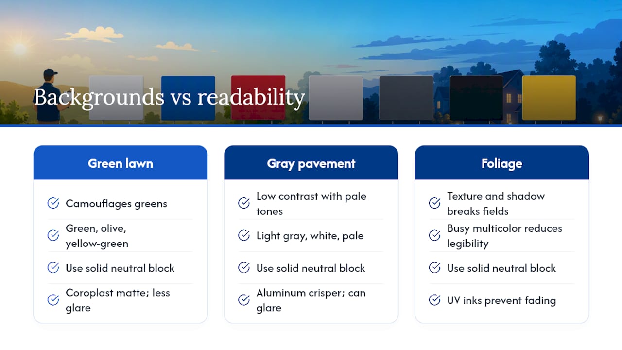
The fix in most cases is not a different color scheme entirely. It’s a solid, contrasting block: a rectangle or banner shape behind your text in black, white, or another neutral that has nothing to do with the surrounding landscape. That block does the separating work so your text color choice isn’t fighting the lawn on its own.
Material matters here too. Corrugated plastic (coroplast) has a slightly matte finish that handles direct sun without much glare, which is why it’s the standard for short-term political, real estate, and event signage. Aluminum signs read as crisper and more saturated, useful for longer-term installations like directional or business signs, but they can throw more glare at certain sun angles. UV-resistant inks matter because standard prints fade and shift color within weeks of direct sun exposure, quietly eroding the contrast you designed in the first place. A sign that started as black on white can fade toward gray on off-white within a season without UV-stable ink.
Pro Tip: Print your design in both RGB preview and check it against CMYK print expectations before ordering, since screen colors and print colors don’t always match, and a contrast ratio that looks strong on a monitor can shift once it hits vinyl or coroplast.
Double-sided printing is worth the small upcharge for anything installed near a two-way street, since half of your potential readers approach from the opposite direction the design was optimized for.
How Do Fonts and Layout Support Strong Contrast?
Color contrast only pays off if the layout gives it something to work with. A perfectly chosen black-on-yellow pairing still fails if the headline is eighteen words long in a thin script font.
Headline scale comes first. Your main message, whatever you most need a driver to absorb in two seconds, should be the largest, boldest element on the sign, capped at three to five words. “Open House Sunday,” “Vote Smith for Mayor,” “For Sale, Call Now” all fit that window. Longer headlines force smaller type, and smaller type is the fastest way to waste the contrast you just spent time choosing.
Font weight and style matter almost as much as size. Bold, sans-serif fonts hold their shape at distance far better than thin or serif fonts, whose fine strokes blur into the background at forty feet. Letter spacing should stay generous rather than tight; cramped kerning makes bold text look like a solid dark blob instead of legible words once distance and motion blur are added.
Secondary information, addresses, dates, phone numbers, needs its own visual tier. Rather than shrinking it and hoping, put it in a contrasting block of its own (a white bar across the bottom of a colored sign, for example) or size it noticeably larger than a business card would call for. A few practical layout habits:
- Keep the headline to five words or fewer, in the boldest weight available.
- Use one font family total; mixing typefaces splits attention instead of directing it.
- Give secondary text its own contrast treatment rather than shrinking it into the background color.
- Leave breathing room around every text block; crowding kills legibility as fast as poor color choice does.
For a deeper breakdown of sizing and spacing rules by sign dimension, YardSigns.com’s guide on yard sign fonts and sizing covers the specifics font by font.
How Do You Test a Yard Sign Design Before Printing?
None of the rules above matter if you skip the last step: checking the design under conditions that resemble how it will actually be seen. A screen preview at arm’s length tells you almost nothing about how a sign reads from a car window.
- Print a full-size mockup on regular paper, even if it’s just a rough proof, rather than trusting a laptop screen’s color and scale.
- Walk it back to 25 to 50 feet and read it cold, without knowing what it says in advance if you can manage that.
- Run a camera exposure test by photographing the mockup in direct sun and again in shade, since phone cameras reveal contrast problems that the naked eye sometimes compensates for.
- Ask a neighbor or coworker for an honest drive-by read, timing how fast they can name what the sign says.
Grade it against simple pass or fail criteria. The headline should be readable at 25 to 50 feet depending on the posted speed limit on the road it faces. Contact information or a CTA should be legible from within about ten feet, since that’s realistically when a pedestrian or a car pulling into a driveway will see it. And contrast needs to hold up in both direct sun and flat, overcast light. A design that only works in one lighting condition needs another pass. If any of these checks fail, don’t just tweak the font. Go back to the color pairing first, since most legibility failures trace back to contrast, not typography.
Why Trust YardSigns.com’s Yard Sign Guidance?
Color theory only matters if the sign holds up once it leaves the design file. Custom signs are built on weatherproof corrugated plastic or aluminum, printed with UV-resistant inks to preserve designed contrast despite sun exposure. Orders typically ship quickly, so a design correction after a field test doesn’t cost you a lost week before an event or election deadline.
That production speed matters directly to the testing process covered above. If your walk-back test reveals a contrast problem, you need a printer that can turn around a revised proof fast, not one that adds another week to your timeline.
A few specifics worth knowing before you order:
- Double-sided printing is available, which addresses two-way-traffic visibility issues.
- Design proofs and revisions allow you to adjust a color pairing after a field test.
- Signs include stakes that help hold the sign’s angle toward traffic, improving visibility.
- YardSignGuy’s design coverage, including a detailed breakdown of graphic design principles for yard signs, extends this contrast guidance into layout, spacing, and template selection.
An Editorial Take on Getting Yard Sign Colors Right
Most color advice out there treats contrast as a design nicety, something to get right after you’ve picked colors that “match your brand.” That order is backward. Contrast is not the finishing touch. It’s the entire mechanism by which a sign works, and every other decision, font, layout, material, should bend around it, not the other way around.
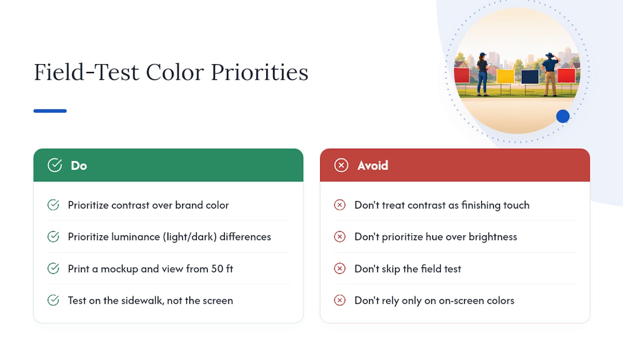
The conventional advice also overweights hue and underweights luminance. People agonize over whether navy or forest green looks more “trustworthy,” then ignore that both sit at nearly the same brightness against a gray sky. Readability doesn’t care what a color means. It cares how far apart two colors sit in light and dark.
If there’s one thing worth prioritizing above the rest, it’s the field test. Not the perfect palette, not the on-brand accent color, the fifteen minutes it takes to print a mockup and walk it back fifty feet. Every failure mode in this guide, chromatic vibration, background blending, contrast collapse, shows up in that test before it shows up on your lawn. Skip the screen, trust the sidewalk.
— YardSignGuy
Get Your High-Contrast Yard Sign Printed Fast
You’ve done the hard part: picked a pairing that holds up at fifty feet and survives an overcast afternoon. YardSigns.com exists for the part after that, turning a tested design into a physical sign without the wait most print shops build into their process. Orders typically ship quickly, and signs print on weatherproof coroplast or aluminum with UV-resistant ink, helping preserve contrast over time.
Start with a free design proof and unlimited revisions if you want a second set of eyes on your color pairing before it goes to press, or work from an existing template if you’re on a deadline. If you’re marking a promotion, an employee milestone, or another workplace event, the employee promotion sign template and the employee of the month sign are both built on the same high-contrast principles covered above, ready to customize with your own message. Upload your design, request a proof, and get a physical answer to whether your colors actually work, not just a guess from a screen.
Sources
The guidance in this article draws on established signage and outdoor advertising research. The Outdoor Advertising Association of America confirms the high baseline noticeability of outdoor signage. Signs.org breaks down contrast as the leading factor in sign readability. Custom Ink’s yard sign guide sets a practical contrast benchmark for text and background. PostNet Denver’s design tips frame the short window drivers actually have to read a roadside sign, which shapes every testing recommendation above.
- Outdoor Advertising Association of America — New study finds more than 90% of U.S. travelers notice OOH advertising
- Signs
- Custom Ink — Custom yard sign guide
- PostNet Denver — Yard sign design tips
