


Yard Sign Design Tips for Visibility That Work
Yard sign visibility is defined by how quickly a passing viewer can read, process, and remember your message. The best yard sign design tips for visibility come down to four factors: text size, color contrast, font choice, and placement. Get these right, and your sign works around the clock without you standing next to it. Miss even one, and you lose the viewer in the two or three seconds they have to read it. Whether you are promoting a sale, running for local office, or announcing an event, the principles below apply directly to your situation.
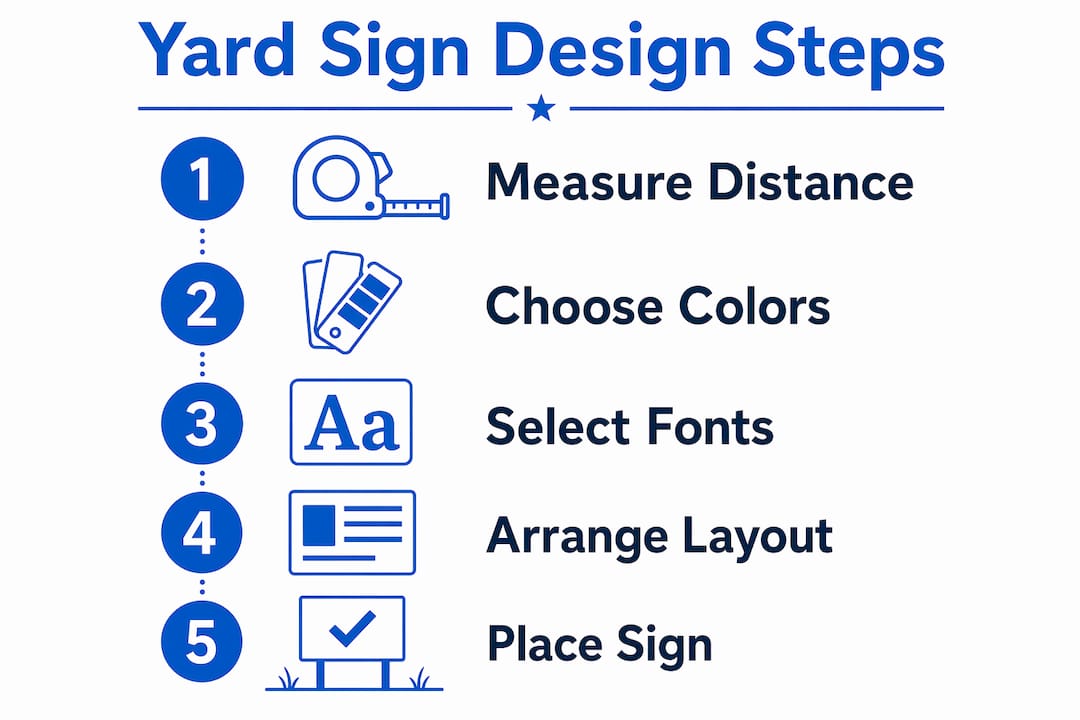
What are the best yard sign design tips for visibility?
Effective yard sign design starts with text size. The industry standard is the 1-inch-per-10-feet rule: one inch of letter height delivers readability at 10 feet. That means a headline needs to be at least 3 inches tall for someone standing 30 feet away to read it clearly. Most small business owners underestimate this and print text that looks fine on a computer screen but disappears at roadside distance.

Message length is the second constraint. Drivers at 30–45 mph have only 2–3 seconds to read a sign. That processing window supports a maximum of six words in your headline. Six words sounds limiting until you realize that “Grand Opening Saturday Free Coffee Inside” is seven words and still loses people. Trim to the core offer and let the sign do the work.
Here is a quick checklist for text and message decisions:
- Headline: 6 words maximum, printed at 3 inches or taller for 30-foot visibility
- Supporting text: Half the headline size, used only for a phone number, website, or date
- Call to action: Bottom third of the sign, short and direct (“Call Now,” “Visit Us,” “Open Today”)
- Word count total: Keep the entire sign under 10 words when possible
Pro Tip: Print a test version of your sign at actual size, tape it to a fence post, and walk 30 feet away. Read it aloud. If you pause or squint, the text is too small or too long.
What color combinations make yard signs most visible?
Color contrast is the single fastest way to improve sign visibility without changing your message. Black text on a yellow background is the gold standard for outdoor signage. The human eye detects this pairing faster than almost any other combination. White on dark blue and black on white are strong alternatives. Red on blue, green on brown, and orange on white all reduce legibility because the contrast ratio drops too low.
Font choice reinforces color contrast. Serif fonts blur at speed and distance. The thin strokes on letters like Times New Roman or Georgia disappear when a viewer is moving. Bold, sans-serif fonts like Impact, Helvetica, and Futura deliver the sharp edges needed for roadside reading. Decorative scripts and handwritten fonts are the worst performers outdoors, regardless of how good they look in a logo.
| Color pairing | Visibility rating | Best use case |
|---|---|---|
| Black on yellow | Highest | Sales, warnings, events |
| White on dark blue | High | Political, professional |
| Black on white | High | General purpose |
| Red on blue | Low | Avoid for primary text |
| Green on brown | Very low | Avoid entirely |
Spacing between letters also matters more than most people expect. Tight kerning, where letters sit very close together, causes words to blur into a single shape at distance. Add a small amount of letter spacing in your design software to keep each character distinct. Canva, Adobe Illustrator, and similar tools all include kerning controls in their text settings.
Pro Tip: Avoid all caps for messages longer than three words. Mixed case text is faster to read because the varied letter shapes help the brain recognize words as whole units rather than letter by letter.
How does layout affect how fast viewers read your sign?
Visual hierarchy organizes your sign into three viewing zones: far, mid, and close. The far zone is what a driver sees first, typically just a color block and a large headline. The mid zone delivers your supporting detail. The close zone, read only by pedestrians or parked viewers, holds contact information or a web address.
Place your headline in the top third of the sign. The eye naturally travels from top to bottom, and the top third gets the most attention before a viewer moves on. Centering the headline horizontally works for most layouts. Left-aligned text works better when you have a logo or graphic on the right side.
Key layout rules to follow:
- Leave a margin of at least one inch on all four edges so text does not get cut during printing or obscured by the sign frame
- Limit the sign to three visual elements: headline, one supporting line, and one graphic or logo
- Never let a graphic compete with the headline for size. The headline wins every time
- Use white space deliberately. Empty space is not wasted space. It directs the eye toward what matters
Standard yard sign sizes run 18 by 24 inches and 24 by 36 inches. The 18 by 24 size suits residential lawns and short-range viewing. The 24 by 36 size works for roadside placement where viewers approach from 50 feet or more. Choosing the wrong size for your location is one of the most common layout mistakes.
Where should you place yard signs for maximum impact?
Perfect design fails without proper placement. Signs mounted at least 12 inches off the ground avoid the visual clutter of grass, mulch, and low landscaping. A sign sitting at ground level gets blocked by parked cars, overgrown grass, and passing pedestrians. Twelve inches is the minimum. Eighteen inches is better in areas with tall grass or uneven terrain.
Angle matters as much as height. A sign placed parallel to the road is nearly invisible to oncoming traffic. Rotate the sign 30–45 degrees toward approaching drivers so the face is visible from further down the road. This single adjustment can double the effective viewing distance without changing the design at all.
Additional placement considerations:
- Avoid spots where utility poles, mailboxes, or parked vehicles create a sightline obstruction
- Place signs on the right side of the road when possible. Drivers spend more time scanning the right shoulder
- For pedestrian traffic, eye level placement at 4–5 feet works better than roadside height
- Check local ordinances before placing signs near intersections or public right-of-ways
For retail-specific placement strategies, Yardsigns covers outdoor sign positioning in detail. Political campaigns have their own placement logic, and Yardsigns also addresses election sign placement for candidates running local races.
What mistakes reduce yard sign visibility the most?
The most common mistake is using a full professional logo as the primary design element. Most logos contain thin lines, fine serif type, and small details that disappear at distance. Simplified, bold logo versions with clean sans-serif type preserve brand recognition while staying legible from the road. If your logo does not simplify cleanly, use your brand name in a bold font instead.
Overcrowding is the second most common problem. Designers and business owners want to include every detail: phone number, website, hours, tagline, and social media handle. A viewer at 30 mph will read none of it. Pick one contact method and cut everything else.
Watch for these additional pitfalls:
- Low-resolution images: Use 150 DPI or vector artwork at print size. Anything lower produces blurry edges that undermine the entire design
- Clashing colors: Red on blue and purple on green create visual vibration that makes text harder to read, not easier
- Thin fonts at small sizes: A font that looks bold on screen can print as a thin line at actual sign size. Always proof at 100% scale
- No weather testing: A sign that reads well in bright sun may wash out in overcast light. Test your color choices in multiple lighting conditions before ordering in bulk
Pro Tip: If your message genuinely requires more than six words, split it across two signs placed 10–15 feet apart. The first sign delivers the hook, and the second delivers the detail. This approach works well for garage sales, open houses, and event directions.
Key takeaways
Yard sign visibility depends on applying the right combination of text size, contrast, layout, and placement before a single sign goes into the ground.
| Point | Details |
|---|---|
| Follow the text size rule | Use at least 1 inch of letter height per 10 feet of viewing distance. |
| Limit your headline to 6 words | Drivers at speed have 2–3 seconds to read your sign. |
| Choose high-contrast color pairs | Black on yellow and white on dark blue outperform all other combinations. |
| Use bold sans-serif fonts | Impact, Helvetica, and Futura stay legible at roadside distance. |
| Mount signs 12 inches off the ground | Angling toward traffic doubles effective viewing distance without redesigning. |
What I have learned from watching signs succeed and fail
The most revealing test I have ever done was simple. I printed two versions of the same sign: one with the client’s original design and one with a stripped-down version using black on yellow and a three-word headline. I placed them both at the same corner and stood 40 feet away. The original was unreadable. The stripped version was clear from twice the distance.
The lesson is not that design does not matter. It is that visibility beats beauty every time in outdoor signage. Business owners often resist simplifying their logos or cutting their taglines because those elements feel like the brand. At roadside, they are invisible noise. The brand that gets remembered is the one that got read.
I have also seen placement ruin otherwise solid designs. A well-made sign placed parallel to traffic, or blocked by a utility pole, delivers zero impressions. Spend as much time scouting your placement location as you do refining your design. Walk the site at the time of day your audience will pass it. Notice where shadows fall, where parked cars cluster, and where the sightline opens up.
One more thing: test before you order in bulk. Print one sign, place it, and get feedback from someone who did not design it. Fresh eyes catch problems that familiarity hides.
— YardSignGuy
Ready-to-order signs built for visibility
Yardsigns offers a full range of customizable yard signs built with the visibility principles covered here. Every sign ships on durable, weatherproof material with vibrant printing that holds up through rain, sun, and wind.
Whether you need a funny promotional sign for a garden center event, a bold property sign with high-contrast messaging, or a congratulations sign for a business milestone, Yardsigns has ready-to-customize options. Orders under 50 pieces ship within 24 hours, so you can get your signs in the ground fast. Browse the full catalog at yardsigns.com and find the design that fits your message.
FAQ
What is the minimum letter height for a readable yard sign?
The standard is 1 inch of letter height per 10 feet of viewing distance. A headline meant to be read from 30 feet needs to be at least 3 inches tall.
How many words should a yard sign headline have?
Six words is the maximum for a headline. Viewers traveling at 30–45 mph have only 2–3 seconds to read a sign, so shorter is always better.
What is the best color for a yard sign?
Black text on a yellow background delivers the highest visibility of any color pairing for outdoor signs. White on dark blue is a strong second choice for a more professional look.
Should yard signs use serif or sans-serif fonts?
Always use bold, sans-serif fonts like Helvetica, Impact, or Futura. Serif fonts have thin strokes that blur at speed and distance, reducing legibility significantly.
How high off the ground should a yard sign be mounted?
Mount yard signs at least 12 inches off the ground to clear grass, landscaping, and low obstructions. Angling the sign toward oncoming traffic increases the effective viewing distance.
Recommended
- Why Yard Signs Boost Local Visibility for Every Campaign – YardSigns.com
- Local Election Yard Sign Placement Ideas That Win – YardSigns.com
- Home Sale Yard Sign - Plain White Blue - Right Arrow Design – YardSigns.com
- Home Sale Yard Sign - Plain White Blue - Right Arrow with Logo Design – YardSigns.com
