


1 in per 10–30 ft: Yard Sign Font Size, Distance Table and On Site Test
Use roughly 1 inch of letter height for every 10 feet of viewing distance on the conservative end, or 1 inch per 30 to 40 feet on the more relaxed end, depending on whether readers are stationary or driving past. For a sign 10 feet away, that means 1 inch letters; at 30 feet, aim for 3 inches; at 50 feet, go with 5 inches. Keep your headline to one to three words, set it in a bold sans-serif, and you’ve covered the two variables that break most yard signs.
TL;DR:
- Using the conservative standard of 1 inch letter height per 30 to 40 feet provides more reliable readability for signs viewed at highway speeds or across large parking lots.
- Letters should be measured directly from printed proofs, as font point size does not accurately reflect actual letter height once printed.
- For moving vehicles at 25 to 35 mph, signs require 4 to 5 inch headline letters, while signs for 45 mph or faster may need headline letters 6 to 8 inches tall to be legible.
- Bold, heavy sans-serif fonts like Helvetica or Arial outperform thinner or script fonts at distance, especially when combined with high contrast backgrounds.
- Testing sign legibility outdoors from the actual viewing distance ensures the size and contrast are sufficient, preventing costly design errors before printing.
Table of Contents
- What Is the Right Yard Sign Font Size for Your Viewing Distance?
- How Traffic Speed Changes Your Letter-Height Math
- Choosing Fonts, Contrast, and Layout That Hold Up at a Distance
- Standard Panel Sizes and How Much Headline They Can Hold
- How to Test Your Sign’s Legibility Before You Print
- Why Material and Finish Affect Legibility Just as Much as Font Size
- What Field Experience Teaches About Yard Sign Font Size
- Get Your Sign Sized Right the First Time With Yardsigns
- Sources
- FAQ
What Is the Right Yard Sign Font Size for Your Viewing Distance?
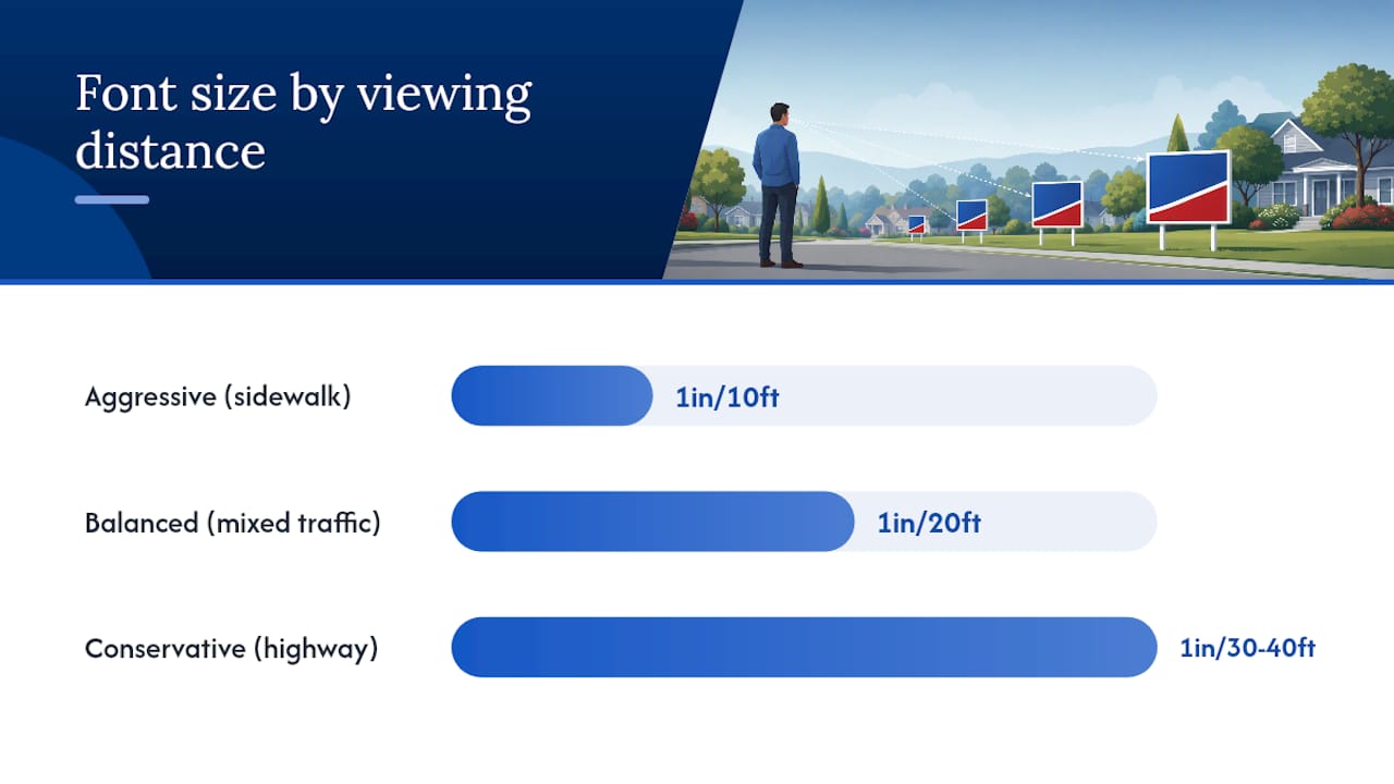
The core math behind yard sign font size comes down to two competing standards, and knowing which one applies to your situation matters more than memorizing a single number. The aggressive standard, 1 inch of letter height per 10 feet of viewing distance, works well for signs near sidewalks, front porches, or slow residential streets where people have time to read at close range. The more conservative standard, 1 inch per 30 to 40 feet, is what commercial sign shops use when they need to guarantee readability at highway speed or across a wide parking lot.
Here’s where a lot of DIY designers get tripped up: font point size and printed letter height are not the same measurement. A 72-point font in a design program does not print as 1 inch tall. Point size measures the full type block, including space above and below the letter, while the actual letter height (usually the cap height or x-height) prints smaller. The fix is simple. Open your scaled PDF proof, hold a ruler against the printed capital letter, and measure it in inches directly. Don’t trust the point size number on your screen to translate cleanly to what a passerby will see.
Which baseline should you pick? It depends on how your audience encounters the sign. A stationary viewer, someone waiting at a bus stop or walking a dog past your yard, can afford smaller letters because they have several seconds to focus. A moving viewer, someone driving by at 30 mph, needs bigger letters because their available reading window shrinks to a couple of seconds at most. If you’re not sure how your sign will be viewed, default to the more conservative multiplier. Oversized letters rarely hurt a sign’s performance; undersized letters kill it every time.
For real estate agents and political candidates whose signs sit along roads with mixed traffic, splitting the difference, something close to 1 inch per 20 feet, tends to produce a headline that reads well from both a sidewalk and a passing car.
How Traffic Speed Changes Your Letter-Height Math
Two-second and three-second read tests are the industry’s way of translating “how fast is this person moving” into “how big do my letters need to be.” The idea is straightforward: figure out how long a viewer will actually have your sign in their field of vision, then size your letters so the headline is legible within that window, not a moment longer.
For a pedestrian standing still or strolling by, you get a generous window, often five seconds or more, which means smaller, more detailed lettering is fine. Standard headline sizes around 2.5 to 3 inches work comfortably here, especially on an 18×24 panel placed near a walkway.
Once traffic enters the picture, the math tightens fast. A car moving at 25 to 35 mph on a residential street covers roughly 37 to 51 feet per second. If your sign sits 50 feet back from the road, and you want the driver to read it in the two seconds before they pass, you’re working with a viewing distance that demands letters in the 4 to 5 inch range for the headline, per the more conservative sign-visibility guidance many print shops rely on.
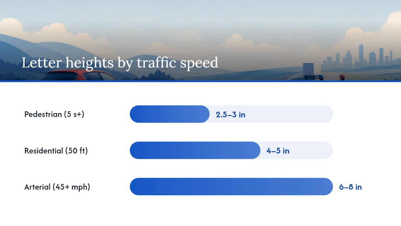
On a busy arterial road where traffic runs 45 mph or faster, the read window shrinks further, and letter height needs to jump accordingly, often into the 6 to 8 inch range for a headline to register at all. In these conditions, some sign designers skip trying to compete with speed altogether and instead focus the sign on a name, logo, or single short phrase that a driver can absorb in a single glance rather than a full sentence.
The takeaway: match your letter height to the fastest realistic traffic your sign will face, not the slowest. A sign that works for pedestrians but fails for drivers has lost half its audience.
Choosing Fonts, Contrast, and Layout That Hold Up at a Distance
Letter height only does its job if the font itself doesn’t fight against legibility. Practical sign-design guidance consistently points to the same conclusion: bold, heavy sans-serif fonts outperform everything else at distance, because their thick, even strokes stay readable even when contrast or lighting isn’t ideal.
A few rules make the biggest difference:
- Stick to bold or heavy weights in families like Helvetica, Arial, or Inter; thin strokes disappear at range and in bright sun.
- Avoid script fonts and condensed faces entirely. They look polished up close and turn to mush from 30 feet away.
- Use mixed case for your headline rather than all capitals. Studies on reading speed consistently show mixed case is faster to recognize because letter shapes vary more, though short punchy phrases in all caps can still work for one or two words.
- Keep letter spacing (tracking) slightly open rather than tight; cramped letters blur together at distance, especially in bright sun or low light.
- Pair dark letters on a light background, or light letters on a dark background. Avoid busy, patterned, or photographic backgrounds behind text.
Layout matters just as much as font choice, and mastering visual storytelling tips can boost your sign’s impact significantly. The three-line rule keeps a sign from turning into a paragraph nobody has time to read: one short headline, one support line, and a contact line (phone number, website, or “Call Now”). Limit your total design elements, including logos, to three to five. Every additional word or graphic competes for the same two-second window you’re trying to win.
Pro Tip: If you’re torn between two font weights, print both at full size and tape them to a wall you pass daily. Walk by at your normal pace for a day or two. Whichever one you can read without slowing down is your answer.
For a deeper breakdown of which typefaces perform best on yard signs specifically, this guide to readable yard sign fonts covers weight and style pairings in more detail.
Standard Panel Sizes and How Much Headline They Can Hold
Most yard signs come in a handful of standard dimensions, and each one sets a practical ceiling on how large your headline can realistically get before it overwhelms the panel. An 18×24 sign, the most common size for real estate and political signage, comfortably fits a headline between 2.5 and 4 inches tall depending on word count. A 24×36 panel, popular for contractor and business signage that needs to be read from farther away, can support headlines from 4 up to 7 inches. A square 24×24 panel splits the difference and works well for logo-forward designs.
Here’s how a typical three-line layout breaks down on an 18×24 sign for a residential street viewed mostly by pedestrians and slow traffic:
- Headline (business name or main message): 3 to 4 inches
- Subhead (short descriptor or offer): 1.5 to 2 inches
- Contact line (phone or website): 1 to 1.5 inches
On a larger 24×36 panel intended for a busier road, those numbers scale up: a 5 to 6 inch headline, a 2.5 to 3 inch subhead, and a 1.5 to 2 inch contact line.
The table below maps viewing distance to the letter heights that hold up under both the conservative and aggressive industry standards.
| Viewing distance | Minimum letter height (aggressive standard) | Comfortable letter height (conservative standard) |
|---|---|---|
| 10 ft | 1 in | 1 in |
| 20 ft | 2 in | 1 in |
| 30 ft | 3 in | 1 in |
| 50 ft | 5 in | 1.5 in |
| 75 ft | 7.5 in | 2 in |
| 100 ft | 10 in | 3 in |
If you’re unsure which column applies, 4 quick tips for designing yard signs recommends a practical floor: don’t go below a 3 inch headline on most residential yard signs, regardless of which formula you’re using, since that size holds up across the widest range of real-world conditions.
How to Test Your Sign’s Legibility Before You Print
Don’t trust your monitor. A design that looks perfectly legible zoomed in on a laptop screen can turn illegible the moment it’s printed at full size and viewed from the street. Run through these steps before you send anything to print:
- Measure actual letter height in your file. Export a scaled PDF at 100 percent and use a ruler against the printed capital letters, not the point size listed in your design software.
- Print a low-cost 1:1 proof. Tape together standard printer paper to match your sign’s full dimensions, or print a scaled PDF at a local print shop, so you’re looking at true size before committing to the final order.
- Pick your test spot. Set the mockup where the sign will actually stand, then walk or drive to your target distance, whether that’s 20 feet from the sidewalk or 75 feet from the road.
- Run the two-second test. Glance at the sign for two seconds, look away, and ask yourself honestly whether you absorbed the headline. If you didn’t, the letters need to grow.
- Photograph it from distance. Take a phone photo from your test spot; a camera often reveals legibility problems, like low contrast or thin strokes, that your eyes glossed over standing in person.
This kind of on-site check catches problems a screen simply can’t show you, and it costs nothing but a few sheets of paper and ten minutes outside. For more layout checks worth running before you order, this yard sign design checklist walks through additional details worth confirming.
Why Material and Finish Affect Legibility Just as Much as Font Size
A perfectly sized headline still fails if the sign fades, glares, or warps within a few weeks outdoors. Sun exposure gradually reduces contrast between your letters and background, which effectively shrinks your “readable” letter height even though the physical dimensions never change. A sign that started at a crisp 4 inch headline can read more like a washed-out 2 inch headline after a summer of direct sun if the inks aren’t UV-resistant.
Substrate choice plays a role too. Corrugated plastic, often called Coroplast, is the standard material for most yard signs because it’s lightweight, weather-resistant, and holds color well without warping in humidity. Aluminum signs cost more but resist bending in wind and tend to hold their finish longer in harsh climates, making them a common upgrade for signs that need to survive months rather than weeks.
When ordering, ask specifically about UV-resistant inks and double-sided printing, since a sign facing two directions of traffic loses half its value if only one side is printed. Metal H-stakes matter more than people expect too. A sign that tips over in wind isn’t legible from any distance.
What Field Experience Teaches About Yard Sign Font Size
The single most common mistake I see isn’t a bad font choice. It’s designers sizing their headline based on how the sign looks on a laptop screen, twelve inches from their face, instead of how it will look from the street. A headline that feels almost too big in your design software is often exactly the right size once it’s standing in a yard.
The second mistake is cramming too much onto one panel. Every extra line of text past the three-line structure, headline, support, contact, cuts into how large you can print each element, which drags your letter height below the threshold that actually gets read. Cutting copy is almost always the better fix, not shrinking the font.
Rules of thumb like 1 inch per 10 feet or 1 inch per 30 feet are useful starting points, but they’re not substitutes for standing where your audience will stand and checking the sign with your own eyes. That five-minute test outdoors catches more legibility problems than any formula on this page.
— YardSignGuy
Get Your Sign Sized Right the First Time With Yardsigns
Getting the math right on paper is one thing. Getting a sign printed at the exact letter height, contrast, and panel size you calculated is another, and that’s where a lot of DIY orders go wrong between the design file and the finished product. Custom yard sign orders often include proofs with revisions, allowing you to check your headline height against the rules in this guide before anything goes to print, not after.
Most orders under 50 pieces ship quickly, using UV-resistant inks and double-sided printing on weatherproof corrugated plastic or aluminum, with metal H-stakes included so signs stay upright and legible in real wind, not just in a mockup. Whether you’re sizing a single custom yard sign for your yard or ordering a batch for a campaign or open house, the templates are already built around standard panel sizes like 18×24 and 24×36, so your headline lands in the right proportion automatically. If you’re ordering in volume, the bulk yard signs collection includes options like 25 signs for $368.75 or 50 signs for $612.50. Upload your design, request a free proof, and confirm your letter heights match the distance your sign actually needs to cover before you commit to the order.
Sources
The distance-to-letter-height table in this guide draws on Apex Workwear’s sign visibility guidelines, which lay out the aggressive 1 inch per 10 feet standard many shops start from. For the more conservative approach used on faster roads, NURO Print’s sign visibility calculator is worth testing your own numbers against. HCG Signs and Campaigns & Elections both offer practical minimums and layout advice grounded in real print orders, and the W3C’s WCAG guidelines remain the standard reference for contrast and accessibility principles that apply just as well to yard signs as to websites.
- How To Design Yard Signs For Visibility: Best Practices - Apex Workwear
- Sign Visibility Calculator — Font Size & Sign Dimensions by Distance | NURO Print
- How to Design a Yard Sign That Gets Noticed — HCG Signs Blog
- 4 quick tips for designing yard signs
FAQ
What is a good font size for a yard sign?
A headline should generally be at least 3 inches tall for typical residential viewing distances, scaling up to 5 inches or more for faster roads. The exact number depends on your viewing distance, using roughly 1 inch of height per 10 to 30 feet away.
What is the recommended letter height for outdoor signs?
Outdoor signs generally follow a range between 1 inch per 10 feet (aggressive, close-range standard) and 1 inch per 30 to 40 feet (a more conservative multiplier built for moving traffic). Choose the smaller multiplier for pedestrian-focused signs and the larger one for signs near roads.
What is the standard size for a yard sign?
The most common yard sign dimensions are 18×24 inches and 24×36 inches, with 24×24 also used for logo-heavy designs. Yardsigns offers templates built around these standard panel sizes for custom yard signs, so headline proportions scale correctly by default.
What is the best font to use for an outdoor sign?
Bold, heavy sans-serif fonts like Helvetica, Arial, or Inter perform best because their thick strokes stay legible at distance and in bright sunlight. Avoid script fonts and condensed faces, which blur together once a viewer is more than a few feet away.
