


18×24 Directional Yard Sign Templates: Print Prep & Free Proofs
The fastest route to a print-ready directional sign is a pre-built template you edit online, not a blank design file. Start with a free editable directional sign template from a site like Template or an online editor with prebuilt layouts, then set your canvas to 18×24 inches, the standard yard sign size most vendors print. Pick a template, swap the arrow direction and wording, and export the design ready for printing.
TL;DR:
- Using an 18x24 inch template ensures signs are large enough to be readable from a vehicle at low speeds but remain easy to install with simple stakes.
- Selecting high-contrast, bold sans-serif fonts with minimal words and prominent arrows maximizes visibility and quick comprehension for drivers.
- Online editors offer faster, more deadline-friendly options with built-in print sizing and previews compared to downloadable files requiring design software.
- Proper print preparation, including exporting in PDF/X at 300 DPI, adding bleed, and converting to CMYK, prevents blurry or misaligned signs.
- Sign placement should provide clear sightlines, consistent arrow direction, and adequate spacing to give drivers enough reaction time and avoid confusion.
Table of Contents
- Where to Find Directional Yard Sign Templates
- What Makes a Directional Sign Actually Readable?
- What Size and Material Should Directional Signs Be?
- How Do You Prepare a Template File for Printing?
- Placement Rules and Mistakes That Ruin Directional Signs
- Why a Practitioner’s Workflow Beats a Generic Template Search
- Editable Templates: Downloadable Files vs Online Editors
- The Real Bottleneck Isn’t the Template, It’s the Print Prep
- Order Custom Directional Signs With a Free Proof
- Sources
- FAQ
Where to Find Directional Yard Sign Templates
Three sources cover almost every situation. Free downloadable templates (PDF or AI files) work best when you already have design software and want full control over fonts and layout. Paid vendor templates, often bundled with a print order, save time because they’re pre-sized to match production specs. Online editors with drag-and-drop tools and built-in previews are the fastest option for someone who has never opened Illustrator.
Canva’s yard sign templates organize designs by use case, including directional, wayfinding, and parking categories, so you’re not scrolling through hundreds of unrelated layouts. Template.net offers free directional templates you can edit in the browser and export directly for print. Pacdora adds 3D mockup previews, letting you see how a sign looks staked in grass or lining a driveway before you commit to printing. If speed matters more than customization depth, an online editor beats a downloaded file every time.
Search these template categories to narrow your results fast:
- Event directional (festivals, races, fairs)
- Parking and traffic flow signs
- Wedding “this way” and ceremony arrows
- Multi-arrow wayfinding for large properties or campuses
Downloaded templates give you pixel-level control. Online editors trade some of that control for speed and built-in print sizing, which matters most when you’re working against a deadline.
What Makes a Directional Sign Actually Readable?
A directional sign has one job: tell someone which way to go before they drive or walk past it. That means the design rules here matter more than they do for a typical yard sign promoting a business or a campaign.
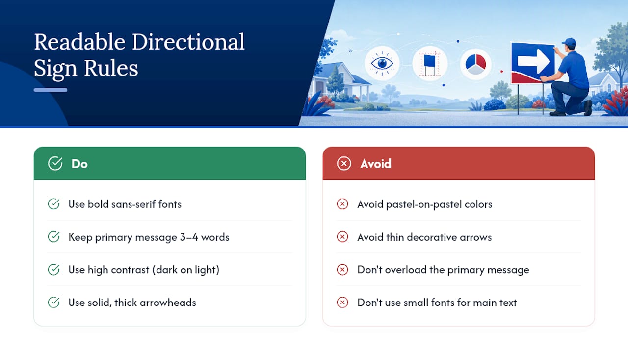
Use a bold, sans-serif font and keep the primary message to three or four words. “Parking This Way” beats “Please Follow This Sign to Reach Guest Parking” every time, because drivers only get a couple of seconds to read it. High contrast does the heavy lifting for visibility. Dark text on white or yellow reads from farther away than pastel-on-pastel combinations that look great on a screen but wash out in sunlight.
Arrows and icons need to be bold and unambiguous. Thin decorative arrows or stylized icons might match your event’s branding, but they can be misread from a car window or a fast walking pace. Stick to solid, thick arrowheads pointing in one obvious direction.
Build your hierarchy in three layers: the primary message (where to go), a secondary line if needed (like a booth name or time), and tertiary details (a logo or small text) that only matter up close. For deeper guidance on letter sizing and pairing, YardSigns.com’s breakdown of readable yard sign fonts and its list of design tips that convert both go further into spacing and letter weight.
Pro Tip: Print a mock-up at actual size and prop it up 20 feet away. If you can’t read the main message in two seconds, the font is too small or the message has too many words.
What Size and Material Should Directional Signs Be?
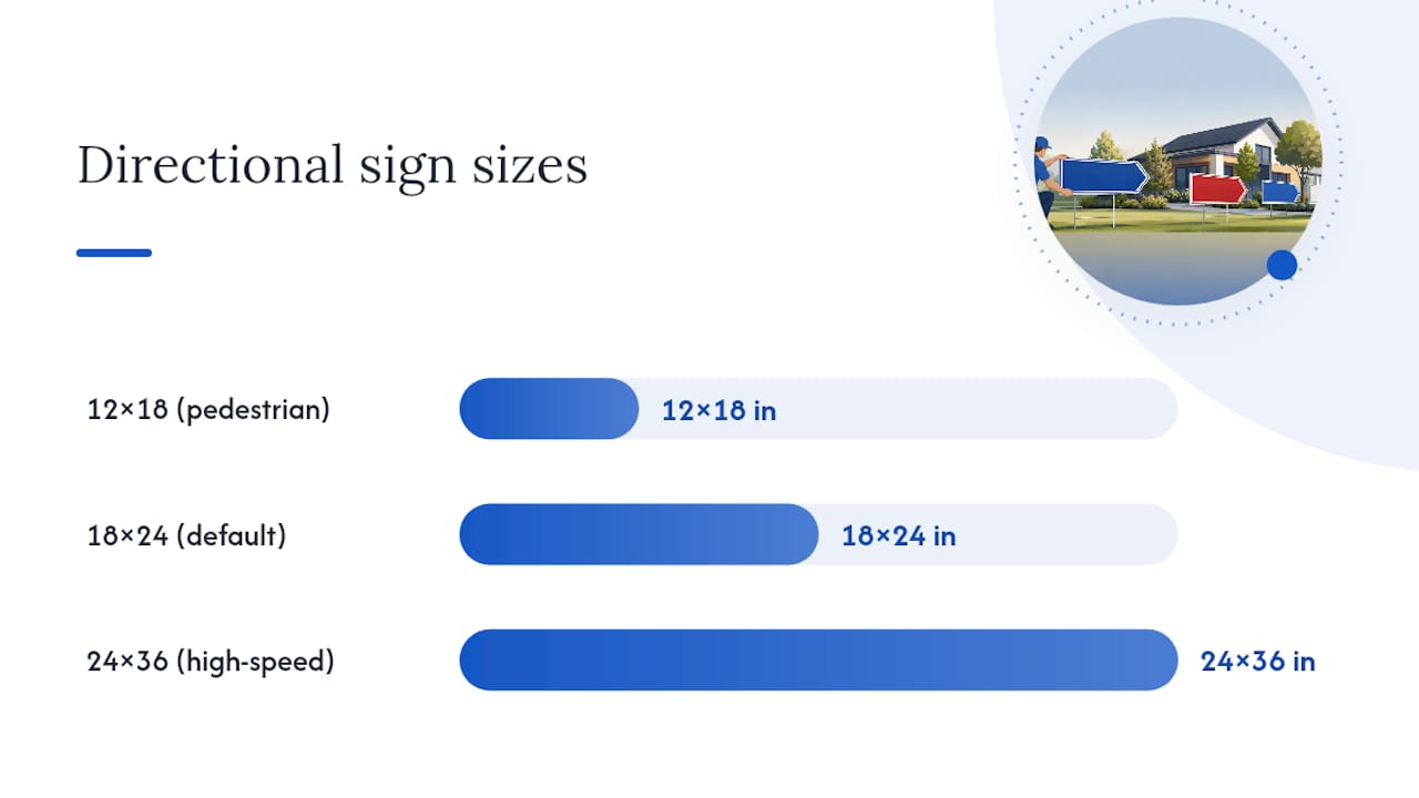
The 18×24 inch size is the default for a reason: it’s large enough to read from a car at low speed but small enough to plant with a single H-stake without looking like a billboard. Most templates, including the free ones on Template.net, are pre-sized to this standard, which saves you a resizing step before ordering.
That said, 18×24 isn’t the only option worth knowing:
- 12×18 works for pedestrian-only paths or tight indoor/outdoor transitions where signs sit closer to foot traffic.
- 24×36 suits high-speed roads or large parking lots where readers need more lead time to react.
- Rider strips attach below a main sign for supplemental info, like a time or booth number, without redesigning the whole layout.
Material matters as much as size. Corrugated plastic is lightweight, inexpensive, and ideal for one-day or one-weekend events since it won’t survive months of rain and wind. Aluminum costs more but holds up through repeated outdoor exposure, which makes sense for signage that stays up for weeks, like a construction site or a long real estate campaign. YardSigns.com covers the tradeoffs in more depth in its guide to yard sign materials.
For mounting, wire H-stakes are the standard for grass and soft ground, and they push directly into the earth without extra hardware. Metal frames work better on pavement or gravel where a stake won’t hold. If your event runs through wet weather, check that your printer uses weatherproof coatings and UV-resistant ink so colors don’t fade or bleed by the second day.
How Do You Prepare a Template File for Printing?
Getting a template from your screen to a printed sign that looks right takes a few technical steps most people skip on their first try. Skipping them is exactly why so many first print runs come back blurry or cropped wrong.
- Export in the right format. Use PDF/X for vector-based designs since it preserves sharp edges on text and arrows. If your printer requires a raster image instead, export a PNG or JPG at 300 DPI minimum. Anything lower will look pixelated once it’s blown up to 18×24 inches.
- Set your bleed and safe area. Add ⅛ to ¼ inch of bleed around the edges so any slight trimming during production doesn’t cut into your design. Keep all text and important icons inside the safe margin, roughly ¼ inch in from every edge.
- Convert to CMYK. Most templates start in RGB, which looks vibrant on screen but shifts color once printed. Switch to CMYK before exporting, or confirm your printer’s exact color specs first.
- Preview before ordering. Online editors with 3D mockup previews let you check legibility and proportions in a simulated real-world setting, which catches sizing mistakes that flat, on-screen views miss.
Placement Rules and Mistakes That Ruin Directional Signs
Sign placement matters as much as the design itself. A driver moving at 25 mph needs several seconds of clear sightline to read a sign, process the direction, and react, so signs need enough spacing between them to give that reaction time. Walk or drive your planned route ahead of the event and confirm each sign is visible before the turn it’s marking, not right at it.
Keep arrow orientation consistent across every sign in a sequence. A sign pointing right followed by one pointing left with no explanation confuses people fast.
Common mistakes to avoid:
- Cramming too much text onto one sign instead of splitting the message across two
- Choosing colors with low contrast that vanish in bright sun or at dusk
- Planting a sign facing the wrong direction relative to oncoming traffic
- Using flimsy wire stakes in windy or high-traffic areas where signs get knocked over
Readability research consistently points to the same finding: a short primary message with bold contrast outperforms detailed text every time, because most people process a directional sign in under two seconds while moving.
Why a Practitioner’s Workflow Beats a Generic Template Search
YardSignGuy has spent years watching event organizers scramble for last-minute signage, and the pattern is always the same: the sign looks fine on a laptop screen and fails outdoors. YardSigns.com built its process around that gap, offering weatherproof corrugated plastic and aluminum options, free design proofs before anything prints, and turnaround under 24 hours for orders under 50 pieces.
That combination matters most when you’re a week out from an event and just found a template you like. Pick a directional layout, request a proof, and confirm the size and stakes before committing to a full run. For a closer look at how coatings hold up outdoors, the weatherproofing guide explains what separates a sign that survives a rainy weekend from one that fades by Saturday afternoon.
Editable Templates: Downloadable Files vs Online Editors
The choice between a downloadable file and an online editor comes down to how much control you need versus how fast you need to move. A downloaded PDF or AI file from a template library gives you full access to fonts, colors, and layering in whatever design software you already own. That’s the better route if you’re comfortable with a program like Adobe Illustrator or Affinity Designer and want pixel-precise control over every element.
An online editor skips the software step entirely. You open a browser, pick a directional template, and edit text and colors directly in the interface. AI-driven tools can even auto-align text and suggest high-contrast font pairings, which helps non-designers avoid the classic mistake of low-contrast lettering that looks fine on screen and disappears outdoors.
Both approaches typically export print-ready files, but online editors have an edge for organizers on a tight timeline: no software installation, no learning curve, and often a built-in preview so you catch problems before you pay for printing. Some editors, like those built around event-specific layouts, also generate a social-friendly export alongside the print file, so you can post your directional sign design online to help attendees find the location before they even arrive. That dual-use export is worth checking for if your event relies on both physical wayfinding and digital promotion.
The Real Bottleneck Isn’t the Template, It’s the Print Prep
Most articles on this topic treat template selection as the hard part. It isn’t. Canva, Template.net, and Pacdora all offer more directional layouts than any one event needs, and picking between them rarely determines whether your signage works.
The actual failure point is print preparation. Low-resolution exports, missing bleed, and RGB files sent to a CMYK printer cause more ruined sign runs than bad design choices ever do. A gorgeous template exported at 72 DPI still prints blurry.
If there’s one thing to prioritize, it’s testing legibility at real-world distance before you finalize anything, not after. Prop up a printed proof, walk twenty feet away, and see if the message lands in two seconds. That single habit catches more problems than any amount of template browsing. The conventional advice to “just pick a nice template” undersells how much the print-prep and placement steps determine whether a sign actually does its job on event day.
— YardSignGuy
Order Custom Directional Signs With a Free Proof
Once your template is ready, ordering shouldn’t slow you down. Most orders under 50 pieces ship quickly, which matters when an event is days away and you’re still finalizing wayfinding.
Start by choosing a template style, whether that’s a simple arrow layout or a themed design for a fundraiser or celebration. You can get a design proof before anything prints, with revisions if the arrow direction, wording, or colors need adjusting. Choose corrugated plastic for short-term events or aluminum for signage that needs to last several weeks outdoors, and orders typically include metal H-stakes to simplify installation. If you’re planning a charity walk or community fundraiser, the charity fundraising event sign page shows how a themed template translates into a finished, weatherproof product. Pick your layout, request your proof, and get signs in hand before your event weekend arrives.
Sources
- Custom yard signs & lawn signs | Canva
- Custom yard signs design online & 3D mockup | Pacdora
- Template
FAQ
How Do You Build a Directional Sign From Scratch?
Start with a template sized to 18×24 inches, add a short primary message and a bold arrow, then export the file at 300 DPI with proper bleed before sending it to print.
What Are the Most Common Yard Sign Mistakes?
The biggest mistakes are cramming too much text on one sign, using low-contrast colors that fade in sunlight, and placing signs too close to the turn they’re marking instead of giving drivers time to react.
Can You Give Examples of Directional Signs?
Common examples include “Parking This Way” signs with a bold arrow, wedding ceremony arrows pointing toward a venue entrance, and multi-arrow wayfinding signs used at festivals or large campuses.
Can You Print Your Own Yard Signs?
Yes, if you have access to a large-format printer and weatherproof materials, but most people get better results and faster turnaround ordering from a printer like Yardsigns that handles proofing, materials, and stakes in one order.
What Size Should a Directional Yard Sign Be?
The standard size is 18×24 inches, which balances readability at a distance with easy staking, though larger 24×36 signs work better along high-speed roads.
