


Vector vs Raster Printing: 8 Quick Preflight Steps for Print
Use vector for logos, type, and cut paths. Use raster for photos. Most print jobs need both working together in the same file. That’s the whole answer, and it comes down to two practical facts: vector artwork scales without losing sharpness, and raster images need enough resolution built in before they ever reach the printer. YardSignGuy has watched both rules save (and sink) more print runs than any other single factor.
TL;DR:
- Using vector files for logos, text, and cut lines ensures sharp, scalable graphics, especially for large signage that viewers see from afar.
- Raster images require high resolution, such as 300 DPI for close-up prints, to prevent pixelation or blurriness during enlargement.
- Combining vector artwork with high-resolution raster photos in a single PDF helps avoid quality issues and streamlines the printing process.
- Flattened or low-resolution raster files are common causes of print quality loss; always verify file type and DPI before submitting.
- Files should be saved in PDF/X formats with embedded fonts, CMYK color mode, and included bleed and safe margins to meet professional printing standards.
Table of Contents
- What Are Vector and Raster Files for Printing?
- Vector vs Raster Comparison: Scalability, Color, and File Size
- When Should You Use Vector, Raster, or Both?
- Print-Ready File Checklist Before You Send Artwork
- Common Vector and Raster Printing Mistakes to Avoid
- Which File Formats Do Printers Actually Expect?
- What This Means for Fast-Turn Yard Sign Production
- How Yardsigns Handles Vector and Raster Artwork
- Authoritative Quick Reads and Standards
- Sources
- FAQ
What Are Vector and Raster Files for Printing?
A vector file is built from mathematical paths, not dots. Curves, lines, and shapes are stored as formulas, so the artwork can scale from a business card to a billboard without a single jagged edge. A raster file is a grid of pixels, like a mosaic. Zoom in far enough and you’ll see the individual tiles, which is why raster images depend on having enough pixels packed into the final print size.
That distinction, laid out clearly by Adobe’s comparison of raster and vector formats, explains almost every print problem designers run into.
In practice:
- Vector examples: logos, wordmarks, icons, line art, cut paths
- Raster examples: photographs, gradients, scanned textures, complex shading
Vector vs Raster Comparison: Scalability, Color, and File Size
Scalability is where vector wins outright. A logo built as a vector path prints as cleanly at 2 inches as it does at 20 feet, because there’s no pixel grid to stretch. Raster images don’t get that luxury. Enlarge a low-resolution photo and the software has to guess at new pixels, which is how you end up with a blurry, blocky mess on a finished sign.
Color and tonal detail flip the advantage. Photographs, skin tones, and soft gradients render far more naturally in raster format. Vector fills can approximate a gradient, but they can’t replicate the subtle noise and depth of a real photograph.
File size and editability split the difference:
- Vector files stay small regardless of output size and edit cleanly (change a color, resize a shape, done).
- Raster files grow heavier as resolution increases, and edits often mean starting over with the original photo.
Viewing distance changes the math entirely. A flyer read at arm’s length needs roughly 300 DPI. A banner viewed from across a parking lot can hold up fine at 100 to 150 DPI, according to DesignYourWay’s print resolution guidance. That’s the detail most beginners miss: DPI requirements aren’t fixed. They depend entirely on how close the reader stands.
When Should You Use Vector, Raster, or Both?
Most print jobs aren’t purely one or the other. They’re a combination, and knowing which parts of a design belong to which format saves you a round of frustrated emails with your printer.
- Logos and business branding: vector, always, if the source file exists
- Signage and cut-out lettering: vector, since cut paths must be true paths, not pixel outlines
- Real estate or event photos: raster, captured at high enough resolution for the final size
- Brochures and flyers with mixed content: both, combined inside one PDF
- Large-format banners and yard signs: vector for logos and text, raster for any photography, viewed from the appropriate distance
The best practice, echoed by Graphic Warehouse’s print clinic, is to keep every vector element as a true vector inside your final PDF and drop in high-resolution raster images only where a photo is genuinely needed.
Pro Tip: If you’re not sure whether an element started as vector, click it with the selection tool. If you can grab individual points and paths, it’s vector. If you just get one flat, uneditable block, it’s already raster, and enlarging it further will not help.
Print-Ready File Checklist Before You Send Artwork
Running this checklist before you hit “send” catches the problems that cause reprint delays.
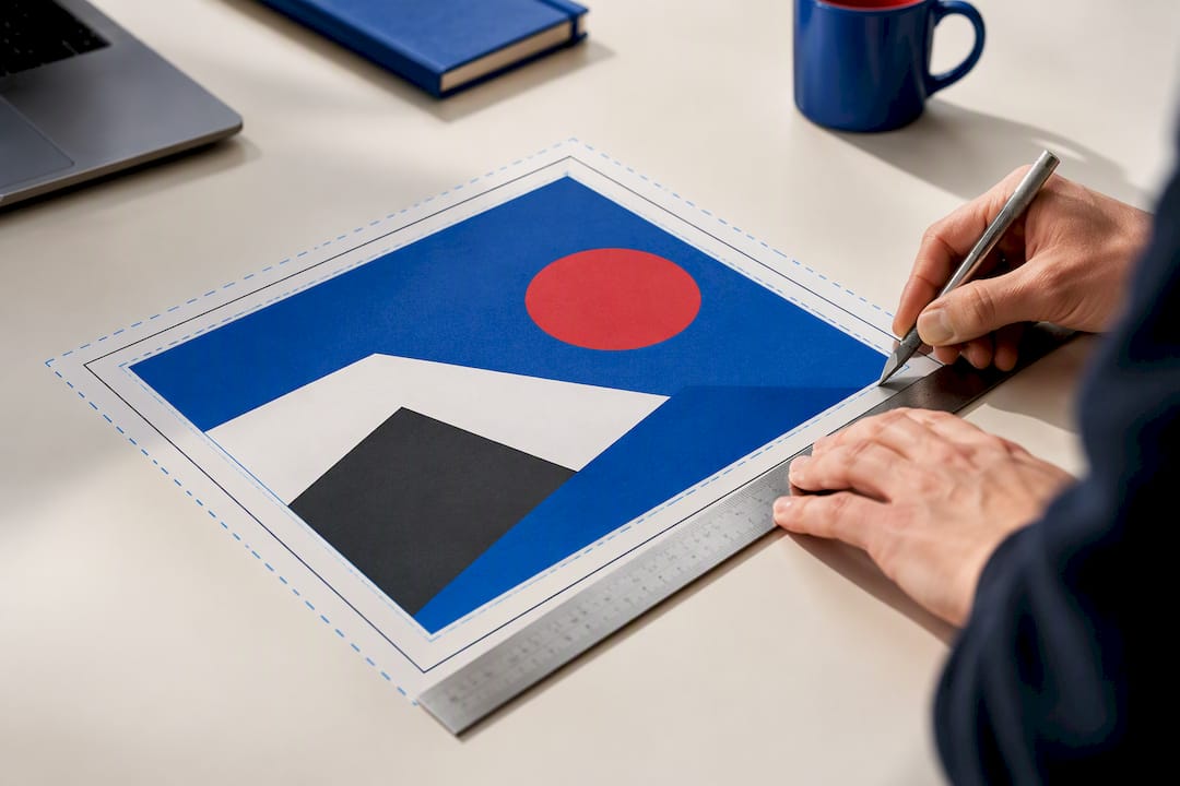
- Zoom in to 400% and inspect edges. Vector lines stay crisp. Raster elements start showing pixel structure.
- Select every object. Confirm logos and text are still selectable vector shapes, not a flattened image pretending to be one.
- Calculate effective DPI. Divide the placed image’s pixel width by its printed width in inches. A photo that’s 1,200 pixels wide printed at 4 inches gives you 300 DPI, which is the standard target for close-view print.
- Embed or collect all linked files. A missing linked image is one of the most common causes of a rejected print job.
- Outline or embed fonts. If the printer’s system doesn’t have your font installed, text can silently reflow or disappear.
- Label cut paths as their own named vector layer. “Cutline” or “Die Line” in a clearly separated layer avoids confusion during production.
- Convert your color mode to CMYK. RGB files can shift color unpredictably once printed.
- Add bleed and safe area margins, and export using a PDF/X standard like PDF/X-1a or PDF/X-4 when your printer supports it.
For yard sign artwork specifically, checking effective photo resolution before upload catches the single most common rejection reason: images that look fine on a laptop screen but fall apart at full sign size.
Common Vector and Raster Printing Mistakes to Avoid
The single biggest mistake is flattening an entire design into one raster image before export. It looks fine at first glance, but it erases every advantage vector gave you and locks in quality loss the moment anyone resizes it. If a printer sends back a flattened file, ask the designer for the original layered source instead of trying to patch pixels.
Low-resolution stock photos are the second most common issue. Run the DPI math from the checklist above before you place any image, not after.
Other frequent problems:
- Pixel-only cut previews. Cutlines must remain vector paths, not an outline baked into a raster file.
- Color mode mismatches. Always verify the file is CMYK, not RGB, and flag any spot colors explicitly.
- PDFs that look vector but aren’t. Open the file and inspect it, since a PDF is only a container and can quietly hold a rasterized preview instead of live paths.
Pro Tip: Before approving any proof, ask your printer directly: “Are the logo and text still vector in this file, or did something flatten during export?” That one question prevents most last-minute quality surprises.
Which File Formats Do Printers Actually Expect?
File extensions tell a printer what to expect before they even open your artwork.
- AI, EPS, SVG: vector masters, ideal for logos, cut paths, and anything that needs to resize cleanly later
- TIFF, high-resolution PSD: raster masters for photography, uncompressed for maximum print quality
- JPEG, PNG: fine for web use, risky for print unless resolution and color mode are confirmed first
- PDF: the standard delivery format, since it can hold both vector paths and embedded raster images together
Most print shops specifically request PDF/X-1a or PDF/X-4 because those standards force fonts to embed, colors to convert to CMYK, and transparency to flatten predictably, which is exactly the kind of guesswork a professional printer wants to eliminate. Checking printer-approved file formats before export saves a revision cycle almost every time.
Keep bleed and safe area guides active in every export. A design that looks perfectly centered on screen can end up with text cut off after trimming if those margins aren’t built in from the start.
What This Means for Fast-Turn Yard Sign Production
Keeping logos and headline text as true vector isn’t a nice technical detail; it ensures your branding remains legible and impactful according to visual storytelling tips. It’s the difference between a same-day proof approval and three rounds of back-and-forth over blurry edges. A photo that looked sharp on a phone screen often isn’t sharp enough at 18x24 inches, and catching that before production keeps a quick-turn order actually quick.
Working from a proven template and requesting a free proof before printing removes almost all the guesswork described above.
— YardSignGuy
How Yardsigns Handles Vector and Raster Artwork
Yardsigns built its process around exactly the file problems covered above. Many print orders include a free design proof with unlimited revisions, so a resolution issue or a flattened logo can be caught before it becomes a wasted print run, not after.
The materials matter too. Corrugated plastic and aluminum signs with UV-resistant inks hold vibrant color whether the artwork is a crisp vector logo, a full-bleed photo, or both combined, and are built to stand up outdoors for extended periods. If you’re preparing a mixed file with a vector logo and a raster photo, running through the preflight checklist above first will get your proof approved faster. Ready to put a print-ready file to work? Start your order on the custom yard signs page, or head straight to bulk yard signs if you’re printing for a campaign, a listing, or an event with more than a handful of locations.
Authoritative Quick Reads and Standards
For deeper technical grounding beyond this guide, Adobe’s raster vs. vector comparison covers the core format differences. The Print Reviewer breaks down mixed-format PDF workflows, and DesignYourWay’s print guide details DPI bands and export standards in more depth.
Sources
- Raster vs. vector: What are the differences? | Adobe
- Raster vs. Vector for Print: What Actually Matters - The Print Reviewer
- Vector vs Raster for Print: Which One Wins? - DesignYourWay
FAQ
Is SVG or PNG Better for Printing?
SVG is generally better for print because it’s a vector format that scales cleanly for logos, text, and cut paths. PNG is a raster format best reserved for photos, and only when the pixel dimensions are high enough for the final print size.
Can You Convert a Raster Image Into a Vector File?
Yes, through a process called tracing, but it works best on simple logos and line art, not photographs. Complex photos rarely trace cleanly, since the software has to guess at shapes that were never true paths to begin with.
What DPI Do I Need for a Large Yard Sign?
Large-format signs viewed from a distance can look sharp at 100 to 150 DPI, while anything viewed up close should hit closer to 300 DPI. Yardsigns’ free proof process catches resolution problems before a sign goes to print.
Why Did My Logo Look Blurry After Printing?
The most likely cause is that the logo was placed as a low-resolution raster image instead of a true vector file. Ask for the original vector source, or check by selecting the logo. If it’s one flat block instead of editable paths, it’s already raster.
Does Yardsigns Accept Both Vector and Raster Files?
Yes, Yardsigns works with both vector files like AI, EPS, and SVG and high-resolution raster images like TIFF and PNG, and every order includes a free proof so file issues get caught before production. Current pricing and templates are available directly on the Yardsigns site.
