


How to Design Eye-Catching Political Yard Signs
A political yard sign is a name recognition tool, not a billboard. Its single job is to burn your candidate’s name into a voter’s memory in the two or three seconds a passing car allows. Get that right, and every sign you plant becomes a free impression. Get it wrong, and you’ve paid for plastic that nobody reads. This article covers the design principles, tools, materials, and creative strategies that make attractive campaign yard signs work in 2026 races at every level.
What are the essential design principles for eye-catching political yard signs?
Political yard signs are primarily name recognition tools, not vehicles for listing issues or lengthy slogans. That single fact should drive every design decision you make. Your candidate’s name must dominate the sign visually. Everything else is secondary.
The most effective signs follow a short list of non-negotiable rules:
- Name first, name biggest. The candidate’s name should occupy at least 60% of the sign’s visual space. If a voter can’t read the name at a glance, the sign has failed.
- High contrast above all else. Dark backgrounds with white text outperform light backgrounds with dark text in outdoor conditions. Navy blue, forest green, or black paired with white are proven combinations.
- Sans-serif fonts only. Fonts like Arial, Helvetica, or Montserrat read cleanly at distance. Script fonts, decorative typefaces, and condensed weights all reduce legibility.
- Limit text to three elements maximum. Name, office sought, and one short slogan. If the slogan adds clutter, cut it.
- No gradients, no drop shadows, no clip art. These elements reduce contrast and make signs look dated. Clean flat color is always more readable from a moving vehicle.
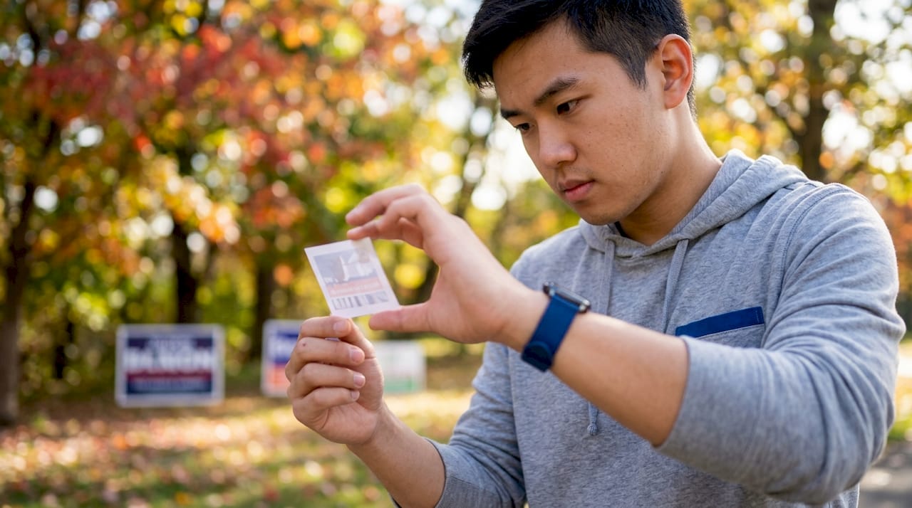
Pro Tip: Print a small version of your design at roughly 2 inches wide and hold it at arm’s length. If you can read the name instantly, the sign will work at roadside distances. If you squint, redesign.
The logic behind simplicity is practical, not aesthetic. A voter driving at 30 miles per hour passes a standard yard sign in under two seconds. That window does not allow for reading a slogan, a website URL, or a list of endorsements. Every word beyond the name competes for the same limited attention.
What tools and materials do you need to create political signs?
The standard in political signage is corrugated plastic, also called coroplast. Corrugated plastic is the preferred durable material for outdoor yard signs because it resists rain, wind, and sun without warping or fading. Most campaigns use the 24" x 18" size, which balances visibility with cost per unit.
| Element | Recommended Option | Why It Matters |
|---|---|---|
| Material | Corrugated plastic (coroplast) | Weather-resistant, lightweight, and durable |
| Standard size | 24" x 18" | Visible from the road without excessive cost |
| Printing | Double-sided full color | Readable from both directions of traffic |
| Installation | H-stakes (wire frames) | Easy ground installation without tools |
| Design tool | Canva or similar editor | Free templates, fast customization |
For the design phase, Canva offers editable political yard sign templates that are already sized correctly and built around proven layouts. Candidates can swap in their name, campaign colors, and fonts in minutes. This removes the guesswork from layout and spacing.
Double-sided printing is worth the added cost. A sign printed on both faces captures traffic moving in both directions. On a two-lane road, that doubles your impressions per sign without adding a single extra unit to your order.
Bulk orders reduce cost per sign and create consistent visual presence across a district. Ordering in quantity also means every sign in the field looks identical, which reinforces name recognition through repetition.
How do you execute the design process step by step?
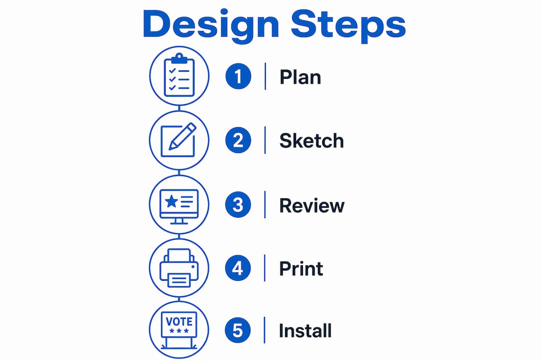
A clear workflow prevents the most common design errors before they reach print. Follow these steps in order.
- Lock in your name placement first. Place the candidate’s last name at the largest size the sign allows. First name or initial goes above or below at roughly half the size. Do not center the layout until the name is set.
- Choose your two campaign colors. Pick one background color and one text color. High contrast is the rule. Test the combination by viewing it on a phone screen in bright sunlight.
- Add the office line in a smaller font. “For City Council” or “State Senate District 12” should sit below the name at roughly one-third the name’s font size. Keep it short.
- Add a slogan only if it fits in five words or fewer. If the slogan requires a second line, cut it. A cluttered sign is worse than a sign with no slogan.
- Select one sans-serif font and use it throughout. Mixing two or more fonts is one of the most common design mistakes in political signage. One font, two weights (bold for the name, regular for supporting text) is the correct approach.
- Test readability at simulated distance. Shrink the design to thumbnail size on your screen. If the name reads clearly, the sign will work at 30 feet. If it does not, increase the font size or reduce surrounding text.
- Order a proof before bulk printing. A physical proof catches color shifts between screen and print. Colors on a monitor are backlit; printed colors on coroplast look different in daylight.
- Plan your placement before you order quantity. Strategic sign placement at high-traffic intersections, near polling locations, and along commuter routes multiplies the value of every sign you print.
Pro Tip: Ask three people who have never seen your design to glance at it for two seconds and then tell you what they read. If they can’t say the candidate’s name, your design needs revision before it goes to print.
A yard sign must be readable within 2–3 seconds by a moving vehicle to be effective. That benchmark is the clearest test you have. Build your entire workflow around passing it.
What are common mistakes in political yard sign design?
Most ineffective signs share the same handful of errors. Recognizing them before you design saves time, money, and votes.
- Too much text. Signs overloaded with information are ignored or forgotten. Website URLs, phone numbers, and policy positions have no place on a yard sign.
- Poor contrast. Yellow text on a white background, or red text on a dark blue background, both fail in bright sunlight. Test your color pair outdoors before committing.
- Decorative fonts. Cursive, serif, and display fonts reduce legibility at distance. They may look polished on a poster but they fail on a roadside sign.
- Making the slogan larger than the name. The name is the message. A slogan that competes visually with the name splits attention and reduces recall.
- Gradients and shadows. These design elements reduce contrast and make text harder to read against changing backgrounds like grass, sky, and pavement.
- Bad installation. A sign placed too low, behind a shrub, or at an angle away from traffic is invisible. Placement is part of the design process.
“The yard sign’s chief function is to embed the candidate’s name into voter memory, not to communicate complex messages or platforms.” — Campaign strategists cited by Scarlet Strategies
The most expensive mistake is printing hundreds of signs with a design flaw and discovering it after installation. A single proof print and a two-second readability test cost almost nothing. Reprinting 500 signs costs a significant portion of a local campaign budget.
What creative strategies make your campaign signs stand out?
Standing out in a yard sign-heavy neighborhood requires more than a clean design. Creative yard sign concepts that use spaced multi-sign displays or distinctive visual branding create stronger voter recall than a single well-placed sign.
| Strategy | Standard Approach | Creative Upgrade |
|---|---|---|
| Single sign placement | One 24" x 18" sign per location | Three smaller signs spaced 10 feet apart for visual rhythm |
| Color scheme | Generic red, white, and blue | Distinctive two-color palette unique to the candidate |
| Branding element | Name only | Name plus a simple logo or icon that appears on all materials |
| Printing | Single-sided | Double-sided for two-direction traffic coverage |
| Consistency | Mixed sign sizes across the district | Uniform size and design across every location |
Beyond the table above, these tactics add measurable impact:
- Create a visual “thumbprint.” A simple logo, icon, or graphic element placed consistently on every sign trains voters to recognize your candidate’s materials at a glance, even before they read the name.
- Use campaign colors as a system. The same two colors on yard signs, mailers, and social media graphics build recognition across every channel. Voters who see your colors on a sign will recognize them in a Facebook ad.
- Integrate with grassroots campaign tactics. Signs placed by volunteers in their own yards carry social proof. A neighbor’s sign is more persuasive than a sign on public property.
- Pair physical signs with digital outreach. Yard signs complement digital campaigns by reinforcing name recognition across both physical and online environments. A voter who sees your sign in the morning and your ad in the evening retains your name far more reliably.
The rhythm strategy deserves special attention. Three smaller signs spaced evenly along a fence line or property edge create a visual beat that draws the eye more effectively than one large sign. The repetition registers as momentum, which is a powerful psychological signal in a competitive race.
Key takeaways
Effective political yard sign design is built on name dominance, high contrast, and ruthless simplicity. Every other choice serves those three principles.
| Point | Details |
|---|---|
| Name dominance | The candidate’s name must be the largest, most readable element on the sign. |
| High contrast colors | Dark backgrounds with white text outperform low-contrast combinations in outdoor conditions. |
| Limit text ruthlessly | Restrict content to name, office, and a slogan of five words or fewer. |
| Use corrugated plastic | The 24" x 18" coroplast sign is the proven standard for durability and visibility. |
| Test before bulk printing | A two-second readability test and a physical proof prevent costly reprints. |
What I’ve learned designing political signs that actually move voters
Most candidates I’ve worked with arrive with the same instinct: they want to say more. More issues, more endorsements, more contact information. The sign becomes a resume. That instinct is understandable and almost always wrong.
The signs that perform best in competitive local races are almost boring in their simplicity. A last name in bold white letters on a navy background. An office line in smaller text. Nothing else. Those signs win because they do one thing perfectly rather than five things poorly.
The trend I’m watching for 2026 campaigns is the integration of physical signage with digital reinforcement. A candidate who runs the same two colors and the same clean name treatment across yard signs, Instagram ads, and door hangers creates a recognition loop that compounds over a campaign cycle. Voters don’t consciously connect the touchpoints, but the name sticks faster.
One more thing: placement is a design decision. A perfectly designed sign installed behind a hedge or facing the wrong direction is a wasted asset. Build your placement plan at the same time you build your design. The two decisions are inseparable.
— YardSignGuy
Ready to print your political yard signs with Yardsigns?
You’ve done the design work. Now you need a printer that matches your standards for quality and speed.
Yardsigns produces custom political yard signs on weatherproof corrugated plastic with vibrant full-color printing that holds up through a full campaign season. Orders under 50 pieces ship within 24 hours, so you can respond to a late-breaking race development without losing ground. The platform offers ready-made customizable sign templates that apply the design principles covered here, and bulk pricing makes it practical to blanket a district without blowing your budget. Visit Yardsigns to configure your order, upload your design, and get your signs in the field fast.
FAQ
What is the best size for a political yard sign?
The standard size is 24" x 18" on corrugated plastic. This size is visible from the road, cost-effective in bulk, and compatible with standard H-stake wire frames.
How many words should a political yard sign have?
Three elements maximum: the candidate’s name, the office sought, and a slogan of five words or fewer. Signs with more text are harder to read and less memorable.
What font works best for campaign yard signs?
Sans-serif fonts like Arial, Helvetica, or Montserrat are the most readable at distance. Avoid script, decorative, or condensed fonts, which reduce legibility from a moving vehicle.
Does double-sided printing make a difference?
Yes. A double-sided sign captures traffic moving in both directions, effectively doubling impressions per sign without adding units to your order.
How early should I order yard signs before an election?
Order at least four to six weeks before election day to allow time for proofing, printing, delivery, and organized placement by volunteers.
