


Retail Storefront Signage Ideas That Drive Real Foot Traffic
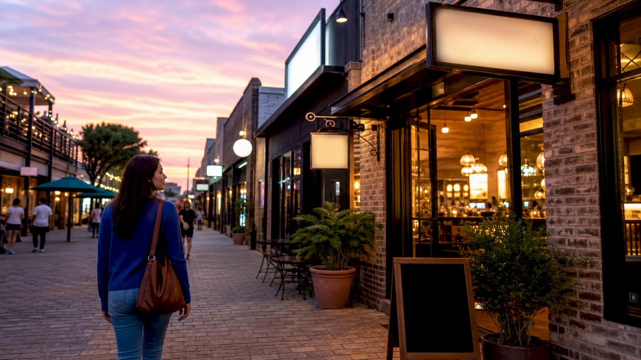
Retail storefront signage is defined as any exterior sign, graphic, or display that communicates your brand, products, or offers to people passing by. The right retail storefront signage ideas do more than label your location. They act as your store’s hardest-working marketing tool, running 24 hours a day without a paycheck. The industry term for this discipline is “exterior visual merchandising,” and it covers everything from illuminated channel letters and Dibond fascia panels to window vinyl graphics and A-frame sandwich boards. Getting it right means more walk-ins, stronger brand recall, and a storefront that competes on any block.
What are the top types of retail storefront signs and how do they differ?
Storefront signage types vary widely by budget, visibility, and purpose. Understanding each type helps you spend money where it counts most.
| Sign Type | Cost Level | Best Use Case |
|---|---|---|
| Illuminated channel letters | $$$ | Primary fascia, night visibility, premium brand image |
| Dibond/ACM fascia panels | $$ | Flat fascia branding, versatile, mid-budget |
| Window vinyl graphics | $ | Hours, promotions, accent branding |
| Blade/projecting signs | $$ | Pedestrian zones, perpendicular visibility |
| A-frame sandwich boards | $ | Daily specials, sidewalk offers, portable use |
Each type serves a different point in the customer journey. Channel letters announce your brand from a distance. Window vinyl fills in the details up close. A-frames catch the eye of pedestrians already on your sidewalk.
- Channel letters: Three-dimensional and illuminated, these are the gold standard for primary fascia signage. They carry a higher upfront cost but deliver unmatched night visibility.
- Dibond/ACM fascia signs: Flat aluminum composite panels that print sharply and resist weather. A practical mid-budget choice for most retail storefronts.
- Window vinyl: Low cost and easy to swap out seasonally. Use it for hours, sales, and brand accents without committing to permanent fixtures.
- Blade signs: Mount perpendicular to your building face, making them visible to foot traffic walking parallel to your storefront.
- A-frames: Portable and inexpensive. Write daily offers in chalk or print a seasonal promotion to pull in sidewalk traffic.
Successful storefronts combine 2–3 sign types to cover identity, details, and offers simultaneously. A single sign rarely does all three jobs well.
Pro Tip: If your budget is tight, invest first in a quality fascia sign, then add window vinyl and an A-frame as affordable layers that you can update frequently.
How to design eye-catching signs that stand out from the street
High contrast between text and background is the single most important factor in sign legibility. Dark text on a light background, or light text on a dark background, outperforms decorative fonts and complex layouts every time. Contrast is not a style choice. It is a communication requirement.
Letter size matters just as much. The minimum recommended letter height for a storefront sign is 4 inches, which gives adequate legibility at standard street viewing distances. Go smaller and drivers miss you entirely.
Keep your message short. Your sign should display your store name plus one descriptor at most. “Fresh Flowers Daily” beats a paragraph of services every time. Shoppers process signage in under two seconds while walking or driving.
Font selection follows the same logic. Clean sans-serif typefaces like Helvetica, Futura, or Franklin Gothic read clearly from a distance. Ornate script fonts look attractive in a logo but fail as primary sign text.
“Less is more: signage works best with simple, direct messaging that attracts and quickly informs rather than overwhelming viewers.”
Plan for night visibility from the start. Illuminated signs or well-aimed spotlights extend your marketing hours into the evening. A sign that disappears after sunset loses half its working day.
Pro Tip: Walk across the street and photograph your storefront at different times of day. You will spot contrast problems, obstructions from awnings or trees, and dead zones that are invisible from inside your store.
8 creative storefront signage ideas to boost customer engagement
1. Illuminated channel letters with halo effects
Illuminated channel letters with halo or front-lit effects create an upscale look that reads clearly day and night. Halo-lit letters cast a glow behind the letterform, giving your fascia a premium, three-dimensional appearance. Retailers in competitive urban blocks use this technique to stand out when neighboring storefronts rely on flat printed panels.
2. Seasonal window vinyl graphics
Swap your window graphics four times a year to match seasonal promotions. A boutique clothing store might run a bold winter sale graphic in january, then shift to a spring collection theme in march. Window vinyl is inexpensive to print and install, making it the most cost-effective way to keep your storefront looking current. Pair it with interior displays that match the same theme for a consistent visual experience.
3. Digital LED displays and smart screens
Eco-friendly LED signage and smart displays are rising trends in retail for 2026. A digital signage screen in your window lets you rotate promotions, show live social feeds, or display countdown timers for sales without reprinting anything. The upfront cost is higher than static vinyl, but the ability to update content in minutes pays off quickly for retailers who run frequent promotions.
4. Handwritten chalkboard A-frame signs
A chalkboard A-frame placed on the sidewalk creates an immediate, personal connection with foot traffic. Write a daily special, a witty line, or a limited offer by hand. The handwritten format signals authenticity and urgency in a way that printed signs cannot replicate. Coffee shops and specialty food retailers use this technique to drive impulse visits from people who were not planning to stop.
5. Blade and projecting signs with bold graphics
A blade sign mounted perpendicular to your building face is visible to pedestrians walking along your block before they can see your front door. Use a bold graphic, your logo, or a single strong word. Avoid cramming multiple messages onto a blade sign. The format works because it catches peripheral vision, not because it delivers detailed information.
6. Lightbox signs for night prominence
A lightbox sign uses an illuminated panel behind a printed or vinyl face. The result is a bright, evenly lit display that holds its color and contrast after dark. Lightboxes work well for retailers in areas with evening foot traffic, such as restaurant districts or shopping centers that stay busy after 6 p.m. They cost less than channel letters but deliver comparable night visibility.
7. Eco-friendly and sustainable signage materials
Retailers are increasingly choosing recycled aluminum, FSC-certified wood, and water-based inks for their exterior signs. Beyond the environmental benefit, sustainable materials communicate brand values to a growing segment of shoppers who factor ethics into where they spend money. Pair an eco-friendly material choice with a simple, clean design to reinforce the message without stating it explicitly.
8. Brand storytelling through signage themes and artwork
Retail displays and signage that tell a thematic brand story boost customer engagement and sales. A bookstore might use illustrated murals on its window panels. A specialty food shop might use vintage-style typography and hand-drawn ingredient illustrations. The goal is to give passersby a clear sense of what your store feels like before they walk through the door. This approach works best when the exterior signage theme continues inside the store.
How to plan and position signage for maximum impact
Strategic placement determines whether your signs actually get seen. Follow this sequence when planning your storefront signage system.
- Map your sightlines. Stand at the nearest intersection and identify where drivers and pedestrians first see your building. That point determines where your primary fascia or channel letter sign must be visible.
- Audit obstructions. Trees, awnings, parked delivery vehicles, and neighboring signage can block your sign from key sightlines. Address obstructions before installing new signs, not after.
- Layer your sign types. Use fascia signage for brand identity at distance, window graphics for details at mid-range, and an A-frame for offers at the sidewalk level. This three-layer approach guides customers from street to store entrance without gaps.
- Plan electrical access early. Business owners frequently overlook signage mounting and electrical access when planning illuminated signs. Retrofitting electrical supply after installation adds cost and can compromise sign durability.
- Coordinate with interior displays. Your window graphic promoting a seasonal sale should connect visually to the display customers see when they look through the glass. Disconnected interior and exterior messaging creates confusion.
- Check local sign codes. Most municipalities regulate sign size, illumination, and placement. Verify permits before ordering fabrication to avoid costly changes.
- Walk through as a customer. Approach your store from every direction a customer might use. You will find dead zones and missed opportunities that are not visible from inside. Yardsigns recommends this walk-through at least twice a year.
What budget and maintenance tips should retailers know?
Spend your largest signage budget on your primary fascia or channel letter sign. That sign works every day and represents your brand to every person who passes. Cutting corners there costs you more in lost impressions than you save in fabrication.
Use window vinyl and A-frames for flexibility. Both are inexpensive to produce and easy to update, making them ideal for promotions, seasonal changes, and testing new messaging. Weatherproof materials like Dibond and cast vinyl resist fading, cracking, and moisture damage far longer than budget alternatives.
- Choose Dibond or ACM panels for flat fascia signs exposed to direct weather.
- Use cast vinyl rather than calendered vinyl for outdoor graphics that need to last more than two years.
- Schedule a cleaning inspection every six months to catch fading, peeling, or damage before it becomes visible to customers.
- Plan for durability from the start by selecting materials rated for your local climate conditions.
Pro Tip: A worn or faded sign signals neglect to potential customers before they ever enter your store. Budget a small annual maintenance line item specifically for sign cleaning, bulb replacement, and vinyl touch-ups.
Key takeaways
Effective retail storefront signage combines a layered system of sign types, high-contrast design, and regular maintenance to attract customers and communicate your brand clearly from the street.
| Point | Details |
|---|---|
| Layer your sign types | Combine fascia, window vinyl, and A-frames to guide customers from street to entrance. |
| Prioritize contrast over decoration | Dark on light or light on dark always outperforms ornate fonts for legibility. |
| Size letters for distance | Use a minimum 4-inch letter height so drivers and pedestrians can read your sign. |
| Maintain signs regularly | Schedule cleaning and inspections every six months to prevent a worn appearance. |
| Plan placement before fabrication | Map sightlines, audit obstructions, and confirm electrical access before ordering any sign. |
What I’ve learned from watching retailers get signage wrong
I have walked past thousands of storefronts over the years, and the same mistake shows up repeatedly. Retailers treat their signs as a one-time decision made at opening day, then never revisit them. The sign fades, the A-frame sits blank, and the window vinyl from last year’s sale still faces the street in march. That storefront looks like nobody is paying attention, because nobody is.
The retailers who get it right treat their signage as a media channel, not a fixture. They update their A-frame weekly. They swap window graphics with the seasons. They walk across the street and look at their own storefront the way a stranger would. That habit alone catches more problems than any design consultant.
My strongest advice is to keep it simple and keep it maintained. A clean, high-contrast sign with your name and one clear message will outperform a cluttered, elaborate design every time. Signage is not the place to show off. It is the place to be understood in two seconds or less.
The outdoor sign placement guide from Yardsigns covers the walk-through analysis method in detail if you want a structured process for auditing your own storefront.
— YardSignGuy
Ready to put these signage ideas to work?
Yardsigns offers a wide range of custom, weatherproof signs built for retail storefronts that need to perform in real conditions. Whether you need a bold restaurant storefront sign to highlight your signature dish, a durable panel for a service business, or a fast-turnaround promotional sign for an upcoming sale, Yardsigns ships orders under 50 pieces within 24 hours.
The design process is straightforward, and the materials are rated for outdoor exposure. Browse the full catalog at Yardsigns to find sign formats that match your storefront type, budget, and timeline. From special event signs to service business panels, the options cover most retail categories without requiring a large minimum order.
FAQ
What is the most effective type of retail storefront sign?
Illuminated channel letters are the most effective primary storefront sign for visibility and brand impact, especially at night. For budget-conscious retailers, a Dibond fascia panel combined with window vinyl delivers strong results at a lower cost.
How many signs does a retail storefront need?
A retail storefront needs at least two to three sign types working together: a primary fascia sign for identity, window graphics for details, and a sidewalk A-frame for offers. This layered signage system guides customers from the street to your entrance.
What font works best for outdoor retail signs?
Clean sans-serif fonts like Helvetica, Futura, or Franklin Gothic read clearly at distance and in varied lighting. Ornate or script fonts reduce legibility and should be reserved for logos rather than primary sign text.
How often should retail storefront signage be updated?
Window vinyl and A-frame content should be updated seasonally, at minimum four times per year. Primary fascia signs should be inspected and cleaned every six months to prevent fading or damage from making your storefront look neglected.
Do I need a permit for a retail storefront sign?
Most municipalities require permits for exterior signs, particularly illuminated or projecting signs. Check your local zoning and sign codes before ordering fabrication to avoid fines or mandatory removal after installation.
