


Sign Design for Non-Designers: A Practical Guide
Sign design for non-designers is the practice of applying core principles like contrast, typography, and letter sizing to create legible, functional signage without any formal design training. The industry term is signage design, and it differs from general graphic design by prioritizing physical constraints: viewing distance, ambient lighting, and environmental durability over pure aesthetics. You do not need a design degree to get this right. You need a clear message, the right font, and an understanding of how people read signs in the real world. This guide breaks down every principle you need to know.
What is sign design for non-designers?
Sign design for non-designers is the application of fundamental signage principles to real-world communication needs. The goal is simple: a viewer reads your sign, understands your message, and takes action. Everything else is secondary.
The most important principle is legibility. According to established signage standards, 1 inch of letter height per 25 feet of viewing distance produces comfortable reading. At 50 feet, that same 1-inch letter height is the absolute maximum for legibility. That means a sign viewed from 100 feet needs letters at least 4 inches tall. Most beginners design signs on a computer screen and never test them at actual viewing distance. That single mistake produces more illegible signs than any other error.
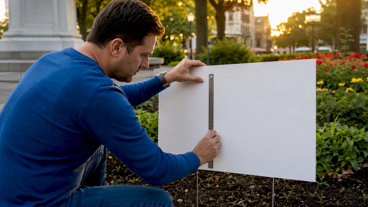
Contrast is the second pillar. The minimum contrast ratio for text on signage is 4.5:1 for standard conditions, with 7:1 recommended for optimal legibility under varied lighting. Black text on a white background clears 21:1. Yellow text on a white background fails the minimum. Contrast is not a style preference. It is a readability requirement.
Typography rounds out the core three. Sans-serif fonts with open apertures, such as Frutiger and DIN, maintain legibility at distance and speed. Decorative scripts and thin serif fonts look refined on paper but break down at 30 feet. Stick to clean, open letterforms for any sign meant to be read quickly.
- Use a minimum 4.5:1 contrast ratio between text and background
- Size letters at 1 inch per 25 feet of intended viewing distance
- Choose sans-serif fonts like DIN, Frutiger, or Helvetica
- Limit your sign to one primary message and one supporting detail
- Use whitespace deliberately. Empty space is not wasted space
Pro Tip: Before you finalize any sign design, print it at full scale and walk to the intended viewing distance. What looks clear on your monitor often disappears at 50 feet.
Visual hierarchy matters too. Place your most important message at the top in the largest type. Supporting details go below in smaller text. Viewers scan signs in under three seconds. If your hierarchy is unclear, your message is lost.
How do environmental factors and materials impact sign design?
Signage performance depends on physical constraints more than aesthetics. The environment where your sign lives determines every design decision, from color choice to substrate selection.
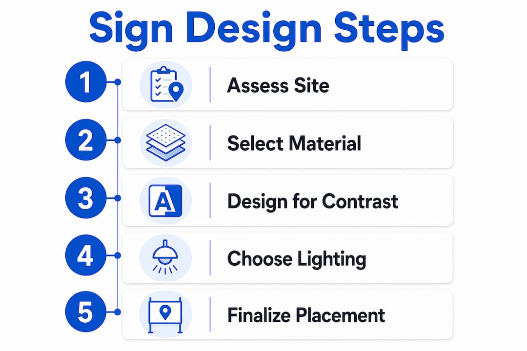
Indoor vs. outdoor lighting
Indoor fluorescent lighting and outdoor natural light affect color and contrast differently. Lighting conditions change how colors read and how much contrast you actually need. A dark navy background that reads clearly under indoor fluorescent light may appear nearly black in direct afternoon sun, reducing contrast with dark text. Outdoor signs generally need higher contrast and bolder colors to compensate for glare and changing light angles throughout the day.
Mounting height and viewing angle
A sign mounted at 8 feet on a wall reads differently than one staked at 18 inches in a yard. Viewers approach yard signs from a low angle, which means the bottom third of the sign is often the hardest to read. Keep your primary message in the top half of the layout. For wall-mounted signs, center the message at eye level whenever possible.
Choosing the right material
| Material | Best for | Durability | Cost |
|---|---|---|---|
| Coroplast (corrugated plastic) | Yard signs, short-term outdoor use | 1–2 seasons | Low |
| ACM (aluminum composite) | Storefront, long-term outdoor | 5+ years | Medium-high |
| Vinyl banner | Events, temporary promotions | 1–3 years | Low-medium |
| Aluminum | Permanent outdoor, ADA signs | 10+ years | High |
Investing in durable, weather-rated substrates reduces replacement costs and maintains sign quality over time. Cheap materials warp, fade, and peel. A coroplast yard sign is the right call for a two-week promotion. It is the wrong call for a permanent storefront identifier. Match the material to the sign’s lifespan. You can explore a detailed outdoor sign material comparison to find the right substrate for your budget and environment.
Pro Tip: For outdoor signs that need to last through multiple seasons, choose a UV-resistant laminate finish. It adds minimal cost and prevents color fading by 60–70% compared to uncoated prints.
ADA-compliant permanent signs require tactile characters, braille, high-contrast finishes, and proper mounting height. If your sign is a permanent interior identifier for a public space, ADA compliance is a legal requirement, not an option.
What common mistakes do non-designers make in sign design?
Non-designers often treat signs as decoration rather than communication tools. That single mindset shift explains most beginner errors. Here are the most common mistakes and how to correct them.
-
Ignoring viewing distance when sizing letters. A sign designed on screen at 100% zoom looks fine. At 40 feet in a parking lot, the text is unreadable. Apply the 1-inch-per-25-feet rule before you finalize any layout.
-
Choosing decorative or thin fonts. Thin, decorative fonts fail at distance. Experienced designers choose fonts like DIN or Clearview specifically because they hold their shape at speed and distance. Swap script fonts for clean sans-serifs on any sign meant to be read quickly.
-
Overcrowding the layout. Overcrowding text and images reduces comprehension speed and increases viewer error rates. Less information, presented clearly, outperforms a packed layout every time. Audit your message: if a word does not help the viewer act, remove it.
-
Poor color contrast. Yellow on white, red on green, and light gray on white all fail basic contrast requirements. Test your color pairs against the 4.5:1 minimum before printing.
-
Ignoring glare and lighting variation. A sign that reads perfectly in morning shade may wash out in afternoon sun. Design for the worst lighting condition your sign will face, not the best.
-
Skipping a real-world legibility test. Designing on screen without printing at scale is the most common novice mistake. Print a test copy, tape it to a wall, and walk to the intended viewing distance before you order.
Pro Tip: Run a “squint test” on your design. Squint at your sign until it blurs slightly. If the primary message is still readable, your hierarchy and contrast are strong enough.
Non-designers benefit from auditing the environment and establishing a clear information hierarchy before choosing colors or graphics. Start with the message, then build the visual around it.
How can non-designers plan and create effective signs?
Creating an effective sign follows a clear sequence. Work through these steps before you open any design software.
-
Define the sign’s single purpose. What is the one action you want a viewer to take? “Call this number,” “enter here,” “sale this weekend.” One purpose per sign. Two purposes compete with each other.
-
Calculate letter height. Measure or estimate the viewing distance. Divide by 25 to get your minimum letter height in inches. A sign viewed from 75 feet needs 3-inch letters at minimum.
-
Choose your color pair. Select a high-contrast combination based on your environment. Black on white, white on dark blue, and black on yellow are proven performers outdoors. Avoid color pairs that fail the 4.5:1 contrast ratio.
-
Select a legible font. Helvetica, Arial, DIN, and Frutiger are safe choices for any sign. Avoid fonts with thin strokes, tight letter spacing, or decorative flourishes.
-
Sketch the layout before opening software. Place your primary message at the top in the largest type. Add one supporting detail below. Leave at least 30% of the sign area as empty space. Whitespace is what makes text readable.
-
Select your material. Match the substrate to the sign’s environment and lifespan. For short-term outdoor promotions, coroplast works well. For weatherproof seasonal signage that needs to last through rain and sun, choose a more durable substrate.
-
Test at scale before ordering. Print a full-size proof, mount it in the intended location, and check legibility from the actual viewing distance. Adjust letter size or contrast if needed.
For practical layout guidance specific to retail environments, the Yardsigns resource on outdoor sign placement covers mounting height, angle, and positioning in detail.
When it comes to software, tools like Canva, Adobe Express, and Google Slides all offer sign templates that apply basic grid structures automatically. They are good starting points. The principles in this guide still apply regardless of which tool you use.
- Canva: free templates, drag-and-drop layout, good for beginners
- Adobe Express: stronger typography controls, free tier available
- Google Slides: basic but functional for simple rectangular sign layouts
Know when to hand off to a professional. If your sign will be permanent, large-format, or ADA-regulated, a professional sign shop adds real value. For short-term promotions, events, and yard signs, applying these principles yourself produces results that work.
Key takeaways
Effective sign design for non-designers requires three non-negotiable elements: correct letter sizing for viewing distance, sufficient contrast between text and background, and a single clear message.
| Point | Details |
|---|---|
| Letter sizing rule | Use 1 inch of letter height per 25 feet of viewing distance for comfortable reading. |
| Contrast minimum | Maintain at least a 4.5:1 contrast ratio; aim for 7:1 in variable outdoor lighting. |
| Font selection | Choose open-aperture sans-serif fonts like DIN or Helvetica over decorative styles. |
| Material matching | Select substrate based on lifespan and environment to avoid early fading or warping. |
| Message discipline | Limit each sign to one primary message and test legibility at full scale before printing. |
Why simplicity is the hardest skill in sign design
Most people assume good sign design means adding more: more color, more text, more graphics. After years of working with small business owners on their signage, I have found the opposite is true. The hardest skill is subtraction.
The signs that perform best are almost always the ones where the designer removed something. A phone number that got cut. A tagline that disappeared. A second color that became one. Every removal made the primary message stronger.
The conventional advice is to “keep it simple,” but that phrase does not tell you what to cut. My rule is this: if a viewer needs more than three seconds to understand your sign’s purpose, something has to go. Time yourself. Show the sign to someone unfamiliar with your business. If they hesitate, you have your answer.
The other thing I have learned is that non-designers underestimate environmental constraints every single time. They design for the screen, not the street. Viewing distance, sun angle, and substrate texture all change how a sign reads. Walk your location before you design anything. Stand where your viewer will stand. Look at what is behind the sign. That context shapes every decision that follows.
You do not need design talent to create a sign that works. You need discipline, a clear message, and the willingness to test your assumptions in the real world.
— YardSignGuy
Ready to put these principles into practice?
Yardsigns makes it straightforward to apply everything in this guide without starting from scratch. Their catalog covers restaurant signs, handyman signs, and real estate signs built on proven layouts that already follow the contrast, sizing, and hierarchy principles covered here.
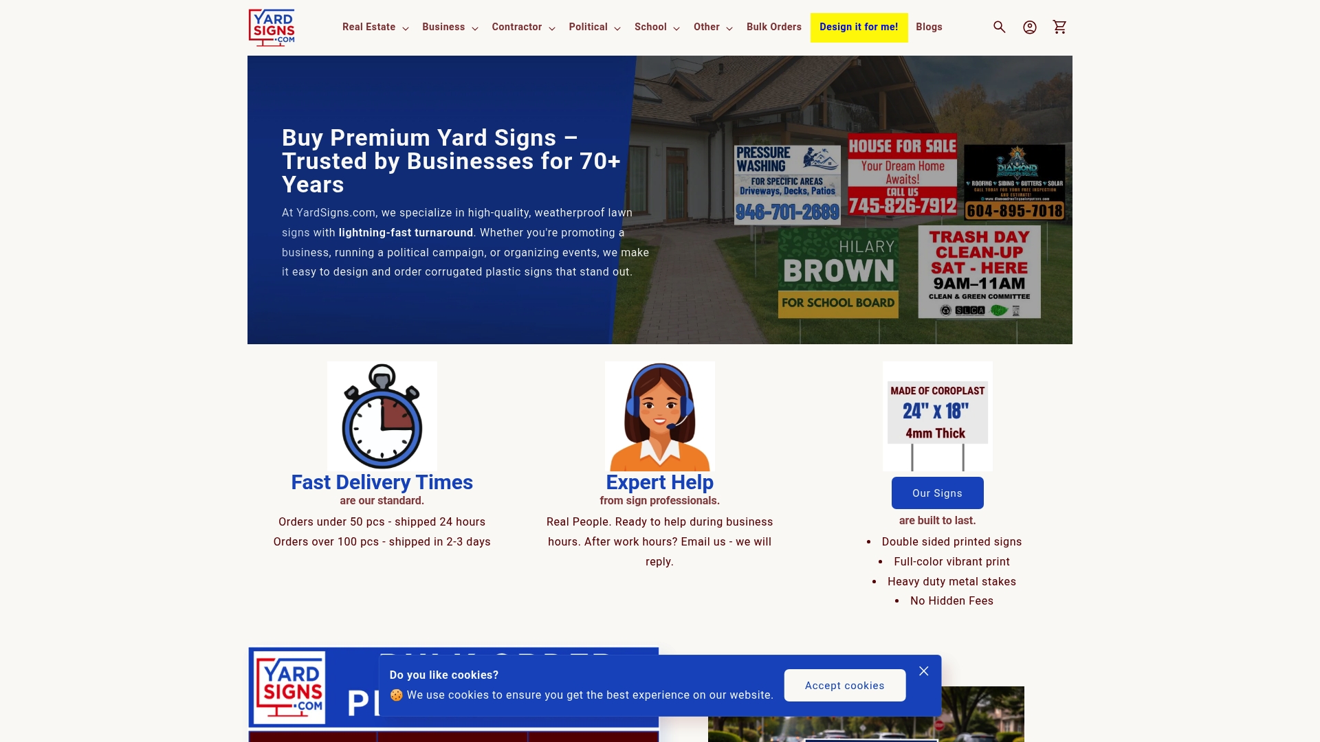
Every design is customizable, printed on weatherproof materials, and ships within 24 hours for orders under 50 pieces. Whether you need a single yard sign for a weekend event or bulk signs for a campaign, Yardsigns delivers quality that holds up in real conditions. Browse the full catalog at yardsigns.com and find a template that fits your message.
FAQ
What is the basic rule for sign letter sizing?
Use 1 inch of capital letter height for every 25 feet of viewing distance for comfortable reading. At 50 feet per inch, that is the absolute maximum for legibility.
What fonts work best for signs?
Sans-serif fonts with open apertures, such as DIN, Frutiger, and Helvetica, maintain legibility at distance and speed. Avoid thin, decorative, or script fonts on any sign meant to be read quickly.
How much contrast does a sign need?
The minimum contrast ratio for sign text is 4.5:1. A ratio of 7:1 is recommended for outdoor signs exposed to variable lighting conditions.
What material should I use for an outdoor yard sign?
Coroplast (corrugated plastic) is the standard choice for short-term outdoor signs lasting one to two seasons. For longer-term use, aluminum composite material (ACM) or aluminum provides significantly better durability.
Can I design my own sign without design experience?
Yes. Apply the core principles: size letters for viewing distance, use high-contrast color pairs, choose a clean sans-serif font, and limit the sign to one primary message. Test at full scale before ordering.
